process
accessibility
How Big Is Big Enough?
O’Reilly Answers recently posted an excerpt from Tapworthy about the ideal size of iPhone tap targets.
community
Develop iPhone Apps with Staying Power
This week at Mashable, I shared some ideas for extending the (alarmingly brief) lifespan of mobile apps. The secret: content trophies, competition, community, and a dash of emotion.
apple
Designing for iPhone 4's Retina Display
The gorgeous high resolution of iPhone 4 soothes the eye but adds extra legwork for iPhone designers. Here’s the big picture.
iphone
Graffiti Compasses, Welcome Mats, and the Art of the Generous Greeting
Web and software designers, take note: Spray-painted compasses in New York illustrate how helpful a thin layer of extra help can be for new arrivals.
process
Dieter Rams and the Fresh Prince
Will Smith’s cringe-inducing wardrobe of the eighties got me thinking about the difficulty of truly timeless design. Dieter Rams to the rescue.
iphone
Tips for iPhone Visual Identity
I posted a slew of pointers at O’Reilly Answers for designing a unique visual identity for iPhone apps.
art
Local Development: New Technology, New Community
It was a real treat to sit down with John Maeda to talk iPhone apps, economic development, and how to build a community of digital artisans.
ipad
Quick Thoughts on Designing for iPad vs iPhone
I had a fun conversation with O’Reilly Online Managing Editor Mac Slocum about the differences designing for iPad vs iPhone.
conference
Just Like Being There
The good folks at SXSW just posted the audio of my talk on Tapworthy app design. Have a listen and follow along with the slides, too.
conference
Tapworthy App Design at SXSW
I’m in Austin to talk about iPhone interface design on March 15. Come say howdy.
books
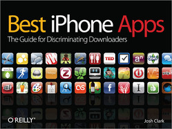
Best iPhone Apps: Reinventing (and Designing) Books in the Web Era
Or, “Why I wrote and designed an entire book in Pages.” The web has changed the way we read, and my new book is part of an experiment to create a new kind of print storytelling, with lessons for writers, designers, and publishers alike.
process
Dot Your I’s
A clever logo solution smuggles in the required legalese without cluttering the design.
art
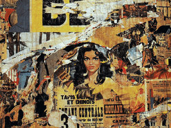
Jacques Villeglé: The Original Mashup
An exhibition of torn poster art asks fascinatingly relevant questions in an era of online mashups and user-generated content.
business
Follow the Grid, Skip the Lines
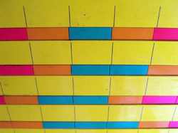
My post office features a clever heat-map grid to announce slow and busy hours. A perfect idea for the web.
icons
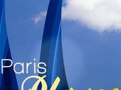
C’est la Beach
As Paris morphs into the Riviera, some clever icon design works its own transformation.
c25k
No Pain, No Pain: The “Couch to 5K” and Humane Design
I wrote the “C25K” training program for new runners over a decade ago. Its philosophy overlaps neatly with my philosophy of software design.
bigmedium
Controlled
Your faithful correspondent fell under the browbeating eye of authority on a few recent and essentially trivial occasions, making me think a bit about the effects of control, rule enforcement and tone in my own work.
art
Design Treasures Found and Lost in the Paris Métro
Tons of cool historical design in the Paris subway is getting gutted.

