process
design system
Design Systems: Pilots & Scorecards
Dan Mall shares techniques for selecting pilot projects to develop and prove out design decisions for large-scale design systems.
design system
Style Guide Audience
Brad Frost underscores the value in helping design systems embrace the whole organization.

mobile
Your Traffic Went Mobile; Why Hasn’t Your Design Process?
The mobile audience is now twice as big as desktop. Does your organization’s design process reflect that mobile is now your primary platform?

mobile
No Share Buttons on Mobile Sites (Except This One Weird Case)
Only 2 out of every 1000 mobile web users ever tap a custom share button. Don’t even bother including them in mobile sites except when users are coming from a social network.
design system
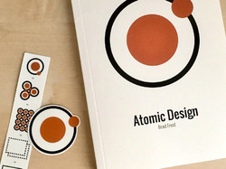
Atomic Design
Brad Frost just published his marvelous book Atomic Design, and it was my honor to pen the foreword with our friend and collaborator Dan Mall.

interview
Sneak Peek: Magical UX and the Internet of Things
In an interview, Josh Clark previews his keynote for the Delight conference, explaining why magic yields more imaginative interfaces than technological inspiration.

ew.com
Mobile Magic for Entertainment Weekly
Entertainment Weekly has a new responsive mobile website. Here’s a behind-the-scenes look at how we built it.
books
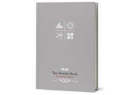
The Mobile Book
Smashing Magazine published The Mobile Book this week. I was honored to contribute the book’s final chapter about designing for touch.

touch
New Rule: Every Desktop Design Has To Go Finger-Friendly
New hybrid keyboard-touch laptops and tablets have changed the game. When any desktop machine could have a touch interface, we have to proceed as if they all do.

PEOPLE
Time Inc.'s first responsive site
We designed the responsive mobile website for People Magazine. Here’s how we did it and why.
touch
Touch Means a New Chance for Radial Menus
Radial menus are suddenly in vogue, but it’s not just passing fashion. For touch, this is good interaction design.

buttons
With iOS Buttons, Know Your Right from Your Left
Back! Done! Cancel! Save! Mobile apps sport a bevy of buttons to dismiss a view, but their proper placement isn’t always obvious. Here are the general rules to follow.

history
Grids, Design Guidelines, Broken Rules, and the Streets of New York City
The history of New York City’s aggressive grid of city streets offers plenty of lessons for digital designers.

content strategy
Mobile Isn't the Lite Version
Jakob Nielsen’s dubious mobile website guidelines make the mistake of assuming that there’s such a thing as “this is mobile content, and this is not.”
mobile
Designing for “Context” Is Tricky Business
Designers often conflate device context with user context—or worse, with user intent. “This is mobile, so they’ll never want to do that.” ”This is mobile, so it’s aimed only at users on the go.” Friends, this is hooey.

gestures
“Buttons Were an Inspired UI Hack, but Now We’ve Got Better Options”
The good folks at O’Reilly interviewed me this week about how new technologies change how we should think about interface design as both consumers and designers.
apple
3.1 Million Pixels Are Heavy
If you want to take advantage of the new iPad’s gorgeous screen (and of course you do), every image you push down the wire is about to put on a ton of weight. That has implications in lots of places and for lots of people.

gestures
Gestures in #NewNewTwitter
Big changes are afoot in the new Twitter app for iPhone, with both good and bad things happening with the app’s gesture interactions. Here’s a hard look.