Centaurs and Park Benches: Innovation by Idiosyncrasy
By
Josh Clark
Published Jan 3, 2008

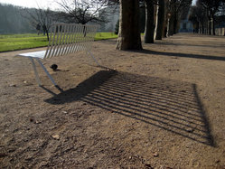
It was only a park bench. My eyes nearly rolled right over it as I walked past. But now I was staring at it, circling it, taking photos of it. This mundane piece of public furniture had my full attention.
I was taking a walk this week in the Jardin des Plantes, a sprawling botanical garden whose design, like most parks in Paris, is formal and meticulously geometric. (Even the enormous trees lining the promenades are chiseled into perfect cubes.)
The park has hundreds of benches, and I had never noticed this particular one before. It was a sleek white aluminum form frozen in mid-motion, springing gracefully out of the ground, a perfect sculptural concept for a garden.
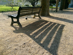
I liked the design, sure, but I particularly liked it as a counterpoint to the army of traditional benches that surrounded it. These heavy wood-and-iron constructions were designed by the Alsatian firm SINEU Graff back in the 1920s, and each one is etched with the enigmatic title “Le Centaure,” the model name of the bench. Scanning the park, I saw that it was all centaurs; not one other white bench in sight.

Just on its own, the presence of this single notable park bench had made me pause to take in and appreciate the design of the park and the nostalgic quality of its century-old seating. The high-touch design of this modern bench was a spark that dazzled on its own but also illuminated its surroundings.
I think that great design often works this way, with a hint of idiosyncrasy. An unexpected (even subversive) element sheds new light on the whole, drawing attention not only to the flourish itself but also to the form of the overall construction.
In business and product design this type of small tweak can result in giant innovative leaps. Web 2.0 darling Twitter put a new twist on instant messaging by making messages completely public, in the process creating something that might be called micro-blogging. The big, fun, grippable handles of OXO kitchen products are another popular design example, tweaking a familiar product to deliver a breakthrough ergonomic improvement and a healthy dose of personality, too. In both cases, relatively small changes dramatically altered the perception of the entire offering.
Great design often works this way, with a hint of idiosyncrasy. A subversive element sheds new light on the whole.
I try to do this in my own humble way, looking for opportunities to add subtle visual surprises to the design of my various projects. This is tricky business, though. Departing from familiar form can be innovative and delightful, but it can also annoy and confuse. Usability problems often follow when you stray from established conventions.
Innovation is risky and it doesn’t always work, even when you’re just tweaking a familiar form. People might love the result, they might hate it. But either way has got to be better than playing it safe.
One of my favorite missives from Kathy Sierra’s much-missed blog featured a chart labeled “How Users Feel About Your Product or Service.” On the left was “Love,” on the right was “Hate” and in the vast middle was “Zone of Mediocrity” with the caption, “here you’re screwed.” Better to try for something new and different than to go utterly unnoticed.
And after all, I noticed the new bench at Jardin des Plantes. How many times can you say that about a park bench? The design is a little wacky considering the formality of its surroundings; it’s a risk. But tucked away among a herd of centaurs, the bench made me stop, think and appreciate my surroundings. That’s good design.


