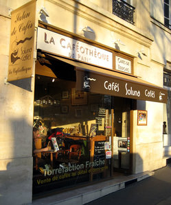
Last week, my food-critic pal Rosa invited me and a friend to a coffee tasting at Soluna Cafés, a “_caféothèque_” here in Paris. Along with a high-pitched caffeine buzz, I left the tasting with a strong impression that applies as much to interactive design as it does to coffee: In matters of taste, subtlety is everything.
The goal of the event was to introduce we three coffee dabblers to top-flight “_grand cru_” coffees. I had never attended such a thing for coffee, but it turned out to be much like a wine tasting. Our host walked us through ideal growing conditions, the factors that cause taste variations in coffee, the role of the coffee tree’s berries in the flavor.
Then, to exercise our noses, we were given a box of 30 or 40 vials of scented oils, each representing an aroma found in various coffees. Our task was to identify the scent of these unmarked bottles. Vanilla, cucumber, smoke, cherry, green pea, pepper, jasmine… I learned, one, that coffee has a whole range of underlying scents and flavors that I had never considered or detected; and two, that I’m lousy at guessing the smells of scented oils.
My wine-smart friends Rich and Kristen have a similar case of vials, tuned to the aromas you find in wine. Unlike me, they’re actually terrific at identifying the scents, which is also why they’re so much better at discerning (and appreciating) fine wine than I am. Turns out that the vials are more than a quirky olfactory game; they’re a tool for sharpening your palate, for training you to detect subtle shifts in scent and flavor. The better you become at the game, the more sensitive you become to the good, bad and unusual in your vino.
Sensitivity to subtlety serves us well in arenas well beyond the coffee cup and wine glass. For designers, an appreciation for the subtle, understated use of color and visual effects lends elegance and confident grace to graphic work. Jeff Croft offered some examples recently at the Blue Flavor blog:
High-quality, professional work usually bears a distinct ability to be subtle — to show restraint, and avoid garishness. That’s not to say, of course, that this work is boring. Instead, it is impactful and compelling without being overt.
Take a popular visual effect, for example: the gradient. Both professional and hobbyist designers love them some gradients. But look closely, and you’ll probably find that great designers tend to use them in moderation, and with great care. You’ll find blends between two very similar — almost indistinguishable — shades, rather than gradients that go from, say, a dark green to a light green. The result is an effect you can feel moreso than see.
The same thing is seen with the drop shadow. Whereas amateurs often make the mistake of using very heavy shadows, more experienced designers are likely to produce barely-noticeable effects that create a sense of depth and dimension without drawing attention to themselves.
The subtlety seen in great design work doesn’t just apply to fancy effects, either. Subtle differences in text color can be very effective at conveying meaning and hierarchy. Every-other-row stripes in the background of tables and charts are often times barely noticeable when employed by great designers. Rules and other lines make [sic] be used in very subtle ways. All of these elements are important and functional — but they don’t need to be overt in order to do their job well.
It sounds simple, but it’s difficult in practice. For practitioners, subtlety in design means soft-pedaling individual flourishes for the improvement of the whole. It means submerging your id to enable the finished work to surface, allowing individual elements to blend organically and in balance. It’s not always easy to step back to allow your work to take center stage. Restraint in the face of enthusiasm.
It’s not a new challenge. I’ve lately been re-reading Edward Tufte’s stunning series of books on information design. In Envisioning Information, Tufte cautions against the designer’s temptation to put one’s art above the informational mission, offering up the example of solar-system models circa 1800:
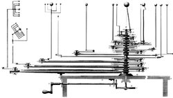
Narratives of the universe were impressively cranked up in orreries, simulations of our solar system (as known in 1800), with planets and their satellites rotating and orbiting. Although a triumph of gear ratios, the machines did commit a grave sin of information design—Pridefully Obvious Presentation—by direction attention more toward miraculous contraptionary display than to planetary motion.

The inner show-off threatens to overwhelm the entire purpose of the design, distracting from its actual content. Bold flavors overwhelm the balance of a subtle blend.
Alas, like savoring a rich coffee or a well balanced wine, it takes practice and training to develop sensitivity to and appreciation for design subtleties. The web is full of loud and lurid designs for the same reason that most people drink bad coffee and lousy wine. Friends, we lack taste. We lack subtlety.
Me, I’m working on it. I’d like to think that I’m becoming more discerning of wine, of coffee, and of design. For the latter, I spend time studying sites, advertisements, book designs and art installations that move me, dissecting their elements to understand the techniques that make them tick. I study the history of graphic design, of typography. And I tinker. I play around with designs, layouts, colors.
These efforts are my vials of scented oil, and I’ve gradually become aware of distinctions that were previously invisible to me. I don’t pretend that I am a master designer, but I’m confident that I can at least appreciate and identify the elements of good design in the work of others, to try to incorporate them into my own work. I am slowly becoming a gourmand if not yet a gourmet.
And hey, whattya know: Just this morning, thanks to my new friends at Soluna Cafés, I could actually taste the distinct flavor of cherry undertones in my espresso. In the coffee cup or on the web, it turns out that patience, practice and a little thoughtful attention make a difference.


