Ideas and Discoveries
multidevice
Leaping the Gap Between Devices
As devices multiply, the new opportunity is less about designing individual screens, and more about designing interactions between the devices.
wearables
Smart Watches, Wearables, and That Nasty Data Rash
The real luxury of wearing information is not in exposing ourselves to every passing data point but in filtering that data in ways that deliver insight and amplify our humanity.
books
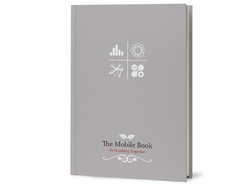
The Mobile Book
Smashing Magazine published The Mobile Book this week. I was honored to contribute the book’s final chapter about designing for touch.
touch
New Rule: Every Desktop Design Has To Go Finger-Friendly
New hybrid keyboard-touch laptops and tablets have changed the game. When any desktop machine could have a touch interface, we have to proceed as if they all do.
touch
Touch Means a New Chance for Radial Menus
Radial menus are suddenly in vogue, but it’s not just passing fashion. For touch, this is good interaction design.
buttons
With iOS Buttons, Know Your Right from Your Left
Back! Done! Cancel! Save! Mobile apps sport a bevy of buttons to dismiss a view, but their proper placement isn’t always obvious. Here are the general rules to follow.
history
Grids, Design Guidelines, Broken Rules, and the Streets of New York City
The history of New York City’s aggressive grid of city streets offers plenty of lessons for digital designers.
content strategy
Mobile Isn't the Lite Version
Jakob Nielsen’s dubious mobile website guidelines make the mistake of assuming that there’s such a thing as “this is mobile content, and this is not.”
mobile
Designing for “Context” Is Tricky Business
Designers often conflate device context with user context—or worse, with user intent. “This is mobile, so they’ll never want to do that.” ”This is mobile, so it’s aimed only at users on the go.” Friends, this is hooey.
gestures
“Buttons Were an Inspired UI Hack, but Now We’ve Got Better Options”
The good folks at O’Reilly interviewed me this week about how new technologies change how we should think about interface design as both consumers and designers.
apple
3.1 Million Pixels Are Heavy
If you want to take advantage of the new iPad’s gorgeous screen (and of course you do), every image you push down the wire is about to put on a ton of weight. That has implications in lots of places and for lots of people.
ffly
A Day Made of Glass
The folks at Corning put together a heckuva concept video that peeks into the near future of touchscreen interfaces.
advertising
QR Codes Are Footnotes, Not Ads
Go figure, but pulling someone through a QR code means we have to give people information they actually want or need.
gestures
Gestures in #NewNewTwitter
Big changes are afoot in the new Twitter app for iPhone, with both good and bad things happening with the app’s gesture interactions. Here’s a hard look.
history
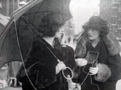
Eve's Wireless
A 1922 silent movie shows off perhaps the first mobile phone, “Eve’s Wireless,” a contraption that required a fire hydrant and an umbrella to work.
apple
Making Stuff
The iPad is a device suited for sitting or reclining, which certainly makes it a device of contemplation, and yep, that’s the perfect state of mind for reading or watching a movie. But it’s a mistake to think of it as “only” a new-fangled book or tv screen. Contemplation is not the same as passivity.
books
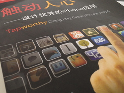
Tapworthy in China (and Japan! and Spain!)
“Touch People’s Hearts” is the translated title of the Chinese edition of my book Tapworthy (触动人心), and I couldn’t be more tickled.
