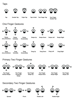
“Cue” is a clever set of icons for teaching touch. Designer P.J. Onori created the icons for mobile interfaces or wireframes to prompt touch interactions, and they take a fresh point of view on the challenge.
What’s the big deal?
Buttons are a hack, I’m fond of saying. The abstractions and workarounds we’ve created to support 30 years of graphical user interfaces are weak replacements for direct interaction. Touch lets us consider whether we need these workarounds and, where appropriate, sweep them aside to create the illusion of touching the content itself.
Touch is leading us to a future with less and less chrome, possibly even none at all, as gestures replace familiar buttons, menus, and tabs. But if there are no visible controls, how do users figure out how to use the damn thing? In recent talks, I’ve been talking a lot lately about practical solutions to this problem, explaining how to make gestures discoverable without visible controls.
We’ll all eventually learn gestures the same way we learn everything else in the real world. Experience and visual cues will lead us to try things, and the response will tell us whether it’s right. The better the visual cues we provide, the more likely we are to figure things out. This is the way the world works. So, even if the gestures themselves are invisible, the coaching prompts we provide must be visible.
We have a lot of tools we can use: user observation, contextual help, animation, forced pauses, and perhaps most important… good signage.
That’s where Cue comes in.
Refined to the basics
The best icons are almost always the simplest, a rich reduction of the fundamental action the icon represents. Cue offers a fine example of this, by emphasizing the touch itself far more than other systems which typically illustrate the entire hand. Here’s a comparison of the swipe gesture in Cue (left) to excellent but more complex icons from Gesture Icons, Luke Wroblewski, and GestureWorks:

The compact simplicity and ability to scale to small sizes makes Cue a useful building block for touch prompts in mobile interfaces. [P.J. says he had four principles][blog] that drove the icon design process:
Create a core visual language that all gestures could build from. Gestures will come, go and change over time. The system should be able to support that.
Distill each gesture to its core action. The illustrative nature of most gesture icons reduce focus from the fundmental interaction being performed.
Represent each gesture in a non-literal, yet clear way. Not everyone is right handed, nor do they perform gestures uniformly which makes literal expression less than optimal.
Design forms that would be legible at small sizes. Mobile devices are already space-constrained. My goal was to create icons that could take up little space in a mobile interface if needed.
Good stuff here. Cue is licensed under a Creative Commons license and available in multiple formats: PNG (4 sizes), SVG, Omnigraffle and InDesign formats. The icons come with and without labels.
Fine work, P.J. Now go get ‘em.
