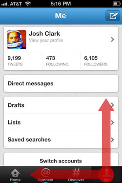
Gnashing of teeth and rending of garments greeted the arrival of New New Twitter last week, and the iPhone app caught an especially stiff backlash. Much of the criticism focused on Twitter’s downplay of once-core features (direct messages and account switching) and the arrival of the Discover tab which pimps Twitter’s trending topics. The changes seem due to an apparent shift away from power users and toward relative civilians, as well as a try at positioning Twitter as a content discovery service as much as a communication service. In that light, many of the changes make good sense, and it’s clear lots of hard thinking went into it.
Me, I was most intrigued—both positively and negatively—by changes in the app’s gesture interactions. I put together a quick screencast that summarizes my thoughts, along with demos of the gestures at hand:
If you prefer your opinions in prose instead of video, here’s the skinny…
A swipe, swiped

I was disappointed to see Twitter remove a little-known swipe shortcut. In previous versions, swiping left-to-right across the Navigation bar popped you back up to your Twitter timeline after you’d descended down through several layers. Twitter, like Facebook, is great for exploring content and profiles: tap a tweet to drill down through links and account profiles. This is terrific, but you can go a long way down the rabbit hole, which means lots of tap-tap-tapping of the Back button to find your way home. The swipe was a shortcut for teleporting directly back to your timeline without retracing your entire path, and I had begun to hope that this might become a de facto standard for iOS apps.
Trouble was, this shortcut wasn’t even close to widely known. A friend at Twitter confided, “Half of our employees didn’t even know about that swipe gesture,” let alone regular folks. So Twitter changed the action to something they hoped we’d all find more easily: another tap on the Home tab now zips you back to the top level of your timeline.
I support the motive but have misgivings about the change. It’s too easy to do a single tap by mistake, and here that mistap will lose your place if you’re drilled way down into the app—a form of data loss. By contrast, a swipe requires just enough intent to keep you out of trouble. That’s why a swipe is used in iOS to unlock your phone, power off, answer a call, turn off an alarm, or trigger the delete shortcut. Those are all actions that you don’t want to touch off accidentally. Losing a deep position in the app is just as serious, and should be protected by a similarly serious gesture. A swipe is good defensive design, an ideal shortcut for that.
Alas, few people knew about the swipe shortcut, so the gesture wasn’t serving its purpose. A better solution than changing the gesture, though, would be to help people find it in the first place. More on that in a bit.
This rabbit-hole problem is common enough in iOS apps that a standard shortcut is badly needed. I’d hoped that the swipe gesture might be it, and for a few brief weeks, it was beginning to look like that just might happen.

See, until last month, Facebook for iPhone had its own top-secret gesture for this. When you drilled deep down into versions prior to 4.0, you could tap the screen title in Facebook’s Navigation bar to zip back to the app’s home screen. So here we had two highly influential apps using different actions to accomplish the same task. But when Facebook 4 came out and reorganized the app’s navigation, the swipe was suddenly the common action for both. In the current version of Facebook, swiping left to right across the Navigation bar reveals the app’s top-level navigation, and from there you can hop to the top of any of Facebook’s sub-apps.
For a bare few weeks, in other words, both Twitter and Facebook used the same swipe to spring back to the top of the app. With two such big-audience apps supporting the gesture, it stood a chance of becoming a useful standard. But the latest version of Twitter removed it, and that suddenly seems less likely.
I’d love to see Twitter reintroduce the swipe gesture and take a fresh approach to helping folks find it.
Don’t prune. Teach.
Lots of designers avoid using gesture shortcuts altogether, because they rightly assume that their audience won’t find them on their own. Gestures are invisible, without the cues of buttons and other traditional controls. The answer, though, is not to prune gestures entirely, but instead to supply visual hints at appropriate times to help people find these shortcuts.
Before doing this teaching, though, there’s real value in having the app’s audience learn the slow way. Thumping the Back button to return home, for example, reinforces the mental model of the app. Before someone learns a shortcut, it’s helpful for them to know just what it is they’re shortcutting. But after they’ve done it a few times, it’s appropriate to reveal the shortcut—just like a video game rewards you for completing a level. Shortcut achievement unlocked! This is how games take players from novice to expert to master, and other kinds of software can benefit from this, too.
That includes Twitter and Facebook. After someone returns to the top level several times from, say, three or more levels deep, a text overlay and gesture animation should materialize to explain the shortcut. The best way to teach is to build in steps from a basic foundation to more advanced moves, and I believe these gradual, contextual lessons are the best way to teach gestures. This is how you help people level up.
In your corner
Meanwhile, I very much like two new shortcuts in the Twitter app. The new version buries direct messages and account switching under the app’s Me tab. That’s a double-tapping hassle for frequent users of those features, but two new gestures remove the sting. Swiping up from the right corner slides up your direct messages, and swiping left from the right corner flips to the view for switching accounts.

Those swipes conveniently start on the Me tab, where both features live, but the fact that it’s the corner is more important. On both touchscreens and traditional screens, the corners are especially easy targets. On the desktop, you can just slam the cursor into the corner and you’re guaranteed to hit that one pixel. It’s not quite as easy on the touchscreen, but the corners are still more forgiving touch targets than just about any other part of the screen. Swiping from a corner is the easiest part of the screen to start from.
Corner swipes are great gestures for navigation shortcuts, with one caveat: iOS designers shouldn’t count on downward swipes from the top corners, where you’ll run afoul of the Notification Center. I imagine that’s one reason why you can’t dismiss Twitter’s direct messages by swiping back down; if you miss, you’ll instead pull down the notifications windowshade. (You can, however, flip back from the accounts view by swiping right across the bottom.)
So, the practical guideline for adding corner swipes in iOS is: you can swipe both horizontally and vertically from the bottom corners, but only horizontally from the top corners. (Ideally, you’ll reserve those top corners for zipping back to the top level, as discussed above.)
The foiled hijacking
Previous versions of Twitter let you swipe a tweet in the timeline to get quick access to a toolbar of actions to reply, retweet, and so on. That’s been removed; to get those actions you now have to tap the tweet to go its detail view and tap the action there—a quick swipe-tap combo replaced by a slower tap-tap combo.
I’ve long been conflicted about the old Twitter’s swipe gesture. In iOS, a swipe in a list typically triggers a delete action, though apps sometimes piggyback on that gesture’s familiarity to do something different. Reeder, for example, uses the swipe as a shortcut to mark an article read. No harm done there, since there’s no such thing as deleting a Google Reader article, and marking read is kind of delete’s cousin. But Twitter’s old swipe gesture didn’t just piggyback; it outright hijacked the swipe to do something completely different.
I generally frown on hijacking standard gestures for new actions. People who expected that swipe to delete a tweet either never found the action or were surprised when they did. That’s not ideal, but on the other hand, the swipe had such obvious utility. On balance, I miss that shortcut, and I’m sorry to see it go.
If it’s gone for good, then I’d at least like to suggest an alternative shortcut:
Tap-and-hold is a universal problem solver
I wish more iOS apps used tap-and-hold to reveal an action sheet for an iOS equivalent of a right-click contextual menu. It’s a quick win to give power users easy access to actions on the tapped object without distracting novices. In this case, tapping and holding a tweet could reveal buttons to reply, retweet, or quote that tweet. Previous versions of Twitter let you tap and hold a link to copy it, and I’d love to see the same offered in the new version, along with the ability to open in Safari, read later, and so on.
I count many of the folks at Twitter as some of the smartest people I know and, not least, as good friends. I see how much work and thought went into Twitter, and man, they had a tough brief: make the app easy for new and mainstream users, create an environment that will support advertising without damaging content, and surface (hopefully) interesting topics to explore. These goals suggest solutions that are at odds with the habits of many of the service’s most passionate users, as we saw in last week’s backlash.
I think, though, that the addition of a few well-considered gestures can give those users quick access to the features they care about without derailing the service’s evolving goals. The challenge of designing for gestures is that they’re invisible, but that’s also their advantage. They remove the chrome and clutter of advanced features, tucking those features away until newcomers are ready to tackle them.


