We’ve only just scratched the surface of touchscreen interface design. Done right, touch allows us to create the illusion of working directly with content, instead of through the abstract metaphors of menus, buttons, tabs, and assorted “administrative debris” that we’ve adopted over the last 30 years of desktop interfaces.
This is a Very Big Deal. Manipulating content through direct physical action rhymes with how our brains naturally perceive the world and make for easy, obvious use. Just watch a toddler use an iPad, and you’ll see how quickly they latch onto its familiar, direct interactions. Friends, I’m not kidding: we should design with toddlers in mind. They get this stuff better than we do.
As designers, we have some deprogramming to do. We’ve soaked so long in the necessary metaphor hacks of the desktop, that it’s hard to imagine interfaces that are free of buttons and menus. There’s still a role for those time-tested gizmos, and I’m not suggesting that we throw them out entirely. But as I wrote recently, here’s the thing:
Buttons are a hack. As in the real world, they’re often necessary, but they work at a distance—secondary tools to work on primary objects. A light switch here turns on a lightbulb there. These indirect interactions must be learned; they’re not contextually obvious. The revolution that touchscreen devices are working is that they allow us, more and more, to use primary content as a control, to create the illusion of direct interaction.
I don’t mean to suggest that we throw out all of our familiar buttons entirely. Light switches shall remain necessary, after all, and so shall buttons, especially where it’s necessary to trigger abstract actions (“share via Twitter,” for example). But it’s important to recognize those devices for what they are: necessary hacks for moments when direct interaction isn’t possible. Touchscreen interfaces allow that direct interaction in many more contexts. As new solutions arise, we should be open to putting our time-tested workarounds aside. When designing an interaction for touch, always ask: do I really need another button or control for this?
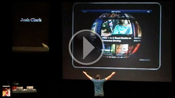
This is a topic that constantly occupies me. And I plan to write and talk about it a lot, so brace yourself. I kicked off my public campaign against buttons at New Zealand’s amazing Webstock conference in February. Here’s the video: Buttons Are a Hack: The New Rules of Designing for Touch. I hope you’ll take a peek.

(Also, man, my talk’s not bad, but there were some seriously high-test talks at Webstock. Waste no time: watch the rest of the conference videos immediately.)


