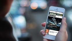
We designed a new responsive mobile website for Entertainment Weekly. Check it out at m.ew.com.
I had the good fortune to lead the overall design effort for the project, and I invited some of the planet’s finest web heroes to join in.1 They’re like The Avengers, only without all the bickering and Hulk-like rage.
Everything happened under the careful and pragmatic attention of Entertainment Weekly Product Director Chad Schlegel. We also worked closely with EW.com Editor Bill Gannon, Art Director Martin Schwartz, and Senior Project Manager Serena Tan. Everyone on their crew was a pleasure to work with: enthusiastic, flexible, and willing to hand themselves over to the responsive design process. That process continues to evolve and its departures from traditional design milestones and deliverables can sometimes give all of us vertigo. With every project, though, the process gets more grounded, more settled.
I’d like to share some of that process, as well as some novel design solutions that we developed.
- The brief
- A magazine feel
- Killing the carousel
- Progressive disclosure
- Limiting the long scroll
- Navigation: content as an enhancement
- Nifty anchor navigation
- Photo galleries that are more than photo galleries
- Share share share share
- Respectful advertising
- Cross-platform branding
- A responsive process
- More from the team
The brief
Our mission: design a responsive site for phones and small tablets—everything south of the iPad Mini.2 This new edition replaces a simple site that has served phones for several years. While that site focused on efficient delivery of news and headlines, the new site was to branch out and include the full EW.com experience, including photo galleries, videos, and community experiences.
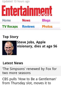
Beyond a full slate of features and content, though, a big piece of this was about brand. The simple design of the original mobile site, while efficient, did not capture the energy and ebullience of Entertainment Weekly’s desktop and print experience. “The mobile site right now doesn’t convey our personality. It’s like a government form. It’s not fun,” Chad told us. Assistant Managing Editor Mike Bruno brought the message home: “We want to take what we’re good at and just wallop you in the head with that stuff.”
Part of connecting the mobile design with the larger Entertainment Weekly brand also meant literal connection across platforms. The design had to feel not only consistent with those platforms (print, apps, and web across devices) but also had to make them known. One of the site’s job in both function and aesthetic was to plug readers into the breadth of the Entertainment Weekly universe in all of its platform contexts.
So: featureful, pretty, on-brand, and platform-minded… all with the goals of increasing reader engagement as measured by page views, user sessions, and community involvement.
We spent a lot of time with Entertainment Weekly readers, finding out their sense of the brand, and the jobs that the website, apps, and magazine do for them. Robert and I did hours of interviews with regular readers. And from there, we were off. (Dan gives a great overview of our kickoff process, including a slew of photos.)
A magazine feel
EW.com cranks out a huge amount of news every day, typically between 50 and 75 new stories per day. Yet for all of this emphasis on breaking entertainment news, the brand’s roots are in its magazine origin. As part of the mission to connect the brand across platforms, we wanted to create a magazine feel even on the small screen. That meant leading with the site’s wealth of glossy, high-quality photos. When you hit the site, no matter what page, the art leads as key content, taking up much of the first-screen experience.
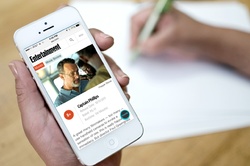
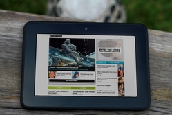
On larger screens, like small tablets, this photo-led design is even stronger, with the photo running huge, almost like a magazine cover. For a site that has so many exclusive photos and videos—where multimedia is a peer to prose—this approach had three advantages: it’s visually arresting; it connects to the print brand; and it promotes photos as one of the biggest draws to the site (a fact which traffic patterns had long indicated).
As a result, a strong lead image commands a third of the screen on nearly every page of the site. But which stories should get the lead-image treatment on the homepage and channel pages? For the past several years, Entertainment Weekly has long promoted several top stories in its “dynamic lead” (DL), a bit of industry jargon that refers to a carousel.
There was vigorous discussion about the pros and cons of keeping the carousel, and we finally ditched it.
Killing the carousel
Carousels are slideshow-style widgets that chop content into individual panels, and you swipe or tap to spin through the offerings one by one. Media sites like this one often use them to create a slideshow of featured headlines. Carousels seem to solve lots of problems, delivering high-impact visuals without sacrificing screen real estate. Because carousels let you stack lots of content into the same compact space, it’s especially tempting to impose them on tiny mobile screens. Pour featured stories into carousels, and presto, the headlines all magically share the same premium top-of-page position.
Alas, research reveals miserable click-through rates on carousels.3 Poking at them only a little bit reveals why: carousels are slow because you have to work to use them. They rely on physical repetition, cognitive effort, and little more than vague trust that there’s going to be something useful on that next slide. Carousels ask for those rarest of commodities: patience and attention.
Consider the seven stories featured at the top of Entertainment Weekly’s new mobile site. If we piled the seven headlines into a slideshow carousel, then getting to that seventh story would be a six-swipe slog through the first six. That’s six interactions before you even see that last headline, and most will never get there. Instead of highlighting content, a carousel defeats the purpose by hiding that content behind a pile of swipes and taps.
Our goals for this featured area were twofold: strong visual impact and easy access to all top articles. We wanted a solution that solved for both, instead of a carousel which neglected one of those goals (easy access to all headlines). So we turned to an old friend.
Progressive disclosure
Progressive disclosure is a mobile designer’s best secret weapon. It’s a high-falutin’ term for giving people full content a little bit at a time. You give people a taste or a synopsis and then let them ask for more if they want it, a great strategy for managing content on small screens. A slideshow carousel is a kind of progressive disclosure: you give someone a piece of content and then invite them to browse more of the same. The problem with carousels for headlines is that they have no scent of information and very low content density. You don’t know whether the next slide will be interesting, and you just have to work through the thing to find out, one headline at a time.
Progressive disclosure works best when you give people more to go on. We wanted to show several featured articles at once and then let people decide whether they wanted to see lots more of the same. Otherwise they could move on to other content.
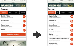
Our solution was a simple More button. The top area of the homepage shows a gigantic splash image for the lead story, followed by two secondary headlines with thumbnail images. Hit the More button to reveal four more articles. By showing three stories at the top, we give people enough information to know if they’d like to see more like that. If so, we give them everything we’ve got. That’s one interaction instead of six for a carousel.
We extended this pattern to all the content sections on the homepage and channel pages. Each of these sections shows a small handful of headlines. Tap a button to see lots more of them, or just keep scrolling down to the next content section to explore a different vein of entertainment news.
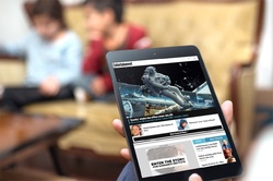
For larger screens with more real estate, we did away with several of these More buttons and just poured all the headlines in at once. Larger screens offer easier scanning of lots of headlines, so they can support that additional content density. That underscores an important job that progressive disclosure does for small screens…
Limiting the long scroll
One of the unfortunate side effects of responsive designs is all too often a crazy-long page on small-screen gadgets. That’s especially true when you design for the desktop first and then crush that design into a single column for phones. “Hm, I’ve got a three column design… I guess I’ll just stack all of those columns on top of each other. Mission accomplished!”
That gives you content parity with the desktop site, which is great, but it doesn’t provide the same parity of usability. When you do that, third-column content that was easily accessible on large screens now gets sunk to the depths of a seemingly endless single column on phones. This buries content… and risks the occasional case of swipe-swipe-swipe thumb sprain for those determined enough to go all the way to the bottom of the page.4
The More button (and progressive disclosure generally) enables a compact view of each content section. You get a taste of each section by scanning the top stories, without committing the design to displaying everything at once. It makes the content quickly scannable while giving easy one-tap access to more if you want it. This approach allows the site to feature lots of content on the homepage and channel pages without risking thumb sprain. Boom: content parity and easy accessibility.
Implicit in progressive disclosure is the notion of primary and secondary content: show the most important stuff always, but push secondary or optional content into another view or state. Optional, nice-to-have content provides some interesting room to play, because you have the possibility of treating content itself as an enhancement. Just like progressive enhancement tests the browser to see if it can handle fancy functionality, progressive disclosure lets you do the same with content, too. “Does this device have the ability (usually: the space) to display this extra content?”
That’s the approach we took with the navigation. Typically, of course, navigation offers you links to the top sections of the site, and that’s what you get on Entertainment Weekly’s mobile site at narrow views, too. You get the primary sections as well as some currently hot topics, and the core job is done.
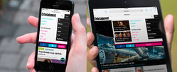
For larger screens, though, we wanted to take the opportunity to share the featured stories of the hour. We went beyond the staple section navigation to promote individual pieces. The goal of navigation is to help people find great content, so we decided to use this area to make explicit suggestions. Nice-to-have content enhanced the navigation to make it into a kind of dashboard panel, a mini homepage with splashy promotion of top stories.
We had some fun with other aspects of navigation, too. On the page for “Tonight’s Best TV,” we created an app-like interaction for navigating anchor links. The page shows editor’s picks of the best TV shows airing in the next seven days. A fixed navigation bar at the top of the screen lets you hop directly to a specific day; tap a date, and the page scrolls smoothly to that day. So far, so good.
But the navigation is also an indicator of your progress through the week. As you scroll down the screen, the navigation bar moves and highlights to show you the date you’re currently browsing. It’s a small thing, but it feels smart and helpful when you use it. The navigation bar is also swipeable; for small screens that can’t fit all seven days across, you can swipe the navigation bar to browse the dates. It’s a fun little interaction for an important corner of the site.
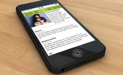
Photo galleries that are more than photo galleries
As for most entertainment sites, photo galleries are a huge draw at Entertainment Weekly, driving redonkulous levels of traffic. Entertainment Weekly adds a twist to their galleries, though: nearly all of them are also lists:
- Movie Tech Breakthroughs: 10 That Broke the Mold
- Breaking Bad: We Rank Every Episode
- 14 Worst Movie Jobs
You get the idea. It’s a perfect viral lovechild of lists and entertainment photos. But crucially, they’re also combined with Entertainment Weekly’s wry and witty commentary. That means the photos don’t just have captions; they sometimes have awesome essay-length missives. We had to make it easy to browse the photos and this potentially very long text and the comments for each photo—all on small screens. There’s a lot going on here, but we managed to wrangle it into a tidy package.
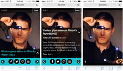
The caption/essay toggles into view over a portion of the photo, so you can still see the photo as you read the text, or dismiss it if you like. Tap the comment button to “flip” the gallery over to reveal comments on the back. If you’re just in it for the photos, tap the center of the photo to toggle all of the gallery controls on and off.
This was a challenging bit of UX to sort out, which likewise meant for challenging code. Jonathan Stark brought it smoothly home.
Media companies across the board are seeing more and more so-called “earned traffic.” That is, readers are sharing their content with other readers, so that a growing number of visitors are now coming to the site via Twitter, Facebook, blogs, and so on. Homepage and search-engine traffic has lost ground to this newer social traffic for years. That means that media sites, Entertainment Weekly included, are more invested in ever than encouraging readers to share. No great surprise there.
We originally planned to put static share buttons at the top and bottom of article pages, but the crew at Entertainment Weekly wanted us to push harder. Social sharing would be a key metric for the success of the redesign. We toyed with gluing a social toolbar to screen bottom, but that absorbed too much space on smaller screens. We wanted this sharing button to be convenient without being obnoxious.
Instead, we wound up with a little share “bug” that floats in the right corner of the screen, staying fixed as you scroll. We made the button translucent so that it was a bit less in your face, competing less with the content it’s intended to support. Tapping this Share button triggers an animation that rolls out the share buttons; tap it again to roll it back up. The whole thing is done with CSS animations. It’s cool. You should try it out.
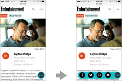
Sharing is one of those functions that almost always serves both reader and publisher. Everyone wins there, and we felt okay about making share functions so omnipresent. Alas, readers typically don’t feel the same way about advertising.
Respectful advertising
Handling ads is always one of the toughest elements of a design project like this one. Ads make the whole enterprise possible, but readers often perceive them as getting in the way of the action. Our responsibility as designers is to give advertisers a good position without trampling the reading experience for users.
When I led the design of People magazine’s mobile website last year, I invented a new ad format called the snap banner. It was a so-called adhesion banner that stuck to the bottom of the page but then snapped into place on the page and scrolled away. The result was an ad that stuck around long enough to make itself known, but which knew enough to leave when it wasn’t wanted.
Since that site launched, Time Inc (parent company of both People and Entertainment Weekly) has adopted the snap banner as a standard format. They changed it up a bit, though, moving the ad to the top of the screen, where it disappears after a certain amount of scroll. We used that format on the homepage for small screens, but combined its interaction with a second ad on the page. When that second ad scrolls into view we disappear the top-of-screen snap banner, so that only a single ad is ever onscreen at any one time.
On larger screens, we show a different ad format entirely, and these scroll normally with the page. With a bigger screen, the ads linger longer, and there’s no need to stick them to the screen for attention. The ad bumps around to different positions on the page according to available width.
Cross-platform branding
From a branding perspective, one of the most important “ads” on the page is the “Subscribe to Entertainment Weekly” section at the bottom of every single page of the site leading into the page footer. This section details the premium content available in this week’s paid edition of Entertainment Weekly, which you can get in both print and app versions.
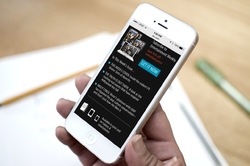
This is the bit of business where we explicitly detail where else you can find Entertainment Weekly content and how it morphs across platforms. From there, the page links to all the company’s accounts on social media. The intended message: Entertainment Weekly is not a magazine, it’s not a website, it’s not an app, and it’s not a Facebook account. It’s all of them at once, an editorial platform that pours content into many different containers.
“We can’t really consider ourselves a magazine company anymore,” incoming Time Inc CEO Joe Ripp recently said. “We’re a media company.” It’s true for everyone now. As platforms proliferate, you have to meet your customers on whatever device or medium they choose. This footer business we cooked into every page of the site is intended to reinforce that message.
A responsive process
That’s also the core principle that animates responsive design: there is no one “true” presentation for your content, no single container. Like many, we’ve seen our design process transform to meet that reality. The process continues to evolve, but we had some great learnings here.
Avoid formal wireframes
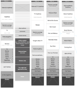
We stayed sketchy and informal for as long as possible, emphasizing coarse blocks of content at very high levels of abstraction. This let us move quickly as we planned the broad strokes of the site. Sketches also keep conversation high level, avoiding the all-too-common headaches that emerge when you get into the weeds too early with fine details. Robert did a lot of these big-picture sketches and then gradually gave fine definition the repeating patterns that we found across pages. As soon as we had the system worked out, we moved right into HTML, skipping the formal wireframe altogether.
Work with the patterns, not the pages
Responsive design is about creating systems of content rather than a rigid page design. This system is built of modules that shift and reorder according to what the device can display. Rather than designing in one page, it’s helpful to drive the main design effort down to its component parts. Brad and others have lately been calling this atomic design, where you design from the building blocks and gradually up to the entire page, rather than the reverse. It’s very powerful.
Brad’s [pattern lab][patternlab] tool proved to be the ideal way to collect and define these atomic components. Once marked up, the components could be assembled inside pattern lab into templates and, with actual content, final pages. The approach encouraged code reuse, which was not only efficient but promoted uber-consistent UX across the site. And because we anticipated this approach, Brad was able to get started on initial markup well before the IA and visual design was complete. Brad detailed his process for the site here.
Element collages rhyme with these patterns
Even while Robert was working on the early sketches for the site’s architecture, Dan and Scott were already at work on the visual design. They did this with element collages, a kind of style tile on steroids. Element collages are collections of lots of branded design elements that give a sense not only of color and type, but of a variety of constructed UI widgets.
What this meant was that IA sketches and visual design happened in parallel and eventually merged. Dan and Scott started with impressionistic notions to establish visual direction. As Robert’s sketches simultaneously evolved, the element collages adopted their information and became examples of the finished patterns. Again, these were like exploded web pages, emphasizing page components more than complete design. Just to be sure that they hung together as a page, we assembled a couple of full-page comps, but we didn’t do this for every page. Full-page Photoshop comps still have a useful role, in other words, but not anything close to the key deliverable they once were.
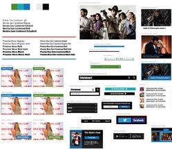
We didn’t create visual comps of every single element, either. Once we had enough designed elements in hand, we could make good guesses in the HTML itself, where we were able to see how things actually played out at different widths. Dan detailed the visual design process for the site here.
We’re getting there
Responsive design is a squishy process. When IA, design, and markup happen in overlapping stages, there are fewer crisp milestones and deliverables. One stage melts into the next, and it takes more discipline than it has in the past to keep the train moving forward. Transitions to new methods and techniques are always a bit bumpy, but the good news is that we’re definitely getting there. Things are settling.
A proliferation of platforms and gadgets has reminded us that the packaging of digital content is naturally ambiguous. Responsive design tries to capture that truth and turn it into an advantage. Slowly but surely, our collective design process is evolving to do the same.
More from the team
The rest of the design crew have also shared their perspectives on the Entertainment Weekly project and its process. Check em out:
- The Responsive Mobile Entertainment Weekly Site by Dan Mall
- Entertainment Weekly by Brad Frost
- Entertainment Weekly by Jonathan Stark
-
Ed note: We did this project back when Big Medium was called Global Moxie.
Global MoxieBig Medium a design agency of one—your humble host, Josh Clark. I take on a handful of design projects every year and, for each one, I assemble bespoke teams purpose-built for each project. Afterward, we disperse into the night until we gather again for new projects. ↩ - For technical and business reasons, Entertainment Weekly maintains a separate site for desktop and other larger screens. In an ideal world, this wouldn’t be necessary, and Entertainment Weekly would serve all devices the same markup. Indeed, this process began with the assumption that a single responsive design would be best. As all projects should, we began with the question, “Can we do this with a single website?” For a variety of reasons that I won’t elaborate here, the answer was no. As always, it depends. ↩
-
People rarely swipe beyond the first couple of slides so the effect is that you wind up hiding the very items you mean to feature. The data shows dramatically lower clicks for the “slides” that follow the lead image. Here’s some sample research to back that up:
- WeedyGarden: Carousel Interaction Stats
- University of York: Are Homepage Carousels Effective?
- Do Frontpage Slideshows Increase Conversion Rate?. This one's in Swedish; try Google Translate's attempt at English
The gist of this research is that carousels definitely do help you have a strong visual impact (big image!), but this helps only the first article. This has the unfortunate effect of making the follow-on articles go unexplored. ↩
- Luke Wroblewski offers a useful pattern to combat the long scroll: off-canvas multi-device layouts, which slides columns, navigation, or other content elements on and off the page on demand. The More pattern is a close cousin of off-canvas layouts, but simplifies it with this simple toggle approach. ↩
