Everything old is new these days. A constant parade of new input methods (touch, speech, gesture, facial recognition) demand that designers revisit “settled” ways to build interfaces. New interaction patterns sometimes evolve (yay!), but more frequently it’s a chance to dredge up older methods that never got their fair shake. Exhibit number one:
The radial menu is seeing a renaissance in touch interfaces, and that’s a good thing.
Microsoft yesterday previewed the Office 15 productivity suite [video], including OneNote, its first Metro-style app for Office. (Metro is the touch-based design language introduced in Windows Phone and now set to storm Windows 8 this fall.) OneNote features a radial menu as a kind of right-click contextual menu. Tap the ever-present menu circle, and out pops a wheel of icons to work on your current selection. Here’s a clip from yesterday’s demo that illustrates the action.
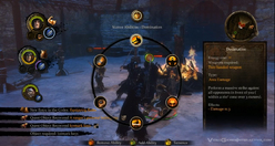
Radial menus (sometimes called pie menus or marking menus) have been around since the late 1960s but never really got much traction in traditional mainstream interfaces, with one exception: games. Combat-based RPG games have a particular fondness for radial menus and often use them for quick access to inventory or combat options.
It makes good sense that itchy-trigger-finger games have adopted the radial menu over more typical list-based menus. In games, limiting interruptions is essential to the experience, and radial menus are more efficient than other selection tools. More interfaces should follow the gamers’ example here.
Radial Menus Are Fast
Radial menus are faster to access than list-based menus in every kind of pointer-based UI, including cursor, stylus, and touch. One big part of that is because every option is spaced at the same distance from the pointer. That’s classic Fitts’ Law: the closer the target and the bigger it is, the easier and faster it is to hit. (So you know: Fitts’ Law also explains why golf is such a miserable sport.)
Even better: you get faster with radial menus over time, because they take advantage of muscle memory in a way that list-based menus cannot. Radial menus are essentially gesture-based: touch-swipe-release. That’s why some call radial menus “marker menus”: it’s like making a mark on the screen. Swiping to 2 o’clock has one meaning, and swiping to 6 o’clock another. Like all physical actions—playing an instrument, typing a keyboard, serving a tennis ball—gestures get embedded in muscle memory, which is faster to access than visual memory. Tap-swipe is faster than scanning for an item in a linear list, just like touch-typing is faster than hunt-and-peck.
The research on this has been in the can for nearly 25 years. A 1988 study did the comparison and found that for a specific test of eight-item lists, users were faster with radial menus than linear ones. And it turns out that speed only improves.
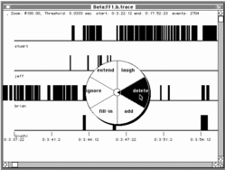
The more you use radial menus, the faster you become. That was borne out in a 1994 study by Bill Buxton and Gordon Kurtenbach, who tested radial-menu speed with a stylus. Over time, they found that expert users stopped looking at the menu at all. They no longer needed the visual cues and went entirely “blind,” marking the screen with gestures, or “marks,” instead of pecking at buttons:
Using a mark on average was 3.5 times faster than selection using the menu. … A user begins by using the menu, but, with practice, graduates to making marks. Users reported that marking was relatively error free and empirical data showed marking was substantially faster than using the menu. … Marking menus, however, are not appropiate when the list of items changes dynamically. In this situation, users can still use the menus but will never graduate to using marks since menu item locations change.
Wow, great, right? All of which begs the question…
Why Doesn’t Everyone Use These Things?
Like any technique, radial menus have their drawbacks, too.
They don’t scale. You can only cram so many items around a circle. Eight seems to be the reasonable maximum for radial menus.
They’re big. Radial menus swing a big stick and take up a wide swath of real estate. On phones, a radial menu gobbles up a big share of pixels.
First use might be awkward. Despite the evident speed boost that comes with experience, we’re more at ease scanning linearly than around a circle. That’s especially true for content that is naturally ordered in a list. But that comfort level may not be so important when you look at actual use. Back in 1994, Bill Buxton wrote:
When a user is familiar with the layout of a menu, selection from a radial menu will be faster than selection from a linear menu. Callahan et al provide empirical evidence of this for eight-item menus. It is possible that a linear menu may be more suitable when there is a natural linear ordering to the menu items and a user must search the menu for an item before making a selection. Alternatively, a radial menu may be more suitable when there is a natural radial ordering of menu items. However,…the effects of organization disappear with practice. Callahan et al provide evidence that, for eight-item menus, even when menu items have a natural linear ordering, selection using a radial menu is still faster and less error-prone than selection using a linear menu.
Why the Renaissance Now?
Radial menus are starting to trend. Tap Path’s splashy menu button to spray out posting options in a 90 degree radius—a one-quarter radial menu. There’s even some experimentation on the web, where you can find the occasional jquery plugin for radial menus or a CSS3 clone of the Path radial menu.
But the expansive screens of tablets seem to be where radial menus have the most opportunity. Microsoft explored the radial menu’s potential in its never-released Courier tablet. Check out the proposed use of nested radial menus in the first part of this concept video for Courier.
Radial menus are great for touch. Part of this is simply experiential. There’s a subtle sense of magic to touching an object on the screen and seeing options sprout from your fingertip.
But it also works neatly with the touch-driven trend of pulling back on controls, buttons, switches, and menus. In the best touch interfaces, the content itself is the control. The information is the interface. Touch the data itself to manipulate it.
That’s why, while bold and useful, the radial menus in OneNote and Path don’t show off the best face of radial menus.
Liberate Radial Menus from the Button
Why do we have to tap a tiny patch of the screen in order to trigger the Path navigation or the OneNote contextual menu? This feels like a vestige of desktop conventions. Especially for large screens, seeking out and pecking at a small button takes effort and concentration. Big screens demand more finger freedom; big screens demand big gestures.
Just as important, the action of tapping a button is removed from the item we want to work on. In almost every case: We don’t want to act on the button. We want to act on the content.
Contextual menus—which is where radial menus are at their best—should be triggered by touching the object you want to affect, or in some cases by touching an empty part of the canvas, probably with a long press. Many apps trigger contextual menus in this way, but it’s typically via linear lists, like popovers on the iPad. Radial menus may work better for you than popovers.

Don’t get me wrong; buttons aren’t evil. They are clear, visual calls to action. Every gesture requires an invitation, and buttons are an efficient way to draw people in, to invite them to touch. But so is the content itself. As we begin to create new conventions for touch interfaces, I suggest the trigger for contextual menus should be the object you want to work on, not a free-floating button.
That gives you the sense of direct interaction with the content. Even better, when you introduce broad canvas-wide gestures, that kind of interaction even allows eyes-free interaction. That gets back to the gesture-based nature of radial menus. As Bill Buxton observed nearly 20 years ago:
Unlike linear menus, marking menus can be operated “eyes free” because selection is based on direction of movement, not position. Hence, they are especially suited to tasks that require attention on other matters (e.g., transport control while watching video).
Radial menus may seem novel, but they aren’t new. It’s just that their time has come. This is more than fashion. This is good interaction design with a wealth of research behind it.
