I recently had the pleasure of doing a Q&A session with Molly Helmuth’s Design System Bootcamp cohort. The questions were great and varied, so I asked Molly if she’d be alright if I shared my answers with you all. Thankfully, Molly is awesome and agreed to let me share here. Be sure to check out Molly’s UI Prep, which offers all Figma training and great resources for the community. Thanks Molly!
There’s a bunch of great questions about design systems, workflow, atomic design, the future of design systems, buy-in, designer-developer collaboration, personal development, and global design system stuff. Let’s dig in!
Was there an aha moment when you realized you had something cool on your hands and you knew you wanted to write the book?
Atomic design was born in 2013 through our client work. I had come into the world of self employment after leaving R/GA and started working with my partner, Josh Clark, on a redesign of techcrunch.com and Entertainment Weekly. Those projects were the first to put atomic design’s ideas to work and was the genesis of the tool that became Pattern Lab. The book followed suit in 2015, which felt good as we had validated a lot of the mental modal and workflow by then.
Is there anything you strongly believed about design systems or the concept of atomic design that you now think is false or no longer makes sense?
I’ve been giving a conference talk with a clickbait-y title called “Is Atomic Design Dead?”
In the talk, I suggest that atomic design is more relevant now than when I first created it. Over the last number of years we’ve seen design systems become A Real Thing with dedicated people, money, resources allocated to them. In many respects, this is a great thing! It underscores the importance of this critical front-end infrastructure. But this success is also a double-edged sword.
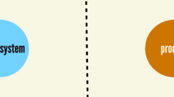
This evolution has created distance between the system — and it’s stalwart makers — from the people and products they serve. This distance has many design system teams asking “how do we get better adoption of our design system?”
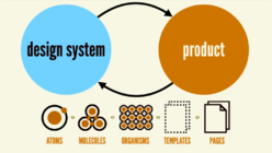
Atomic design continues to serve as a helpful model that connects design systems to the products they serve. In my book, I quote Frank Chimero’s excellent book The Shape of Design:
The painter, when at a distance from the easel, can assess and analyze the whole of the work from this vantage. He scrutinizes and listens, chooses the next stroke to make, then approaches the canvas to do it. Then, he steps back again to see what he’s done in relation to the whole. It is a dance of switching contexts, a pitter-patter pacing across the studio floor that produces a tight feedback loop between mark-making and mark-assessing.Frank Chimero
Which I follow up with:
Atomic design lets us dance between contexts like the painter Frank so eloquently describes. The atoms, molecules, and organisms that comprise our interfaces do not live in a vacuum. And our interfaces’ templates and pages are indeed composed of smaller parts. The parts of our designs influence the whole, and the whole influences the parts. The two are intertwined, and atomic design embraces this fact.
Do you think the term design system is being misused? And should we consider adopting a different name in the future?
Buzzwords are weird. “Design systems” is the thing that stuck, even if it truly is an unfortunate name. The name implies this is the world and responsibility of designers. In reality, design systems are incredibly important and valuable for everyone responsible for making digital products, right?
If we had a time machine, we’d go back and call them “User Interface Systems”
If we had a time machine, we’d go back and probably call them something like “User Interface Systems,” which is more accurate, inclusive, and doesn’t confuse people and organizations as much. But as someone who’s had a hand in creating a buzzword, these words really do have a staying power that are hard to change once they’re established.
Is it ever too soon to start creating a design system?
Here’s the context:
We’re a startup that’s pre-Product Market Fit and are looking to raise seed soon. We expect to grow the team over the next year. I’d like to have some semblance of reusable components (mapped 1-to–1 in design and code) by the time the next designers start, but I also know things are going to be very fluid over the next few months as we converge on our feature-sets and overall look-and-feel. I want to stay nimble and lean, but I also don’t want to accumulate too much design debt and then have a giant task of creating a Design System late in the game. In your experience, when is typically a good time to start investing in a Design System and how do they evolve over time?
It’s a great question that really gets to the heart of “what exactly is a design system?”
So many public-facing design systems are mature, comprehensive, well-documented, and serve giant organizations. But here’s the thing: not every system needs enterprise-grade polish or comprehension. At the end of the day it really boils down to designing and building things in a component-driven manner. That best practice holds true irrespective of the context.
Not every design system needs enterprise-grade polish and comprehension.
A component-driven approach pays dividends even for startup MVPs and simple sites. It doesn’t really incur extra production work; it’s really about thinking thoughtfully about reuse from the start. Your users get a consistent, cohesive experience, and your future self (and team) will thank you as you scale down the road.
When I built my wife’s jewelry studio website, the first page required creating everything from scratch – header, footer, and everything in between. But by the second template, those core elements were ready to reuse. Each subsequent page became faster to build because I was assembling existing pieces rather than starting fresh. My design system wasn’t
As the only designer on the team, how can I ensure my design system work is not halting or slowing down development to avoid crap being added to the design system?
The creation of crap — shortcuts, hacks, experiments, rushed work — is inevitable in product design and development. But this mantra is really important: Don’t put crap in the design system.
While crap is an unavoidable part of product design and development, it has no place in a design system. A design system is critical frontend infrastructure, therefore it needs to be sturdy, reliable, and dependable.
Through our work, we’ve helped many organizations navigate this conundrum. Product teams want the design system to hurry up! Design system teams want product to slow down! My partner Josh Clark wrote about acknowledging these different pace layers and allowing each layer to move at their respective pace:
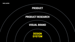
I’d recommend giving Josh’s whole article a read; there’s so much gold in there.
In your experience, is it better for design teams to get a head start before development begins?
Hell no! My soapbox has long been that designers and developers need to work much closer to one another. This is especially in the context of a design system.
Design system success requires close collaboration between designers and developers.
A design system provides a library of user interface components in both design and code. These assets need to be synchronized and carefully orchestrated. Other teams depend on the design system’s assets and need to be able to trust they embody design and development best practices.
I regularly have conversations — including one this week — with people struggling with distance between design and development. Designers and developers are part of different groups and designers are working months ahead than developers.
This, my friends, is where the messes get made and where the agony begins. This is where piles of money get lit on fire and where people have a miserable, frustrating time.
It’s so critical to get designers and developers closer together, getting them synchronized, getting them truly communicating and collaborating with one another. A lot of our work at Big Medium entails helping teams build — and sometimes repair — those relationships.
Is there such a thing as over designing a design system? If so, how can I avoid this?
We see people over-designing design systems all the time. Anytime you catch yourself deliberating over hypothetical situations like:
“Oh, we might need a tertiary button style, so let’s go ahead and build it.”
or
“We might need this extra token in case people need it.”
That’s a sign you’re over-designing the system. What to do instead? Catch yourself and dial things back to what reality necessitates. This underscores the importance of atomic design and the importance of connecting the design system to the products that it serves. Building design systems through the lens of a creating real products grounds your system in reality and keeps those hypotheticals at bay.
Endless deliberation over hypothetical situations slows teams down and can result in over-designed systems
We see a lot of teams get paralyzed by all of these hypothetical what ifs, or we’re trying to craft the perfect components that anticipate every future use case. Perfect is the enemy of good and done. All of that stuff. You gotta get things out the door. But at the same time, there is an art to being thinking about how this stuff might be reused down the road. But let’s not dwell on it or over dial on potential futures. So there’s an art to it. So you do.
Is there one thing you’ve noticed that successful design system teams have in common? And is there one thing you’ve noticed that unsuccessful design system teams have in common?
Yeah. It really has everything to do with the service model around the design system.
What makes or breaks a design system is the service model around it. Design system teams must establish close, healthy relationships with consumers.
How well the design system team plugged into the rest of the product organization? How are they doing at reaching out, being proactive, offering good sort of support and customer service? That’s everything.
We observe many design system teams focus inwards, wanting to block everything out in order to sweat the details of these design tokens and components. Don’t get my wrong, that work is important! But that’s not the gig.
It can be a cold shower to remind design system teams that their jobs are to make other designers’ and developers’ lives easier, which requires to get close with those people. Design system teams build things for others to use, and the most successful teams are well aware of that and are really well connected with the people that they’re serving. It’s good customer support and good user-centered design.
What’s the biggest mistake you see teams, make when tokenizing the system?
Back to over-designing the system, I’d say it’s dwelling in the land of hypotheticals and “what if”s. Naming is hard, but we see teams getting trapped or trying to get too clever with naming and taxonomy. It’s freaking hard work though!
We also see teams create far too many component-specific tokens. We worked with a client that had over 5,000 tokens, comprehensively covering every component and variant: alert error background, alert warning background, alert success background, badge error background, badge warning background…
Component-specific design tokens should be used sparingly; rely as much as possible on semantic tokens.
This is a recipe for disaster. As you add components, as you add variants, you need to add yet more design tokens to manage. It becomes unwieldy really, really quickly. We recommend a three-tiered token system for creating themeable design systems, but we recommend reserving component-specific tokens for very specific use cases like heavily-branded buttons that can vary wildly between themes.
I’ve heard some design teams only adding components to their Figma design system once they’re in code. What do you think about this workflow?
Code really is the the source of truth in a design system, so the Figma library is really a contract or a promise of what’s available in code.
Code is the source of truth for a design system.
This can be jarring to designers who are used to a very different process! Designers are used to first painting a picture of what we want a product to be. And then eventually that picture gets built out in code.
Design systems are different because they are libraries that exist in both design and code. So the Figma library needs to reflect the reality of what product teams — which include both designers and developers — can use from the library.
A design system is a product that provides several assets, and those assets need to be in sync with one another. Bad things happen when there’s drift between those assets and the people who create them.
Should a snowflake component live in the design system if it’s used only once?
Nope! A design system is a collection of solved problems — the boring stuff. Snowflakes by their very nature are not boring; they’re unique!
In a design system ecosystem, product teams are welcome and encouraged to create their own snowflakes in order to solve their problems. Coming back to the idea of pace layers:
The job of the design system team is not to innovate, but to curate. The system should provide answers only for settled solutions: the components and patterns that don’t require innovation because they’ve been solved and now standardized. Answers go into the design system when the questions are no longer interesting—proven out in product. The most exciting design systems are boring.
A design system team’s job is to keep the finger on the pulse of what’s happening at the product level. If 5 teams are all creating snowflakes that are all doing similar things, that’s a super strong signal that there’s an opportunity for the design system to address a common need.
At what point does it make sense to build two separate design systems instead of one that can support two very different themes?
If you’re talking about aesthetic differences, it doesn’t usually make sense to build and maintain two separate design systems. You can accomplish wildly different look and feels with design tokens to support many different brands, subbrands, modes, product families, rebrands, and so on.
A door on sale at a hardware store is going to open and close. That functionality will hold true irrespective of whether the door is pink or red or blue, or if the hardware is brushed nickel or brass, or matte balck. Here’s this vanilla door that works, and you can paint it whatever color you want.
There are plenty of good reasons to maintain separate design systems though. We work with a lot of organizations that have already existing multiple systems in place and serve a multitude of tech stacks. It becomes an “if it ain’t broke, don’t fix it” situation. It truly depends on the context and situation. Sometimes it makes sense to merge systems. Sometimes it makes sense to split them apart. Sometimes it makes sense to share tokens while keeping separate component implementations in place. Sometimes it makes sense to adopt Web Components. It depends!
I have three designers on my team. How might we use branching for submitting new items to our design system in Figma? What happens if one item takes a really long time to develop, and a bunch of other changes get submitted in the meantime?
The world of branching, semantic versioning, variables, and variants are relatively new to designers, but are well-established conventions in the world of development. All the more reason to have designers and developers closer together; developers can help guide designers around these concepts.
You can create branches from the main library to do new feature work. You do your feature work and when that work is ready to be reviewed, you go in and you do a review. In code, a developer will issue a pull request, other people will review it, vet it, and ultimately validate it. It gets merged and released in the next version of the library.
The same process can and should happen in the world of design, but Figma’s branching in is not as sophisticated as Git for code.
What we do is orchestrate the release of libraries so that version numbers are synchronized in code, design, and documentation. Check out Nathan Curtis’s excellent series on releasing design systems.
In development we have feature branches that hang out for weeks or months and sometimes even years. The work takes as long as it needs to do and they might miss a release and that’s okay. It’ll get there when it gets there. That’s the kind of nice thing about branching.
What’s the best way to kick off building your new design system?
It’s critical for a design system accelerate and advance critical business initiatives. Connecting the system’s success to product success is the path to…success.
What you don’t want to do is kick off a design system by going into a vacuum and starting to noodle on some buttons. What business critical product work needs to happen at the organization? That’s the lens to look at the design system. How can you create a design system that helps accelerate and advance those critical product initiatives?
It’s also critical to get at the good, bad, and ugly of making products at the organization. We hold many discussions and interviews with a cross section of stakeholders to get a sense of the challenges the design system needs to help address.
What do you believe is the most significant trend shaping the future of design systems? In what ways do you predict AI improving design systems for designers and developers?
Our team has been doing a lot of work around the intersection between AI and design systems.
We’re finding that this new crop of AI tools can help supercharge many aspects of design system production, help products adopt the design system, and create entirely new design-system powered experiences.
We’re helping organizations adopt AI tools into their design system workflows, speeding up the creation of designs in Figma, the translation of designs to code, and the adoption of design systems in existing products. The power and potential are obvious, and it’s been a lot of fun to help our client teams navigate this new terrain.
While the efficiency angle to AI is apparent, the potential for an entirely new generation of user experience is truly exciting. Josh Clark and Veronica Kindred are writing a book called Sentient Design that covers how AI can create radically-adaptive user experiences.
This new generation of radically-adaptive user experiences depends on the sturdy foundations of a design system. We all know AI tools can hallucinate and introduce unpredictability. A design system provides welcome constraints and predictability
What are some ways I can convince stakeholders, what a design system is? What are some ways I can convince stakeholders a design system is or would be valuable?
Saying “Hey boss, I need four months to go off on my lonesome and create this component library” is not a winning strategy. Extolling the very real benefits of design systems often doesn’t do the trick, either.
Design systems cannot be a side project; they need to become critical front-end infrastructure that real products rely on.
As we’ve already discussed, it’s really important to attach the design system’s success to mission-critical product success. Design systems cannot be a side project; they need to become critical front-end infrastructure that products rely on.
There’s really no success like success. It’s so important to find a way — even if it’s on the sly — to create a design system that’s powering real product work. With a quick win under your belt, you’ve already demonstrated value! The conversation then becomes how much more valuable the system would be with more time and resources allocated to it.
That’s why it’s so important to focus on real product work. it cannot just kind of be like this side project. That eventually you will plug in.
What’s your hot take on dev mode? Is it helpful for developers yet? and as a designer, is there anything I could do to improve what my developers see in dev mode?
I worry that Dev Mode relegates designer/developer collaboration to a toggle switch, which is a shame.
Don’t get me wrong; it’s nice to not have to fumble around design files as much. But what we witness across many teams is that the tools have gotten to a “good enough” state that allows disciplines to stay in their respective bubbles, which ultimately yields subpar products and lukewarm relationships. I have a lot more to say about all of this, but that’s a post for another day.
So the latter part of the question as a designer, is there anything I can do to improve what my developers see in dev mode? I’d reframe it: “As a designer, what could I do to improve my relationship with my developers?” And the short answer is: talk to them. Pull them closer, bring them into your world, express your curiosity to be pulled in closer to their world.
Rather than fixating on tools and documentation, designers should ask “how can improve my relationship with my developers?”
We often look for tools to “solve” human communication & collaboration issues. No doubt tools can help, but they themselves cannot solve these issues. My strong advice is to focus on building and maintaining relationships with your collaborators.
What is something designers would be surprised to learn works differently in code than in a design tool like Figma?
Lots! Animation, interactivity, responsive behavior, source order, box model, performance, user preferences, true text rendering, true type rendering, browser/device quirks, ergonomics, and much more.
All of these things are important aspects of a user experience that cannot be articulated in Figma. These things are very much the realm of design, and need to be carefully considered.
I likely sound like a broken record by now, but this is why it’s so important for developers to be considered to be part of the design process, and designers to be considered part of the development process. Getting those worlds closer together simply yields better products.
What tools outside of Figma are helpful for designers to use in order to better communicate with the dev team?
Your mouth. Your fingers. Real communication, real talking, real collaboration. I’m not talking status meetings and antagonistic review meetings; I’m talking real-time working sessions where you can jam on things and solve problems together. It really is that simple. You just need to spend time with one another and foster a relationship with one another. Tools can help, but often they get in the way of that human work.
What’s your ideal documentation from the design team look like?
Again, this feels loaded with “what do I need to produce in order for you to have what you need without me having to talk to you?” Don’t get me wrong, sometimes documentation is necessary and genuinely helpful. But often, teams get trapped in a ghoulish routine of artifact generation simply for the sake of running through the motions.
Ask developers what they’d welcome in terms of documentation. There’s a fair-to-good chance they don’t need comprehensive documentation; they may just need a quick conversation to be pointed in the right direction. Communication collaboration.
As a designer, what specific development concepts or skills should I learn?
Should designers code? has always been a fun question.

It’s always a good idea to have a solid understanding of the nature of the medium for which you’re designing. When it comes to HTML CSS and JavaScript, it’s helpful to know the basics even if you don’t know how to implement it with your own two hands. Certain concepts are helpful to know:
- The box model.
- Source order is really important since it works differently than dragging elements around a blank canvas.
- CSS Layout, especially Flexbox and Grid are really important. Positioning is helpful.
- Performance basics, like being mindful of the number/size of images, fonts, etc.
Grid’s a great example of a sophisticated technology that isn’t really present in design tools. CSS Grid is extraordinarily powerful, and you’re not going to find that level of sophistication in a tool like Figma.
It’s helpful to learn those concepts, but coming back to what’s become a theme in this little session here: You don’t necessarily need to know how to do this stuff first hand. What you do need to know is how to talk to and collaborate with the people who really know these things so you can do great work togehter.
Is it important for designers to know how to use Storybook?
Storybook is a great tool for review, testing, comparison, and documentation. Do designers need to know how to fire up storybook locally and work there? Maybe, but it’s not necessary. That said, we’ve worked with designers who watched us prototyping in Storybook and learned how to do it themselves! Like we’ve been discussing though, it’s less about knowing how to do things yourself and more to do with creating great relationships with other disciplines.
The idea of a global design system is very interesting. How exactly would this work?
As we’ve been discussing, a design system captures common UI components in order to power an organization’s products.

When you look across the design system landscape, an ironic pattern emerges: every organization ends up building solutions that overlap substantially with what every other organization is building. Our efforts to reduce duplicative work at the individual level are resulting in duplicative work at the inter-organization level.

Here’s the idea behind a global design system:
A Global Design System would centralize common UI components, reduce so much of this unnecessary duplication, integrate with any web-based tech stack, and create a connected vehicle for delivering front-end best practices to the world’s web experiences.

It would fill a gap in between HTML and organization-specific design systems:
How would the global design system be different than using a framework like Tailwind?
I discuss the shortcomings of existing solutions in my post and follow-up post:
- These solutions were (understandably!) created with a specific organization’s specific goals & considerations in mind. The architecture, conventions, and priorities of these libraries are tuned to the organization it serves; they don’t take into account the sheer breadth of the world’s UI use cases.
- They nearly always come with a specific default aesthetic. If you adopt Material Design, for example, your products will look like Google’s products. These libraries can be configurable, which is great, but themeabilitiy has limits and often results in many teams fighting the default look-and-feel to achieve custom results. In our experience, this is where folks end up creating a big mess.
A global design system would be entirely theme-less so people can bring whatever design language to the party. The global design system is like the vanilla door that opens and closes irrespective of what color its painted.
What design systems do you look for, look to for inspiration?
I really liked the Nord health design system, especially their support page. it does a great job at communicating the design system service model. Here’s some frequently asked questions, here’s our office hours, here’s where to get in touch with us. If you have questions, comments, or concerns, here’s what our processes look like for handling it all. That’s truly the stuff that makes or breaks a design system.
What’s the best name for a design system you’ve come across?
Polaris. We’ve worked with like seven Polaris’s haha.
If you’ve made it this far, WHEW! Thank you! Thanks again Molly for for letting me share my thoughts on all of these questions.
