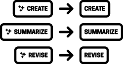
Please put the ✨sparkles✨ away. They’re sprinkled everywhere these days, drizzled on every AI tool, along with a heaping dollop of purple hues and rainbow gradients. It’s magic, it’s special, it’s sparkly.
It’s really not magic, of course—it’s just software. And because so many companies have heedlessly bolted AI features onto existing products, the shipped features are often half-baked, experimental, frequently shoddy. Instead of “magic” or “new,” sparkles are fast becoming the new badge for “beta.” The message sparkles now convey is, “This feature is weird and probably broken—good luck!” It would be more honest to use this emoji instead: 🤪
So what symbol should you use to represent machine-intelligent tools? How about no symbol at all. No need to segregate AI features or advertise their AI-ness as anything special. What matters to the user is what it does, not how it’s implemented.

We give no special billing to spell checkers or spam filters or other algorithmic tools; we just expect them to work. That’s the expectation we should set for all features, whether they’re enabled by machine intelligence or not. Features should just do what it says on the tin, without the sparkle-shaped asterisk. You’re revising text, generating images, assembling insights, making music, recommending content, predicting next steps, etc. These are simply product features—like every other powerful feature your experience offers—so present them that way. No special label required, no jazz hands needed.
Drop the sparkles. No need to segregate AI features or advertise their AI-ness as anything special. What matters to the user is what it does, not how it’s implemented.
One of the essential characteristics of Sentient Design is that it is deferential. It’s a posture that suggests humility. Put the disco ball away. Your goal should be to make machine intelligence a helpful and seamless part of the user experience, not a novelty or an afterthought.
If the feature actually is weird, unreliable, or broken, that’s a bigger problem that sparkles won’t solve. Maybe your feature isn’t ready to ship. Or better, perhaps you need to find a way to make the weirdness an asset instead of a reliability. Now that’s a fun design challenge to solve—and one that engages with the grain of machine intelligence as a design material. Take a measured pragmatic approach to what machine intelligence is good at and what it isn’t—and be equally measured in how you label it. Be cool. Put away the sparkles.
Is your organization trying to understand the role of AI in your mission and practice? We can help! Big Medium does design, development, and product strategy for AI-mediated experiences; we facilitate Sentient Design sprints; we teach AI workshops; and we offer executive briefings. Get in touch to learn more.


