What does a mature, end-to-end design system look like in a big, complex organization? What are all the moving pieces, and how do they hang together in a well-considered architecture? What’s required and what’s optional? Hold onto your butts, because we’re going to go deep on this one.
Let’s start here: a design system’s relationship to digital products can be boiled down like so:
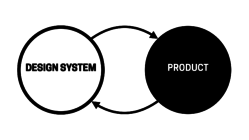
There’s a design system. Products use the design system. The design system informs and influences the products, and in turn the products inform and influence what’s in the design system.
While this depiction is true, it ignores the complexities many organizations wrestle with day in and day out. Over the years, the digital product landscape has become vastly more complex, the responsibilities of design systems have grown substantially, tooling has evolved and matured, and processes & organizational structures for managing digital products have grown up.
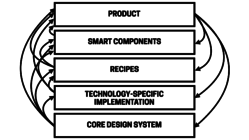
In order to account for this complex reality, it’s important to paint a more nuanced picture of a design system ecosystem that can power an enterprise’s portfolio of digital products. The design system ecosystem of a complex organization takes the form of a delicious-yet-dense layer cake. Call it a devil cake: the devil’s in the details, and the devil can end up looking something more like this:
And to really show it in all of its terrifying detail:
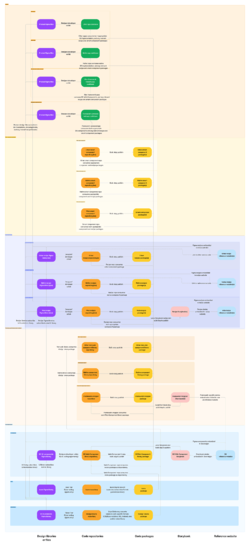
Wow, that looks overwhelming huh!? Before you freak out, it’s important to stress a few things.
First of all, nearly all of these layers are optional and don’t necessarily apply to every organization. Instead, this is a visualization of a complete, mature enterprise design system. It’s informed by our work helping some of the world’s largest companies successfully establish and evolve their design systems. We know companies start seeing value after implementing only a fraction of what’s shown here.
Second, Gall’s Law is extremely relevant here:
A complex system that works is invariably found to have evolved from a simple system that worked. A complex system designed from scratch never works and cannot be patched up to make it work. You have to start over with a working simple system.
All to say, it’s critical for a design system architecture to be only as complex as it needs to be, and add additional layers or complexity only when real needs arise. Growing a design system is a gradual process. (And if it seems overwhelming, well, we’re happy to help. Get in touch to hire us to help plan, build, or evolve your design system.)
In this article we’ll get down to the gory details of what makes up a successful, sophisticated, and mature design system ecosystem. We’ll break down what the capital-E Enterprise folks call the “end-to-end experience” for deploying user interfaces at scale. This is tricky, nuanced work, but that’s the nature of the beast for digital organizations managing several/dozens/hundreds/thousands of products and people.
Alright, let’s dive in!
Anatomy of a design system ecosystem
We’re going to detail this diagram, which describes the various UI assets and the relationships between them. While the diagram looks intimidating, the crux of the ecosystem can be broken down like so:
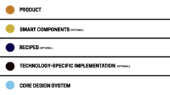
- Core design system layer – which contains the common, organization-wide UI building blocks for both design and development.
- Optional technology-specific layer – which contains framework-specific and native implementations of those common UI components.
- Optional recipe layer – which contains composed UI components to be used consistently across specific contexts (like a product or product family), but aren’t reusable across the entire organization.
- Optional smart components layer – which contains UI components wrapped in logic, functionality, or other smarts to make the integration of common components and services easier for product developers.
- Product layer – the actual websites and apps that we ship to customers (aka the whole reason we’re doing all of this!)
If those are the broad layers of a UI ecosystem, here’s a breakdown of the types of assets that go into those layers:
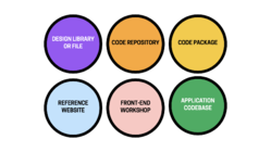
- Design library – Figma team library or similar
- Design file – Figma project file or similar
- Code repository – the source code home – GitHub or similar
- Front-end workshop – a tool like Storybook to build, view, test, review and document coded UI components
- Code package – a code library packaged up and published (on npm or similar) in order to be consumed as a dependency by other applications.
- Reference website – Zeroheight or similar
With all of that table setting out of the way, let’s dig into the anatomy of the core design system!
Core design system
The core design system contains common components, patterns, principles, and conventions that help an organization:
- tell the official story of how it designs and builds user interfaces, and
- provide the building materials to do it.
It’s a library of solved problems, the settled solutions that don’t need re-hashed for the 15th time It’s the boring stuff like form controls, buttons, accordions, and the standard-fare components you see across many popular design systems.
So what ingredients are included in the core design system? The key assets the design system includes are design tokens, icons, UI components, and a reference website.
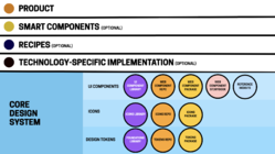
Design tokens layer
Design tokens are low-level design definitions (the sub-atomic particles if you will) — color, typography, border radius, spacing, elevation, and other values — that make up a design language. Design tokens are ultimately applied to UI components in order to achieve a specific look and feel. Think of them as brand variables.
Nearly all of our design-system client work over the last 5 years has included creating/evolving some form of themeable design system. Architecting a thoughtful 3-tier token architecture is the secret sauce for making a design system support multiple brands, white-labeling, different product families, redesigns, dark mode, and more.
We recommend splitting design tokens into their own layer (separate from the UI component layer) to unlock theming, create a separation of concerns between brand language and UI components, and version brand languages independent of UI components.

Foundations design library
Design tokens and associated styles are often referred to as “foundations” in the design discipline. In Figma, these design token foundations are defined as variables for most values, while typography-specific tokens need to be defined as styles (Note: for now! Figma said they’re working on making typography-specific variables available). The foundations should be managed in their own design library that other files and libraries — including the UI component library — can subscribe to. This library can contain the definitions for each supported theme, though organizations supporting dozens or hundreds of themes might want to consider chunking things out into different foundations libraries.
Design tokens repo
In code, the design token source of truth is a repository of JSON files that define all theme values. Tooling (Style Dictionary has become the standard) then converts design token JSON files into the appropriate technology-specific format (CSS custom properties, Sass, iOS, Android, etc), which can then be applied to UI components.
Design tokens package
The technology-specific formatted tokens are packaged up and published on a software registry in order for consuming developers to pull them into web products, native apps, and other environments.
Icons
Icons are a weird one! Like design tokens, they can exist as their own product that gets packaged up and consumed by many different environments. More commonly, we tend to see icons bundled up alongside the design tokens. Teams powering web, native, and other non-web software that need to manage/version icons independently might want to consider splitting icons out as its own independent layer supported by the following assets:

- Icon Figma library
- Icon SVG repository
- Icon package
UI Components
This is the star of the design system show! When people think of a design system, they think of a set of common UI components that can be used and reused in other products. There are a few different assets that constitute a design system’s UI component library, so let’s break it down.

Core UI components Figma library
For designers, a design system’s design library is a dedicated project where designers capture the design specifications for common UI components. Here’s where the design system designers sweat the small stuff (Alert layout! Accordion affordances! Badge variants! Required form field treatment! Etc etc) so other product designers don’t have to. The published design library becomes the thing product designers subscribe to in order to drag-and-drop the system’s components into their product design files.
Web Components library repository
While a Figma library is super helpful for designer efficiency, the true source of truth for a design system is a library of coded components that build real digital products. After all, despite all of this ecosystem mumbo jumbo, the only thing that really matters at the end of the day is the actual user experience human beings interact with. And that reality snags many design system teams; it’s really easy to lose the forest for the trees. Don’t get it twisted: a design system is a means to an end.
We’ve helped organizations build design systems in a multitude of technologies over the years, but as time goes by we now heartily recommend one specific technology to build a core design system for the web: Web Components. Web Components are a standard, part of the web platform itself. That means they’re interoperable with any web framework or technology, they’re lightweight, they’re themeable, and they’re self-contained. Note: It’s totally possible to build the coded design system in a specific technology like React, but just be eyes-wide-open to the fact that the system can’t power products that aren’t compatible with that technology. Everything has pros and cons!
The Web Component repository contains the source code for your design system’s common components. We’ve been using Lit for the last few years with great success (and have used Stencil successfully in the past) to help us author Web Components in a thoughtful, efficient manner.
Web Components Storybook
We use Storybook in order to build, visualize, test, review, and document our coded design system library. Storybook is included in the web component repository as a dev dependency; it’s not a separate repository or anything like that. We publish our Storybook to a URL for testing/review/documentation, and like to use Netlify or similar to publish each work-in-progress branch of the Web Components so that our client teams can test, review, and discuss changes before they get merged into the main library.
Web component library package
A build step converts the web component source code into a dist directory containing the built library of Web Components, which then gets packaged up and published on a software registry. This allows for any web product — a static website, React/Angular/Vue/Etc app, a CMS-powered website, whatever — to pull the web component library into their project and use the design system’s components in their products’ user interfaces.
Reference website
A reference website serves as the storefront that is part marketing website, part documentation, part support channel, and all things design system. The reference website gather all of the assets described above under one roof to help the organization successfully wield the design system to build great interfaces for digital products.
You can build the reference website from scratch, or power it using a third-party tool like Zeroheight. As time goes on, we’ve found great success with Zeroheight as it elegantly pulls design assets from Figma and code assets from Storybook. This maintains Figma and code (visualized through Storybook) as the workshops for design and dev respectively, but brings them together in a single location to provide cross-disciplinary guidance for teams using the system.
Technology-specific implementation (optional)
This optional layer translates the core design system into specific technical implementations. This can help application developers working in specific tech stacks easily wield the design system’s ingredients.
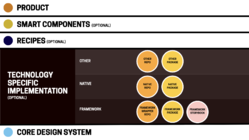
Framework wrapper layer
As we’ve discussed, Web Components are a fantastic choice for front-of-the-front-end code that serves as the backbone of a design system. But! It can be helpful or necessary to maintain a framework-specific flavor of the design system. This entails wrapping the design system’s Web Components in framework-specific syntax (for example, the button Web Component <ds-button variant="primary"> could be wrapped in React and exposed to developers as <DsButton variant="primary">).
Our team thinks framework-specific implementations will diminish over time; most frameworks can consume Web Components as is. But in our experience, we’ve encountered a few good reasons to create and maintain these framework-wrapped versions:
- Some frameworks — especially earlier versions of React — need some massaging to get Web Components to work properly. Lit’s React wrapper is an example of a bit of glue code that’s necessary to get Web Components to work smoothly with the way React handles events.
- Teams with existing React/Angular/Vue/etc libraries that power real products should preserve all that hard-earned adoption! Those-framework-specific libraries can continue to exist, but we often help teams replace the component guts with new web component-powered internals instead.
- Maintaining existing framework-specific libraries can be a good way of incrementally adopting a sturdier API naming standard while still supporting legacy API language.
- Teams used to wielding framework-shaped components (e.g.
<DsButton text="Click me">) don’t have to adopt an unfamiliar web component convention (<ds-button text="Click me">). This layer can also serve as a safeguard in case teams want to swap out different technologies under the hood over time.
Framework code repo
Where does the framework-wrapper repository live? We’ve seen it live under the formal design system umbrella (often as a sibling of the web component package in a monorepo), but we’ve also seen framework-wrapper layers live outside of the formal system maintained by downstream teams working in a specific technology.
Regardless of where the framework layer lives, it’s crucial for the core and framework-specific layers to stay in sync with one another. This can be helped along by the technical architecture of the system, but it ultimately requires coordination between the humans managing the different layers.
Framework Storybook
If a React flavor of the design system exists, spinning up a React-specific Storybook is necessary to provide React developers the appropriate code syntax to reference and copy-and-paste.
Framework code package
Each framework-specific flavor of the design system library gets built and published on a software registry, which allows product teams working in a specific framework to pull in the appropriate flavor of the design system as a dependency.
Native layer
Native apps are often an important part of an organizations’ digital landscape. They’re challenging from a design system perspective for a number of reasons:
- Native app UIs can be coded in an array of technologies. Some use (often heavily-modified) web tech like React Native or Ionic. There’s Jetpack Compose, Flutter, Swift UI, UIKit, and others for bespoke native application development. At the end of the day, there’s not exactly a standard for developing UI components for native platforms, so implementation can be uneven.
- iOS and Android bring OS-level UI conventions and OS-provided UI components along for the ride, which means an organization’s bespoke UI needs to work with the grain of the operating systems.
- Design system tooling for native codebases are absent or immature (If I had a nickel for every time I’ve been asked “is there a Storybook for iOS and Android?”, I’d have a handful of nickels).
- Native teams tend to be more siloed (or outsourced) compared to their web counterparts.
Whatever the challenges may be, organizations creating native design systems will need the following assets:
iOS and/or Android component library repositories
These repositories contain the source code for a design system’s native app implementations, similar to Material Design’s Android codebase.
iOS and/or Android code packages
The native landscape operates a bit differently than the web landscape, but package managers exist (e.g. Swift Package Manager) to help deploy a native design system’s library to other native application codebases.
Other non-web implementations
iOS and Android mobile apps are certainly some of the more common non-web digital products, but there can be a vast array of other software interfaces floating around an organization. We’ve dealt with airplane seat-back UIs, banking ATM UIs, kiosk UIs, medical equipment UIs, scientific equipment UIs, and more. All of these UIs come to life somehow, and the technologies that power these experiences vary widely (and often frighteningly!). Regardless of the specific tech employed for these experiences, the same guidance applies: create a dedicated repository for common UI-specific code, and deploy that code using some form of software registry.
Recipe layer (optional)
We often encounter design system teams who are frantically trying to keep up with every UI-related product decision happening across their organization. The (often small-and-scrappy) team runs from meeting to meeting, captures other product teams’ UI needs in their already-crowded backlog, and then gets to work implementing those requests. This road leads to bottlenecks and burnout.
There’s a better way. The design system doesn’t have to own, include, or oversee every bit of UI across a company’s product landscape. It just needs to provide a core set of ingredients—and support/encourage teams to build recipes with those ingredients.
When we introduce the concept of a recipe component layer to these frazzled teams, you can almost see the weight lift from their shoulders. The recipe layer serves as an important pressure release valve for the UI ecosystem. With recipes, product designers are able to own their product-specific UI components and work at a relatively fast pace, while design system designers carry on working on the core component ingredients at a slower, more considered pace.
The recipe layer proves to be a really crucial layer in the ecosystem for many teams, and an essential layer for massive organizations managing many business units or sub-brands. This article by Robin Cannon explains why IBM’s Carbon Design System team leaned into this concept of recipes:
Business units needed extra capability to tailor how the design system was going to be consumed in their domain.
This layer provides individual business units, sub-brands, product families, or products with important agency and autonomy over their domain while still adhering to the standards defined by the core design system.
What are recipes, exactly? As the name suggests, recipes combine ingredients to create UI experiences that are complex, delicious, nutritious. The design system’s core components are the ingredients stocked in the pantry. Other product designers then take those ingredients to create product-specific compositions that meet their product needs.
A design system’s core component library might contain a card, button, button group, heading, text passage, badge, and key-value table:

Out of those ingredients, different product teams can create their own compositions to be used consistently across their digital products. The e-commerce team can compose a product card recipe, the marketing team can compose a promo card recipe, and the analytics team can compose a customer data card recipe.
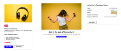
The cool thing is that the design system team can monitor these recipes and decide to “graduate” a recipe component into the core design system if it proves to be super successful. While not every recipe is a core design system candidate, it’s cool that the recipe layer provides a little design system component incubator.
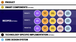
Recipe design libraries
Think of recipe design libraries as cookbooks. They are Figma libraries that contain product- or discipline-specific components and compositions. Recipe libraries subscribe to both the design system foundations and core UI component libraries. Designers working in these libraries create composite components out of core design system components that are meant to be used consistently across their product or product family, but may not be abstract enough or broadly used enough (yet?) to include in the core design system.
Product design teams maintain and publish their own recipe libraries, and downstream product designers subscribe to them in order to use recipe components in individual product files.
Recipe repositories
Recipe code repositories contain the coded corollaries to the recipe Figma libraries. These repositories contain the source code for component compositions meant to be used consistently across a product or product family. A product’s website header is a great example of a recipe: the specific header composition is reusable across one product family, but likely distinct from other headers in other product families:
<site-header></site-header>
Specific card recipes can be created so downstream developers don’t have to assemble raw design system ingredients for every product card instance:
<product-card
    heading="Kids Sloth T-Shirt"
    price="$18"
    imgSrc="path/to/image.jpg"
    imgAlt="Purple t-shirt with smiling sloth illustration graphic"
    href="path/to-product">
</product-card>
Developers can create reusable recipes as Web Components, React/Angular/Vue/etc components, or native components. Because recipes are product-specific, they can be written in whatever language is practical for the team and technical architecture.
Recipe Storybooks
We’ve discussed how important it is for design system teams to be able to view, review, test, and document core UI components, and the same holds true for coded recipe components. Each recipe repository ought to maintain and publish a Storybook for the recipes used in a product or product family. Any recipe Storybook should mirror the corresponding recipe Figma library.
Recipe code packages
In order for recipes to be consumable to downstream products developers, they need to be published on a software registry.
Recipe reference websites
Think of this as a product-specific style guide. If YouTube uses Google’s Material Design System, the YouTube reference site would detail the YouTube-specific components and recipes built on top of Material. It’s important to provide guidelines, rationale, and examples for recipes. How should designers and developers use that product card recipe? What are the configurations? The gotchas?
Smart component layer (optional)
Design system UI components are intentionally dumb. This is by design! In order to be as portable and interoperable as possible, design system components (and many recipes) don’t contain business logic and aren’t wired up to any backend services; they strictly handle a component’s presentation and basic functionality (e.g. an accordion opens and closes on click).
However, these components actually need to work eventually! Enter the smart component layer. If core design system components are strictly front-of-front-end, then smart components introduce the back-of the-front-end. This is is a place where the dumb design system components and recipes get wrapped in logic in order to provide downstream development teams with drop-in, ready-to-use functional components and services.
Some smart component layer use cases include:
- Form submission and validation (e.g. React Hook Form and React Redux Form)
- Payment component for processing credit card payments
- Typeahead querying specific services or databases (e.g. search a company directory or product database and the typeahead dropdown returns the appropriate results)
- Data tables with sorting/filtering/searching logic (e.g AG Grid)
- Product grids with sorting/filtering
- Wiring up analytics to UI components
- CMS-ready components that make design system and recipe components available to CMS editors.
In the same way design systems keep teams from reinventing the wheel, these common smart components and services take care of common business logic and functionality so downstream teams can focus their energy on more worthwhile tasks.
We’ve seen this concept extend beyond smart components and into the realm of full-blown software starter kits. We’ve had a few clients develop their own custom boilerplates akin to Create React App: “here’s a NextJS environment with the design system tokens, components, and other recipes linked as dependencies, all the form fields wired up, and routes ready to go.” Product developer teams can quickly spin up a new project and immediately get to work building their application logic rather than futzing with plumbing and infrastructure. Pretty cool!
This layer is often maintained by the team that also supports the underlying service, using the design system components to deliver ready-to-roll solutions for application teams.
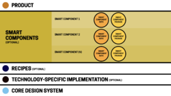
Smart component repositories and packages
The structure and location of smart component repositories and packages can vary wildly since they’re directly adjacent to specific product architecture built using specific technologies. But ultimately, smart components and drop-in services should be managed as discrete products to make usage, versioning, and maintenance as easy as possible.
Product layer
Friends, we have finally arrived! The product layer is where the rubber meets the road. This is where all of this infrastructure comes together to help power real websites and apps used by real human beings.
It’s at this product level where a design system’s success can truly be measured. In order for a design system to be successful, it needs to become the critical front-end infrastructure that powers real digital products. So let’s discuss how all of this design system ecosystem makes its way into real product environments.
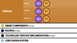
Product design files
Product designers working at this layer would spin up Figma files that subscribe to:
- The design systems Foundations library with the appropriate theme applied
- The design system’s UI component library
- Any relevant recipe library
With all of those tools at their disposal, designers can go about their business designing product-specific screens and flows.
Product codebase powered by
For organizations building React apps, here’s where you’d find apps powered by Next.js/Express/Remix/Gatsby/whatever. It’s at this layer that back-of-the-front-end things like business logic, routing, state management, and cache invalidation come into play.
Product codebases consume as dependencies the appropriate framework flavor of the design system’s component library, any applicable recipe packages, and any smart components. A package.json file could look something like this:
"dependencies": {
  "@your-org/design-system-name": "^0.1.0",
  "@your-org/marketing-site-recipes": "^0.1.0",
  "@your-org/smart-form-components": "^0.1.0"
}
With these packages installed, product engineers can pull in design system components and recipes into their projects like so:
import DsButton from "@your-org/design-system-name/Button";
import SiteHeader from "@your-org/marketing-site-recipes/SiteHeader";
import TextField from "@your-org/smart-form-components/TextField";

<SiteHeader />
<form onSubmit={handleSubmit(onSubmit)}>
  <TextField label="Email" />
  <TextField label="Password" />
  <DsButton variant="primary" text="Sign in" />
</form>
The SiteHeader is provided by the recipe package. The TextField is coming from the smart component package that handles the form logic. And the DsButton is coming from the design system. The ecosystem provides all of the look and feel and even some common functionality, which frees up product developers’ time to focus on bringing the application to life.
Product codebase not powered by
Products that aren’t based on React/Angular/Vue/whatever can consume the design system’s Web Components directly, either via npm/yarn or even by pulling them into a regular ol’ webpage.
<head>
  <link rel="stylesheet" href="ds.css" />
  <script type="module" src="ds-web-components.js"></script>
</head>
<body>
  <ds-button variant="primary" text="Hello"></ds-button>
</body>
It’s worth stepping back for a second to marvel that the design system’s web component source of truth can power any web-based digital product — irrespective of tech stack. It’s incredible! And because these are directly consumable components, improvements and additions can be deployed simply by pulling down the latest version of the library.
iOS/Android/Non-web product codebases
As we’ve already covered, native apps are likely written in non-web languages, which means they can’t share in the web component goodness. Native app environments would pull in their own flavors of the component library as dependencies.
It’s that easy, folks!
Whew, what a ride, huh!? We’ve gone deep into the weeds, so let’s zoom out a bit. A mature design system ecosystem for a complex organization may not be simple, but this layer-cake approach provides a robust way to orchestrate UI for designers and developers across the company. The word “ecosystem” is apt here; these are interconnected systems that all play an important role in powering the UI of a company’s digital products.
It bears repeating that every piece articulated here doesn’t apply to every organization. We’ve explained that most of these layers are optional and can be added iteratively. Start simple and iterate your way to a more complex ecosystem as real needs arise.
It’s People!
Here’s the fun part: you can craft all of these layers and assets and the whole thing can still fall to pieces. Design systems are less about assets and their relationships to one another, but more about people and their relationships to one another.
What we’ve covered here simply defines the ingredients and relationships between the different assets of a design system ecosystem. Of course, it’s human beings that hold it all together. We’ll be following this article up with others that detail the human relationships and processes that make this whole Rube Goldberg machine work. Also, I’ll update this post with demos we’re putting together to show examples of nearly every piece of this vast ecosystem.
Do you see yourself in this post? We’d love to hear about how you’re defining and managing your organization’s design system ecosystem. And hey! Do you need help figuring out how to make all of this work? At Big Medium, we help complex organizations plan, architect, build, evolve, and manage design systems and other aspects of big design at scale. Feel free to get in touch!
