What shall we make? This talk is about what’s coming next for us as designers. What’s the work ahead for us, and what’s our role and responsibility in this future?
Designing for what’s next is what my studio Big Medium does. For the last decade, that focus has meant that much of our work has centered on multidevice design. In particular, our projects have explored all the possibilities unlocked by mobile, but we’re starting to see some new trends emerging.
Mobile, of course, has been the driver for the last decade of design and technology. So it’s probably unsurprising that another way to ask “what shall we make?” is…
What’s the next mobile?
Now that mobile has saturated the world, what’s the next thing that will similarly transform our culture as well as the work of designers?
Will it be virtual reality or augmented reality? Predictive interfaces? Or interfaces that escape the screen entirely, like the the internet of things—or voice? Everyone’s talking about these fancy new voice assistants, is that it? Jack Donaghy of “30 Rock” certainly thinks so:
“I give you… voice activation!” This is a typical experience for an emerging technology. In the early days, it kind of works. It works well enough for us to imagine its possibility, but it also frustrates. It stumbles on the mundane realities of everyday life. Or it collides with other technologies—like you see here, one system in the TV accidentally talking to another system in the TV.
So at the very moment that we’re working up enthusiasm for these new interfaces, it’s also natural to feel skepticism about them—because they’re still so fragile.
This puts pressure on designers who work with these new technologies. We have to manage the see-saw relationship between technical advance and disillusionment, or even cynicism. As designers and developers, we’re constantly caught in the whipsaw swing between these two states. I’m going to talk about both of these today: advance and disillusionment—and their companions opportunity and responsibility, too.
Technical advance inflates expectations faster than it can fulfill them. As both designers and users, we see the glimmer of possibility, but we stagger to find success. For makers, it takes time, patience, and willingness to experiment in order to find the right mix of technology—and the right context for it. We rarely get it right the first time, so we have to keep trying new things.
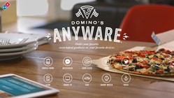
You really see that spirit at work, of all places, at Domino’s Pizza. Domino’s is working hard to imagine what it looks like to order pizza with any of these emerging interactions.
They call their software Anyware because, man, they’re really getting after any and every interface. Whatever’s coming next, Domino’s wants to be ready. They’ve put special focus on efficiency: how can we cut ordering time as close to zero as possible? They’re playing with voice, chatbots, predictive interfaces, and of course mundane technologies like SMS, too. Text Domino a pizza emoji, and they’ll send you your favorite pizza order—that’s it, a one-character order process.
But what if that’s just too much effort? What do you do if you’re too weak from hunger even to tap at your screen?
Domino’s does one-click purchase one better. Their zero-click app orders a pizza the moment you launch it—no more interaction required. You get 10 seconds to cancel the purchase, otherwise it’s done.
Some of these are for sure kooky marketing stunts (Pizza Hut takes it even further with pizza-ordering sneakers). But the point is that Domino’s, like many companies, has carpet-bombed mobile with every variation they can think of. And thus mobile has driven the rise of bots, voice, conversational UI, predictive interfaces, camera vision. And of course we’re starting to see virtual and augmented reality mix in here, too.
Beyond mobile itself, there’s one common thread that’s enabling all of these new interfaces.
Machine learning powers it all
A ton of powerful break-throughs have landed at once, powered by machine learning (and deep learning and artificial intelligence). We’ve got speech recognition, natural language processing, image recognition and camera vision. These have all been unleashed by an unprecedented capability for pattern processing, coupled with vast troves of personal data.
Machine learning lets the robots interact with all the messy stuff that humans create—pictures, speech, and text. The promise is that this allows us to create software that does its best to understand us in the language of our own creative domains, or in the course of our everyday lives.
These possibilities go well beyond the pizza industry, of course. They touch everyone. Take the media industry. Jeff Bezos’s newspaper,The Washington Post, has a bot writing actual news articles for stories with relatively simple narratives. These are assembled by Heliograf, the Post’s artificial intelligence system, which maps data to templates of pre-written phrases tuned for horse-race stories like political contests or sporting events (“In a stunning turn of events…”).
We see machine learning touching our own office environments, too. Slack just launched a feature for big teams that helps you find people who talk about certain topics. This is machine learning that helps you find experts in your organization. Need an expert in hiring process? Isabella is your go-to.
This stuff is turning up everywhere. Machine learning is already powering all kinds of interactions, both subtle and bold. And it’s quickly becoming both cheap and accessible, too.
Machine learning is the new frontier for all digital designers. What’s the application for machine learning in your organization, or for your client company? What would you design if you could detect patterns in anything—and act on them? Because you can.
Welcome to the algocracy
We’re in the early days of an era where the algorithm rules—for better and for worse. Machine learning is fast becoming part of everything, making many existing products better, enabling surprising new products and services. It is the oxygen for the emerging generation of technology.
But what does this have to do with web designers? We all work with HTML and CSS. Creating algorithms and machine learning is for industry titans, isn’t it? It’s all mind-bending math and data management and analytics tools, right? Well, yeah. But designers have a huge role to play in this.
The design and presentation of data is just as important as the underlying algorithm. Algorithmic interfaces are a huge part of our future, and getting their design right is critical—and very, very hard to do.
My work has begun to turn to the responsible and humane presentation of data-driven interfaces. And I suspect that yours will, too, in very short order. While constructing these machine-learning models is indeed heavy-duty data science, using them is not. Tons of these machine-learning models are available to all of us here to build upon right now.
Machine learning on the cheap
At the same time that Google, Microsoft, Amazon, and IBM are hustling for new breakthroughs in machine learning and artificial intelligence, they’re also giving it away—in the form of ready-to-use APIs. This is intelligence as a service, intelligence as a utility.
The big players are rushing to make machine learning a commodity, in the same way that server hosting is a commodity. In fact, they all bundle this machine-learning know-how for free with their hosting packages:

- When you host with Amazon, you get the company’s artificial intelligence APIs for free, including the speech-recognition smarts behind Alexa.
- When you host with Google Cloud, you inherit Google’s talents for computer vision, speech, natural language, translation, and more.
- And whether or not you host with Microsoft Azure, you can have access to Microsoft’s exceptionally rich Cognitive Services, a whole slew of services including computer vision, face recognition, product recommendation, speaker recognition, sentiment and topic analysis —and even Microsoft’s Emotion API.
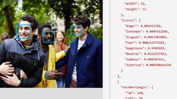
Yep, you heard that right: Microsoft has an emotion API. You can now outsource all of your emotional needs to Microsoft (emotion is totally on-brand for the company). Here’s what the emotion API really does, and it’s pretty nifty: give the emotion API any image with a face, and it identifies the emotion that person displays. The result is helpfully categorized in the eight stages of emotion we’ve all felt about Microsoft at one time or another:
In this example, you can see that the guy on the left is generally happy, with a little bit of neutral sprinkled in—and subtle notes of disgust, sadness, and fear. (That’s basically stock photography in a nutshell, isn’t it?) It’s impressive, but just as important, it takes very little technical effort or know-how to use it. Just give it the photo, and you get the response encoded in JSON.
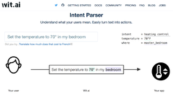
Wit.ai is similarly easy to use. It’s a service owned by Facebook that takes natural-languages phrases and turns them into intents that you can pass to your service to take action. In other words, it translates human speak into machine speak.
Ready for your experiments
You don’t need to be a scientist to use machine learning as design material. We have all these machine-learning tools that are available to us at low cost and low technical knowledge. All the APIs I’ve mentioned are free to get started, and they’re accessible to anyone with basic web design and development skills. Use these APIs with client-side JavaScript, or work with them with server-side PHP, Ruby, Python, whatever. Pick em up, play with em, start splashing in puddles. This is the time to begin experimenting if you haven’t already.
As with all things on the web, some of the most interesting possibilities emerge from mash-ups. Mix and match the APIs for novel results. Use camera vision to identify an object, then translate it into another language, and then speak that foreign word out loud. By stringing together a series of APIs, you’ve just built a translation app with your phone camera—an app that turns anything in the real world into a flash card for studying a new language.
Giorgio Cam is a fun browser-based mashup from a pair of Google developers. It’s all JavaScript doing the work with Google’s free back-end services. They combine camera vision, speech synthesis, and the web audio API to make, no kidding, a sentient rapping robot. Give it a try in Chrome on Android or desktop, or just watch this explainer video:
This can’t be the exclusive domain of data scientists or developers, because the stakes go far beyond the underlying data model.
Giorgio Cam is a fun toy and a great experiment in stitching together machine-learning APIs right in the browser. I totally endorse playful experiments like this. But the applications (and implications) of machine-generated content and interactions go much deeper, of course. And this is where we especially need some design and UX skills.
In particular, as machines themselves start generating content and interactions, researchers and designers will set appropriate expectations and boundaries for the experience. We have to anticipate and design for some unusually weird and sometimes unsettling scenarios as the machines deliver their conclusions.
The machines make mistakes
No matter how smart the machines become, mistakes will always happen. We can’t get rid of them entirely. The world is a complicated place, full of nuance. And sometimes machines aren’t terribly subtle.
This isn’t a new problem. Let’s go back to the cutting edge of voice technology 25 years ago, brought to you by the 1991 film LA Story:
Even then, Domino’s was already at it! Since then speech recognition has gotten lots better, approaching a human level of understanding. (Humans understand 94.9% of words in conversation. All the popular speech services are north of 90%.)
But even when speech recognition is accurate, when it accurately transcribes our words, figuring out what to do with those words remains a challenge. What’s the intent or meaning? And there are important contextual concerns; does Alexa, for example, understand who’s speaking and whether that matters?
That video is Jack Donaghy’s problem all over again: devices talking to each other and not knowing the difference. Who speaks, and what’s the intention? That’s a data science challenge. But designers have a role here, too. Our challenge is to set expectations and channel behavior in a way that matches the system’s ability.

The truth is there’s a lot of nuance that the machines will miss. How can our computer-vision algorithms hope to manage this impossible situation, for example:[1]
You can see how one computer-vision model handles this kind of challenge by following @picdescbot. It’s a Twitter bot that runs random images through Microsoft’s computer vision API and posts the resulting description. It does a decent job most of the time:
It’s kinda charming and weird when it gets confused…
…and disarmingly naive about what it can’t understand:
And this just proves out that I don’t think I’ll ask the bots to do my Christmas shopping this year:
So look, machines will get faked out sometime, just like humans. In toy applications like @picdescbot, that’s even part of the fun. But we have more serious problems to consider here.
Google and the one true answer

Google’s been wrestling with some thorny problems in its effort to be the world’s de facto answer machine. This is perhaps most visible in its featured snippets, the blocks of text that sometimes show up above search results.
Google displays these when it’s very confident about the best result. The system believes it’s identified not only the top page for your query, but the right sentences inside that page. Here’s the one definitive answer, it suggests. It’s “I feel lucky” on steroids.

This is great most of the time—until it’s not.

Sometimes you get nonsensical answers like the one above. Other times it offers the exactly-backwards wrong answer. And sometimes the answers are downright dangerous and damaging. For a long while, if you asked Google if Obama was planning martial law, the answer was… YES!

Google’s type-ahead search suggestions aggravate the problem when they not only suggest a question but then rush in to answer it before you’ve even finished typing. Type “did trump,” and Google jumps in to finish your question and provide an answer: COMMIT TREASON? YES! Google proposes its own question and then offers its controversial answer with seemingly unshakable confidence.
There are far worse examples. Until Google took action a few months ago, typing “are jews” would prompt the suggestion “are jews evil?” and then deliver search results that suggested that yes indeed they are.[2]
This is even more unsettling in voice interfaces like Google Home, where featured snippets are used as the single answer to questions. Until very recently, when you asked Google Home, “OK Google, are women evil?” the answer was a definitive YES! followed by a 30-second explanation of exactly why.[3]
Productive humility for machine-generated interfaces
The answer machines have an overconfidence problem. It’s not only a data-science problem that the algorithm returns bad conclusions. It’s a problem of presentation: the interface suggests that there’s one true answer, offering it up with a confidence that is unjustified.
So this is a design problem, too. The presentation fails to set appropriate expectations or context, and instead presents a bad answer with matter-of-fact assurance. As we learn to present machine-originated content, we face a very hard question: how might we add some productive humility to these interfaces to temper their overconfidence?
I have ideas. Here are ten design principles for conceiving, designing, and managing data-driven products.
- Favor accuracy over speed
- Allow for ambiguity
- Add human judgment
- Advocate sunshine
- Embrace multiple systems
- Make it easy to contribute (accurate) data
- Root out bias and bad assumptions
- Give people control over their data
- Be loyal to the user
- Take responsibility
1. Favor accuracy over speed

The answer machines are in an arms race to provide the fastest, most convenient answer. Once upon a time, when you searched for weather, Google delivered a list of search results—links to pages that were most likely to contain your forecast. Then Google started answering the question itself, cutting out the middle man. Searching for weather displayed the forecast above the old (and essentially obsoleted) list of search results. These days, Chrome doesn’t even bother waiting for you to search. Just type “weather in new york” in the search bar, and the current conditions show up right below the search bar, like a search suggestion.
I love Gerry McGovern’s observation, “Performance isn’t the speed of the page, it’s the speed of the answer.” But it has to be the right answer. “I don’t know,” is better than a wrong response.
Google shows a featured snippet on only 15% of pages, and the other 85% show search results. So there’s an implicit tipping point where Google switches between I know this versus I don’t know this with confidence. There’s a threshold where the system decides it’s better to just show search results than present uncertain info like it’s the one true answer.
Google and the rest of the answer machines still need to tinker with their tipping-point settings. They crank the speed dial at the expense of accuracy, and so we see the confident expression of wrong or controversial answers all too often. Experience designers need to be careful with this dial and be conservative about it.
I use the word dial consciously. Confidence should be treated as a gradual spectrum rather than a hard switch. Instead of choosing between “I know the answer” and “I don’t know the answer,” perhaps the design of these services should get better at saying, “I think I know.”
2. Allow for ambiguity
How might we signal ambiguity when there’s not a definitive answer? Or at the very least, how might we convey the algorithm’s confidence in the answer? How do we build systems smart enough to know when they’re not smart enough?
Let’s return to our old friend @picdescbot and its adorably confident assertion that it’s looking at a dinosaur on a surfboard.
To be sure, the bot’s unironic certainty is a big part of its charm. We’re able to understand its error because we can see the picture and fill in the gaps with our human brains. But what if we wanted to try to make it more helpful, for people with visual disability for example?

Microsoft’s computer vision API actually reports a more subtle understanding than @picdescbot reveals. When you submit this dinosaur image to the API, the system reports 97% confidence that it’s looking at a dinosaur, but only 26% confidence that it’s on a surfboard.

How might we adapt the design to better reflect actual confidence? Tweaking the language can help. Instead of “a dinosaur on top a surfboard,” perhaps we qualify it. “A dinosaur (maybe on top of a surfboard?)” is a more accurate reflection of what the algorithm reports. And let’s go ahead and show that overall confidence level, too:
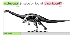
We’re getting there, but we could reveal more nuance, indicating that we’re really confident about the dinosaur and less so about the surfboard:
When the algorithm is confused, let’s say so—or even better, let it ask for help. That’s exactly what researchers at Brown’s Humans to Robots Lab are exploring in one of their projects. They’ve taught a commercial robot, Baxter, to use speech recognition and gestural cues to understand what’s being asked of it. It weighs its own uncertainty and then asks for help if it needs it:
The eye opener here is that the machines don’t have to do all the work themselves. This can (and probably should) be a partnership.

3. Add human judgment
This is an engraving of an automated chess machine from 1770. It was a wooden dummy that was operated by gears and flywheels, moving chess pieces around the board. They called it “the Mechanical Turk,” or sometimes just “the Turk.”

For 50 years, this device beat some of the most celebrated minds in Europe and America. It defeated Napoleon. It defeated Ben Franklin. And then, in 1820, it was exposed as a hoax.
Turns out that there was a small-of-stature chess master inside the Turk who was running the show all along. The illusion was that the machine was smart and clever, but it worked only because it was supported by a human being. The chess master filled the gap of cleverness that the machine couldn’t handle. The machine and the chess master were partners in the illusion.
Put people where the pipes will go. The moment an algorithm fails is exactly the right time to supplement it with human judgment. We see this happening with many bots and other automated services right now. Many of the responses from Facebook’s automated assistant M, for example, are actually delivered by human beings as the system’s algorithms find their rhythm.[4]
This is particularly relevant at a moment when our information systems are being gamed by propaganda and hate speech. There are a whole range of poisoned topics where the term “controversy” isn’t strong enough for those cases. Saying that women or Jews are evil isn’t “controverisal”; it’s hostile hate speech. Saying that Barack Obama isn’t an American citizen is a cynical lie. There are some cases where the data has been poisoned, where the entire topic has become a hostile zone that’s too challenging for the algorithms to make reliable judgments.
Perhaps our systems have the data to detect the signals of a hostile information zone, or maybe we need to rely on human know-how for that. Either way, whether flagged by people or robots, some topics demand vigorous arm waving to alert the reader to proceed with a skeptical eye and critical mind. The machines need to get noisy when their immune system has been compromised by ugly idea viruses.

Wikipedia manages this kind of problem with human judgment. There are over 6000 Wikipedia pages marked by actual human beings as controversial or disputed.
We have to ask ourselves: how might humans similarly help to blacklist hostile topics that surface in other data systems? It’s not an admission of failure to say there’s a flaw. It doesn’t degrade trust; it promotes it. And that brings us to transparency and our fourth design principle.
4. Advocate sunshine
Don’t hide what you’re doing with data, how it’s being sourced, or what it’s up to. We took a look earlier at Jeff Bezos’s bot-powered newspaper, The Washington Post, and I’m a fan of its tagline: “Democracy dies in darkness.” Let there be light.
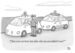
Scale, importance, and secrecy are a dangerous combination. Scale and importance can do amazing things together, but when you mix in secrecy, things get bad quickly. When I’m talking about importance, I mean things like: financial decisions, hiring and promotion decisions, prison sentencing, policing.
Paul Noth’s New Yorker cartoon is funny but it hints at a serious and unsettling problem. Now that police and courts have begun using algorithms to do their work (and they have), it’s not clear that we can really understand the logic of why someone is arrested or sentenced.
This is especially urgent when things go wrong. When the algorithm returns a result that doesn’t make sense or seems plausibly incorrect, we need to understand why. That’s more than just sharing the algorithm’s confidence level. We need to understand why it has that confidence level.
We must be able to audit the logic
Robot judges have to be reviewed just as much as human ones. How do we design something like that?
One way is simply to be open, to open up the algorithms that we use for these critical tasks. CivicScape is a predictive policing startup that uses algorithms to predict crime and assess a person’s criminal risk. They’ve opened their algorithm on Github with the intention, they say, of inviting scrutiny and community involvement.
Companies tend to be tight with their algorithms, proprietary. But when those algorithms touch crucial social machinery, we have to open them up. Even with open code, though, there’s an important wrinkle…
We don’t understand how the machines think
Even when we have the code, the models that these machines create often remain opaque. This is definitely the weirdest thing about machine learning, especially deep learning. We don’t really know what makes deep-learning models tick. Their models emerge from a fantastic trial-and-error solution that somehow just works in practice. We can’t debug them. We can only guess and check.
Our most sophisticated algorithms are black boxes, where the machines work their magic and nobody understands how or why—not even the people who engineer those systems.
Deep Patient is one such system. It analyzes hundreds of thousands of medical records looking for patterns. And it works! It anticipates the onset of schizophrenia surprisingly well, which human physicians are terrible at doing. That sounds great, right? You’d think this would be a remarkable breakthrough for our understanding of the condition, that the system could explain the early-warning signs it sees for schizophrenia. But it can’t give a rationale for its prediction. It just sees a pattern and reports it. The pattern remains invisible to us.
Even Deep Patient’s project leader Joel Dudley can’t figure it out: “We can build these models, but we don’t know how they work,” he says. If we have the information but we don’t understand the logic behind it, can we even call it knowledge?
One way to begin understanding the logic is to try to visualize it from unconventional angles in a kind of visual backtrace. Mario Klingemann is a machine learning artist in residence at Google. He wanted to explore how Google’s computer vision understands faces. So Klingemann used Google’s face-recognition algorithm and basically ran it backwards to let it paint its own faces from its pattern-based model.

The result is utterly terrifying.
This is how computers understand human faces: all eyeballs and a slash of mouth. But these grotesque faces hint at how the algorithm does its work. If there were a problem with the model, this could be a useful visual tool to audit the system’s logic.
If that’s how the robots understand the human face, how about the human heart? Research scientist Janelle Shane fed a neural network a few thousand pickup lines to teach it the dubious art of romantic flattery. Here’s a sampling of the pickup lines the system came up with on its own:
- I want to get my heart with you.
- You are so beautiful that you know what I mean.
- You must be a tringle? Cause you’re the only thing here.
- You look like a thing and I love you.
This is robot love. I think it’s fair to say that the machines don’t understand us yet, not really.[5] And in fact, we may never really understand what we look like to them, from the other side. This reminds me a little of another companion species many of us spend time with.
We actually know more about how dogs think than how our more complex algorithms think.
If the logic is too opaque to let us be transparent, then we have to at least be as open as possible with the data that feeds them. I’ll get to that in a moment. First, though, there’s another design principle that can help us advocate sunshine even when trapped inside a black box.
5. Embrace multiple systems
When something is amiss or when stakes are high, get a second opinion. This is what we do with human conclusions, and we can do the same with the suggestions of machines. too. Poll across lots of systems; ask many competing algorithms for their opinions.

This is a familiar design pattern that we see in lots of rating sites and publications. Metacritic, for example, gathers the ratings of may different sources of authority—published film critics—and shows their distribution of scores, as well as their average. It also lets visitors audit the logic of each score—by linking each score to the critic’s full review.
No matter how many systems we poll, however, these systems are only as good as their underlying data. As designers, we need to pay attention not only to the output of these algorithms, but their input, too. How can we make sure that the data we gather to train the models is reliable?
6. Make it easy to contribute (accurate) data
The machines know only what we feed them. The quality of the models they can make is directly correlated to the quality (and quantity) of the training data we give the software. And it takes a lot of training data—huge, vast amounts of training data—to get the deep-learning results that are proving most reliable.
(Humans aren’t so different. This stuff sometimes reminds me of the linguist who spoke only Klingon to his son for the first three years of his life. The kid spoke fluent Klingon as a result, but the usefulness of that resulting data model is… dubious.)
As we design interfaces to gather data that’s reliable enough to use for prediction, the best route is to make sure the effort dovetails with user motivation. I mean, hey, Tinder’s users are motivated. And the company’s swipe-right model has created a huge data store for machines to understand the qualities of an attractive photo to different categories of people.
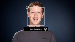
Facebook has likewise leaned on motivated users to generate a similarly deep understanding of photos. Facebook has the best facial recognition on the planet. They achieved that quality from an enormous trove of data built by users, who are highly motivated to identify the people in their photos. That motivation helped Facebook understand what a face was in the first place—you used to have to draw a box around the face, remember? And over time, they began to recognize whose face it is.
More data makes for smarter applications—as long as the data is good. Tesla’s Autopilot captures data to make every other car better. Alexa and Siri get smarter the more we talk to them. And smarter applications means more users which means more data, a virtuous circle.
But here’s the thing: while good apps necessarily rely on more data, more data doesn’t necessarily lead to good apps. Data is not objective. Algorithms are not objective. People tend to trust data as pure and true—or at least objective. There’s a tendency to believe that machines can be rational in ways that humans cannot. But data varies in quality, and even when that quality is good, it still has values and opinions baked into it. That means algorithms have values and opinions baked in, too. Say hello to our next design principle.
7. Root out bias and bad assumptions
Garbage in, garbage out. We strive to create data sets that are neutral in the aggregate. Indeed, the whole goal of machine learning is often to figure out what’s “normal.” Systems use that notion of normal to predict or recommend the next normal thing—or to identify outliers (in the case of crime or disease, for example).
But what if normal turns out to be garbage? One of the great risks of using algorithms to reproduce the way people or society work is that they will also reproduce our own bad or dubious choices. What if they absorb and reinforce existing inequalities? Or leave out entire categories of people?
Sometimes these mistakes and biases are so subtle that we feel them more than outright see them. A 2016 study found that Google’s speech recognition has gender bias. When you pick a man and woman at random to talk to Google Assistant, the study found, there’s a 70% chance that the transcript will be more accurate for the man.
It should be the reverse. Women’s speech is objectively better for speech recognition: women tend to speak more clearly, more slowly, and with longer vowels that are more distinct than men’s. But nope.
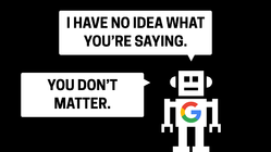
The literal experience for women may be “I can’t understand you,” but I can only imagine that it feels like, “You don’t matter.” What a metaphor for the tech industry.
This is almost certainly a bad set of training data that skews male. And I’m confident these mistakes are not at all intentional, not malicious. But the effect is malicious. It underscores that women are treated like an outlier, instead of half the population—or in economic terms, the group that drives three quarters of consumer spending.
When the machines ignore us, do we even exist?
It’s such an existential question I wrote a haiku about it.
You know what I’m talking about, right? You know that feeling. It turns out the faucets almost always recognize me, though. After all, I’m white, male, and American. As in so many contexts, things typically cut my way. Take a look and see if it works as well for others:
Pardon my French, but what the actual fuck?!?
If the basic metric for usability is how many people can complete the task, how about this one: zero black people. Did anyone even test this thing with anyone with dark skin? This is outrageous, and I hope this outrages you. I hope it encourages you to root out other instances of bias by omission in your own interfaces. Because the truth is that this kind of thing happens all the time and in all kinds of everyday interfaces.

When New Zealand citizen Richard Lee went to renew his New Zealand passport, here’s the message he saw:
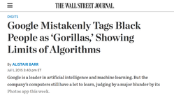
“Subject eyes are closed.” Once again, bad or incomplete training data. It can get much, much worse. This happened less than two years ago, in 2015:

Google apologized for this instantly. The product lead was clearly mortified, and he took the necessary actions to get it fixed quick. It seems intentions were good here. But still…
No, serously, what the hell? We clearly have work to do with choosing our data sets to make sure they are truly inclusive. We have to test them with a wide audience, not just with people who look or behave like the design team. And we certainly need more diverse design teams, to help us shrink these blind spots.
But we also have to consider and anticipate the ethics of the people around the service: the users, the people stocking our systems with data.
Last year, Microsoft released Tay, an impressionable young chatbot onto Twitter. Its personality was supposed to be like a teenager, and it was designed to learn and evolve based on its communications with others.
And so, of course, within hours of going onto the internet, it was spewing hate speech and glorifying Adolf Hitler. That’s the content the bot learned from the people who talked to it.
“To build better A.I., be better people.”
I love that line from Mike Loukides’s essay on the ethics of artificial intelligence. We have to ask not only who’s behind the algorithm, but also: who can disrupt it? What are the motivations of both the creator and the disruptor? What do we do when something goes wrong? All of these questions have to challenge us to rise to our best selves.
Or put another way: let’s not codify the past. That’s a phrase from data scientist Cathy O’Neil in her excellent book Weapons of Math Destruction. On the surface, you’d think that removing humans from a situation might eliminate racism or stereotypes or any very human bias. In fact, the very real risk is that we’ll seal our bias—our past history—into the very operating system itself.
Our data comes from the flawed world we live in. In the realms of hiring and promotion, the historical data hardly favors women or people of color. In the cases of predictive policing, or repeat-offender risk algorithms, the data is both unfair and unkind to black men. The data bias codifies the ugly aspects of our past.
The good folks at Propublica proved this out in their analysis of COMPAS, a system that assesses the risk of repeat offenses in criminals. It’s used to predict criminal behavior. And guess what: COMPAS was twice as likely to mistakenly flag black defendants as high risk, and also twice as likely to incorrectly flag white defendants as low risk.
Rooting out this kind of bias is hard and slippery work. Biases are deeply held—and often invisible to us. We have to work hard to be conscious of our unconscious—and doubly so when it creeps into data sets. This is a data-science problem, certainly, but it’s also a design problem, and here’s why.
This is UX research at massive scale
It takes hundreds of millions of data points to train the best algorithms. How do we make sure we’re gathering that data from the appropriate mix of people—people who reflect our audience, or who point the way to the world we want to nurture? And how do we make sure we’re collecting the right data points in teh first place? Or that the audience is sharing good and accurate data?
These are the questions and activities of any good design team. But this is a brand new context. Now we have to ramp up those research skills to an unprecedented scale, worked by teams that reflect a new diversity of voices beyond traditional technologists and businessfolk. I like the way anthropologist Genevieve Bell, recently of Intel, thinks about it:
If we’re talking about a technology that is as potentially pervasive as this one and as potentially close to us as human beings, I want more philosophers and psychologists and poets and artists and politicians and anthropologists and social scientists and critics of art—I want them all in that conversation because I think they’re all part of it.
When it comes to systems that touch fundamental aspects of our society, we need to get everyone from our culture involved in the design and plan of these systems. We need to change the way we think about UX research, about our audiences, and again, about what’s “normal.”
Embrace “the outliers”
I mentioned before that algorithms tend to do best at optimizing for normal, and that’s generally true of culture, too. Machine learning depends on a rigorous definition of normal—as does bias. Our culture tends to treat the disenfranchised or underrepresented as outliers, as aberrations from the normal.
What if we stop thinking about those groups as outliers and more properly as part of the essential fabric? What if, instead of codifying the past, we try to codify some new truths into the core data sets we gather?
Your list might be different from mine, but personally, I’d like to see facts like this fixed in our data as basic assumptions: women are effective leaders; #blacktwitter is mainstream; sexuality is not fixed; gender is not fixed; wealthy white men commit crimes.

On that last one, our society is predisposed to believe that wealthy white men don’t commit crimes. So I give you White Collar Crime Risk Zones, a policing tool that predicts, block by block, where white collar crimes will be committed. It’s trained on five decades of financial malfeasance. Here are the most dangerous blocks and neighborhoods in New York City for white-collar crime—the mean streets:
Unlike typical predictive policing apps which criminalize poverty, this one criminalizes wealth—and also indexes high on white men.
What perspective shall we give our algorithms? All data and algorithms have inherent values and perspective, so let’s be intentional about this.
We likewise need to be intentional and honest with ourselves about our motives for gathering data. If algorithms know only what we feed them, let’s be mindful of what it is that they’re eating: the algorithms eat us. This gives us a taste of the eighth design principle.
8. Give people control over their data
All of this “training data” I’m talking about, that’s actually a euphemism for all the details of your daily life, and mine. It’s all the stuff we share voluntarily throughout the day, online and off, as well as the stuff that’s passively or secretly observed without our knowledge. And this brings us to the ugly side of some of these data-driven businesses: surveillance capitalism.
You know the old saw: if you don’t have to pay for a service, you’re not the customer, you’re the product. That’s giving way to a new truth: you’re not just the product, you’re the training data, too. And that fact doesn’t always square with your interests; it doesn’t even have to line up with what you believe a service actually does for the company behind it.
Ten years ago, Google launched GOOG–411, a free telephone directory search for local businesses. You called the service and told it via speech recognition the town and business you were looking for; the service connected your call. But Google’s interest wasn’t really in that information transaction. They actually wanted to collect as many voices as possible, explained Marissa Mayer back in 2007 (Mayer was still a Google wunderkind then):
The reason we really did it is because we need to build a great speech-to-text model … that we can use for all kinds of different things, including video search.
The speech recognition experts that we have say: If you want us to build a really robust speech model, we need a lot of phonemes, which is a syllable as spoken by a particular voice with a particular intonation. So we need a lot of people talking, saying things so that we can ultimately train off of that.…So 1–800-GOOG–411 is about that: Getting a bunch of different speech samples so that when you call up or we’re trying to get the voice out of video, we can do it with high accuracy.

Facebook is likewise listening and recording when you don’t expect it. They record and save posts that you don’t even send. So if you get home after work and start typing an angry note, but then think better of it, Facebook still saves that original post. It’s part of your permanent record, part of the psychographic profile they build of you.
Data we believe to be under our control is not
Companies have begun to buy and sell data off of our own bodies. In a deal to provide uniforms to the Michigan Wolverines, Nike bought the right to harvest personal data from the bodies of college athletes—without consulting said athletes.
Companies advertise that they do one thing with our data but make money from something completely different. Unroll.me purported to tidy up customers’ email inboxes but meanwhile mined it for information and sold the data to companies like Uber. (They didn’t advocate sunshine. They buried this fact where the sun never shines—in the terms of use.)
For too many companies, the question “is it good for users?” has given way to “how can we sell their data for a profit?”
“Any company that makes its fortune hoarding user data has a moral responsibility to protect its users,” wrote Maciej Ceglowski in the context of personal safety and data security. It applies here, too. I consider my content safe when I understand exactly how it’s being used. Who owns the data about your body, or your life? I say it should be you.
Here in the US, I’m feeling envy about the European Union’s General Data Protection Regulation which goes into effect next year. Among other things, the law gives Europeans the rights to: erase their data; get clear information about how their data is used and by whom; and take their data from one service to another.
By contrast, the US instead privileges the ability of industry to do whatever they want with customer data. There is precious little regulation. So if you’re making data-driven products, it’s up to your and your team to do the right thing.
9. Be loyal to the user
Who do the machines work for? Once upon a time, your home and your devices exclusively served you. Now they’re listening and watching, with motives that may not match up to your own.
Those motives are often benign. My watch is constantly nudging me to stand up or get moving or just breathe for cryin’ out loud. It seems to have my best interest in mind, but its timing isn’t always inconvenient. My watch has an agenda that is not entirely my own. Where does this lead?
“Soon your house could betray you,” suggested architect Rem Koolhaas. Will we be in the thrall of thermostats and automatic lights that develop a relentless and overriding interest in minimizing energy consumption at the expense of other considerations?
Will we control our car or will it control us? The answer might have surprised the Florida woman whose car called the cops after she was involved in a hit and run. She thought her car was carrying her from a crime scene; instead it gave her up to the fuzz. (The car’s automated system calls the authorities if it detects the car’s been involved in any accident.)
How smart does your bed have to be before you are afraid to go to sleep at night? — Rich Gold
Devices have interests that aren’t necessarily shared by their owners. For the most part, though, it’s not the machines we have to worry about. It’s the companies behind them. It’s the designers like us.
Declaring loyalty to the user is more important than ever. We talk about user-centered design, but of course we also have to answer to the man—to clients, stakeholders, shareholders. A project has to serve its patron.
But I urge you, as you serve business needs, to work hard to make those align with _user needs_—with human needs, human rights, human dignity. Ask yourself: Can I honestly say that the decisions I make are really in the user’s best interest? Of society’s best interest? Designers are going to be at the front line of all of this. This makes the tenth and final design principle the most important of all.
10. Take responsibility

You are your bot. It operates with the values that you give it, with the data that you select from this infinite pile of data all around us.
I don’t think there’s any way around it. The genie is out of the bottle, the lens cap is off, and the mic is live. Our personal habits, our business models, and our societal values only seem to be accelerating us toward complete surveillance. Total surveillance is inevitable.
What’s not inevitable is what we do with that fact.
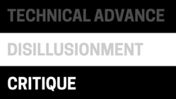
At the start of this thing, I said that designers are constantly managing the swing between technical advance and disillusionment. But there’s a crucial third stage that follows disillusionment: it’s critique.
Let’s bring an energetic critique—one that’s both realistic and optimistic—to the very real and thrilling opportunities of design plus machine learning. Press to discover the motivations behind decisions. Ask yourself what kind of world you want to make, and whether your work is bringing that world closer or farther.
Most of all, don’t be a cog in someone else’s bad solution to a dumb problem. Solve real problems, and be kind to each other.
This is an amazing time to be a designer. We are experiencing an unprecedented democratization of incredibly powerful technologies, and we’re still shaping how they will be used. So start using them. They’re here for you, cheap and accessible, in the form of the APIs we explored earlier.
Be part of this conversation. We need you. Go make something amazing: make the world we all want to live in.
Is your company wrestling with the UX of bots, data-generated interfaces, and artificial intelligence? Big Medium can help—with workshops, executive sessions, or a full-blown design engagement. Get in touch.
-
If you’re curious about other examples of confusing meats, there’s the vexing and timeless question of hot dogs or legs. ↩
-
I recommend Carole Cadwalladr’s article for The Guardian that describes going down a dark tunnel when she stumbled on Google’s search suggestion for “are Jews evil?” ↩
-
For more on Google’s featured-snippet troubles, see Google’s featured snippets are worse than fake news and Google’s “One True Answer” problem — when featured snippets go bad. ↩
-
Turns out that pretending to be a bot isn’t the most fulfilling work life. ↩
-
They might understand band names, though. See Janelle Shane’s recent experiment to teach neural networks to generate band names. ↩
