Big Medium crafted an enterprise design system to help one of the world’s biggest companies—ExxonMobil—scale design best practices across hundreds of internal web applications.
Before the new design system, the company had no common visual language or underlying front-end code to connect its sprawling library of web apps. Instead, every web project started at square one, with developers piecing together design solutions in isolation. Time after time, they rolled out reinvented wheels.
The result of this ad hoc process: developer productivity was slower than it might have been, quality was uneven, the user experience changed from app to app, and most visual designs didn’t reflect the company’s brand.
Big Medium built a cohesive design system called Unity to help fix those problems. Much more than a pattern library, Unity embraces a fully expressed design language, detailed UX guidelines, and tools to fit the organization’s workflows.
The emphasis throughout is on helping developers build fully conceived applications—not just assemble parts.
Faster, better, less expensive
The project’s key goals were to speed app development, reduce costs, and instill design best practices across the developer organization. Faster, better, cheaper; usually you have to pick two. We knew we had our work cut out for us.
After listening carefully to developers throughout the design process, we knew we had to provide tools that would naturally fit their workflow. An “eat your spinach” approach would fail; if developers didn’t find the design system easy to use, they’d turn to an off-the-shelf framework instead. The design system had to be “better than Bootstrap,” a defining phrase for the project.
The early returns are promising. A first wave of developers is now using Unity to build on-brand apps more quickly and consistently than ever. We’re getting comments like this from developers:
“Someone on my team white-boarded out a design this morning. With Unity, I converted it to a working page while multi-tasking in a one-hour meeting.”
A developer community has begun to coalesce around the system, too. Developers are creating and sharing front-end libraries to fit the design-system components to back-end systems. Just as it should be, developers are beginning to share ownership of the system and its tools.
As the design system’s first wave of pilot apps rolls out, we’re also expecting efficiencies on the user end, too, with employees enjoying the productivity gains of improved, consistent UX. The company’s brand and UX best practices are baked directly into code that developers can assemble with newfound speed.
We had terrific internal partners on the project. ExxonMobil’s Mobility and Design group is home to a small design team within an enormous developer-driven technology organization. Unity’s product manager Nick Cochran understood the need to socialize the system to the developer community. Nick was smart to see this as more than just a design project, organizing it as the first stage of a product launch, complete with marketing materials, maintenance and governance plans, and an education campaign. Meanwhile, designer Chris O’Brien and developer Hernan Almeida guided us to keep Unity in tune with the company’s design sensibility and developer workflows.
Here’s what we built with them to unlock the company’s pent-up design potential.
An elegant and efficient visual language

We adapted ExxonMobil’s existing brand guidelines to fit the needs of modern web apps. As is typical of our process, we began with a series of element collages, component sketches for exploring visual style outside of fixed designs.
Hand in hand with this process, we codified this emerging visual language with a set of design principles that tell the system’s story:
- Just enough interface. When in doubt, remove.
- Strong and direct. The design sensibility is simple, plainspoken, solid, and durable.
- Speed is a feature. Construct interfaces to be lightning fast, with as little friction as possible. Every click or tap yields useful information and insight.
- Adaptable density. Images and text often benefit from generous whitespace, while certain data applications yield insights only through high-density presentation. Components should adapt to size and density appropriate to the context.
- Safety always. In a digital context, this translates to a strong dedication to accessibility, security, and error prevention (with patient forgiveness of errors when they happen).
- No tricks or stunts. Be faithful to the digital medium. Don’t create a false sense of depth but embrace the flat plane of the screen. Be predictable and consistent.
- Recycle, reduce, reuse. Limit yourself to a compact set of solutions. Interface components should borrow structure and design styles from one another.
Design and code for nearly 100 interface components

We audited a slew of the company’s web apps to identify the design problems those apps most commonly solve. With that inventory in hand, we designed nearly 100 interface components—everything from a comprehensive set of simple buttons to complex navigation. We created several flexible variations for each—hundreds in all—to demonstrate adaptability to a variety of use cases. Brad and Ian Frost rendered them all in lovingly responsive markup.
A resilient CSS framework
We developed a CSS foundation that would be friendly to maintain and stand up to large-scale collaboration. In other words, we crowd-proofed the thing. Brad Frost developed a set of strict code conventions for us as we built the system. The class naming is easy to understand and obvious to extend; it’s effectively self documenting. All of this makes the system fast to learn, inviting contribution and extension by developers.
Three pilot apps
Design systems can’t be built in isolation. The best design systems are built from battle-tested components extracted from production apps. Part of that process happened during our interface inventory. But a big chunk happened when we developed pilot apps during and after construction of the design system.
The best design systems are built from battle-tested components extracted from production apps.
This process helped us test our assumptions for all three aspects of design, UX, and markup. We selected projects that embraced fairly common design scenarios for the company—dense table data, form entry, data cards, etc—so that we’d be dealing with components with high reuse.

As expected, these pilot projects revealed both flaws and opportunities in the fledgling design system, and we folded those learnings back into the components and underlying CSS framework. In the end, these pilots informed Unity’s design as much as the reverse.
A self-serve reference site
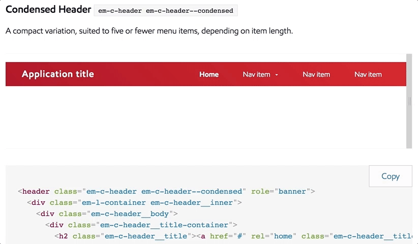
We built a genuinely useful reference site for developers to preview components, grab code, and quickly learn how to customize Unity to their needs. It was important that this site be more than just a code library; it also had to suggest how and when to use Unity’s many components. You can’t grab code on this site without also bumping into the right way to use it.

The site offers sitewide UX guidelines for data-driven topics including data entry, display, and validation, as well as best practices for accessibility, navigation, layout, and copywriting.
At the component level, “do this, not that” examples show the right way to use each interface element. Detailed class documentation shows how to achieve all kinds of variations on each component, with cut-and-paste code snippets for every last one of those variations.
And to be extra-meta, the reference site is of course built entirely out of the very components that it showcases.

Ready-to-use starter templates
It’s hard to build a car when all you’re given is a pile of parts. The reference site had to make it easy to grab more than just individual components. We also wanted to help developers see the big picture.
We created several starter templates for common scenarios and web views. Developers can get these up and running to test the system and start building their own apps fast. (Here again, building pilot apps during the construction process made it easier to provide these templates to developers right from the outset.)

Visual themes for the system
Developers consistently told us they were concerned the design system would straitjacket them to a one-size-fits all set of visuals and interactions. We shared that concern; while we wanted to promote a consistent approach to design and UX, we didn’t want strict homogeneity.
We optimized the CSS styles and JavaScript hooks for flexibility so that developers could extend Unity to fit their needs within the brand context. We created a set of color themes as a demonstration for extending the system—for specific departments or sub-brands, for example.
Making the best solution the easiest
In the end, the secret to the project’s success was understanding the habits, workflows, and incentives of the company’s developers. The system we delivered had to fit an environment where development speed and efficient production are highly valued. More than just creating good code and design solutions, we created the foundation for a good workflow solution—a solution for the organization.
It just happens that we snuck in a whole lot of design goodness along the way, too.
Does your company need a design system to bring order to a disconnected set of apps and websites? Big Medium can help with workshops, executive sessions, or a full-blown design engagement. Get in touch.