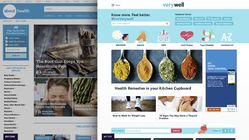
After 20 years on the web, About.com was showing its age. Big Medium helped the company reinvent its product strategy and design process—and created some mighty good-looking and profitable sites along the way. The result was a reimagined (and renamed) media company: Dotdash, a network of premium content verticals. Here’s the story:
At the start of 2016, About.com was still the 40th-largest site on the web in page views, but the network was seeing punishing drops in page views. The network’s massive collection of general-interest content, once its greatest asset, was now seen by search engines as a content farm. Its design was generic and conservative, and the pages were choked with ads and pay-per-click links in a desperate attempt to keep revenue level. Audience and advertisers were turning elsewhere.
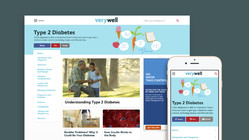
Big Medium worked with About.com to develop a new vertical strategy, carving out the content from the main network into branded premium experiences. Big Medium designed the health vertical Verywell, the finance vertical The Balance, and the food and home vertical The Spruce giving all three a warm, humane feel that was missing from About.com. Dotdash was born, and the network has since grown to include nearly a dozen proeprties. The results were beyond expectations:
- The new verticals have more than doubled engagement in every metric.
- The new verticals together have more traffic than the entire About.com network earned a year earlier.
- With far fewer ads, ad visibility and engagement are way up, along with ad revenue.
- Dotdash’s verticals Verywell, The Balance, The Spruce, and Lifewire are all in Comscore’s top ten in their categories .
Along the way, Big Medium also overhauled the company’s entire approach to web development. Josh Clark, Brad Frost, and Dan Mall embedded with Dotdash’s tech and design leadership to help them create the design system that undergirds Dotdash’s properties. Along the way, we introduced:
- A newly collaborative design process
- “Designing and deciding” in the browser
- The atomic design methodology
- A tight focus on the mobile experience
See the sites in action: www.verywell.com, www.thebalance.com, and www.thespruce.com


