responsive
books
Designing for Touch—in French! And Chinese!
Josh Clark’s book Designing for Touch is now available in French, Chinese, and the original English.
mobile
Mobile Web: Back To the Future
At mobiForge, Ronan Cremin suggests AMP takes us back to a pre-responsive-design world. He may be right, but publishers are choosing that path for the wrong reasons.
Time Inc.
An Online Home for the World's Biggest Publisher
We crafted a new website—and along the way, a new brand—for the world’s most iconic publisher. Here’s how we did it.
touch
How We Hold Our Gadgets
An excerpt from Josh Clark’s book Designing for Touch explores how we grip different devices, revealing the ergonomic demands of touchscreen interfaces.
books
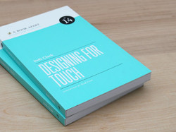
Designing for Touch
Josh’s latest book hands you the best design patterns and interactions for modern interfaces.
ew.com
Mobile Magic for Entertainment Weekly
Entertainment Weekly has a new responsive mobile website. Here’s a behind-the-scenes look at how we built it.
books
The Mobile Book
Smashing Magazine published The Mobile Book this week. I was honored to contribute the book’s final chapter about designing for touch.
touch
New Rule: Every Desktop Design Has To Go Finger-Friendly
New hybrid keyboard-touch laptops and tablets have changed the game. When any desktop machine could have a touch interface, we have to proceed as if they all do.
PEOPLE
Time Inc.'s first responsive site
We designed the responsive mobile website for People Magazine. Here’s how we did it and why.
content strategy
Mobile Isn't the Lite Version
Jakob Nielsen’s dubious mobile website guidelines make the mistake of assuming that there’s such a thing as “this is mobile content, and this is not.”
apple
3.1 Million Pixels Are Heavy
If you want to take advantage of the new iPad’s gorgeous screen (and of course you do), every image you push down the wire is about to put on a ton of weight. That has implications in lots of places and for lots of people.


