No Share Buttons on Mobile Sites (Except This One Weird Case)
By
Josh Clark
Published Mar 16, 2017
Only 2 out of every 1000 mobile web users ever tap a custom share button—like even once—according to a Moovweb study. We found similarly tiny numbers during our research designing Philly.com and verticals for About.com. That means people are over 11 times more likely to tap a mobile advertisement than a mobile share button for Facebook, Twitter, Pinterest, etc.
To be clear: people do share a ton of webpages to those services from mobile devices, but it happens through other means—using browsers’ built-in sharing tools or copying the URL directly into a social post. Mobile users have established their own sharing habits, in other words, and for the vast majority, those habits don’t involve share buttons embedded in the page canvas.
So here’s the guideline I follow:
Don’t include social share buttons in small-screen websites, unless the user just tapped through from a social network.
That last bit is important.
Visitors from social networks
Turns out that use of custom share buttons leaps way, way, way up for visitors coming directly from a social network. People are 20 times more likely to use a social button on mobile when they’ve tapped through from a social network, we discovered during our research designing the About.com verticals. Call them the “20x users.”
Apart from that one specific context, though, effectively nobody ever uses custom share buttons in mobile sites. Don’t even bother with them in other scenarios. Small screens demand sharp focus on core tasks; anything else is a distraction. When the data shows that there’s vanishingly small interest in a feature, your job is to pluck it out of the design. Be ruthless; if nobody’s using it, it’s the wrong solution. So: no custom share buttons for mobile users—except for the 20x users.
We missed that nuance when we redesigned Philly.com a little over a year ago. We knew share-button usage was low, so our early designs removed the share buttons from small screens. In the end, we didn’t have the confidence to pull social buttons off of mobile, an obviously social platform. We didn’t yet have the insight about the 20x users for social-network traffic. Serving buttons only to those users would have addressed our confidence problem of removing them outright.
The revised approach I now recommend is simple and borne out by data:
Show mobile share buttons only to social traffic
For small screens, always show share buttons for visits originating from a social network. (Set a cookie and show buttons for subsequent visits, too.)
For all other small-screen visitors, don’t show share buttons.
For larger screens, always show share buttons; usage is high enough to be valuable.
Super-size the preferred network
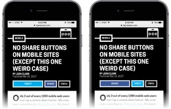
Lean into the visitor’s demonstrated network preference. On both desktop and mobile, super-size the button for the referring social network. The site you’re reading now, for example, has three share buttons for Twitter, Facebook, and email. Mobile users visiting from Facebook will see the Facebook button displayed not only first but also twice the size of the other two share buttons. If you come in from Twitter, it’s the Twitter button that instead shows up first and biggest.

As mentioned above, set a cookie for that network preference. When people visit from a social network, remember that network preference for the next visit; display and super-size the buttons accordingly. Set the cookie again when someone actually clicks one of those social buttons, a much stronger signal of network preference than the referring site.
No more than three
Don’t bother with more than three share buttons. In our research designing the About.com verticals, we found that displaying more than three share buttons actually reduces usage on both mobile and desktop. Pick only the three most popular channels for your audience, and stick with those. You harm sharing when you add more.
Verbs do better than nouns
We also found that labeling the buttons with verbs (“share,” “tweet,” “pin”) performed better than network names (“Facebook,” “Twitter”, “Pinterest”) which in turn performed better than logos alone. The verbs evidently work as a stronger call to action, and also distinguish these share buttons from follow buttons.
On this site, for example, the share buttons carry only these verbs, with buttons tinted with the Facebook and Twitter blues.
Pinning social buttons is not the answer
Hey, please, under no circumstances should you pin social buttons to the top or bottom of mobile screens. In an effort to try to boost mobile use of share buttons, About.com experimented with fixing them to screen bottom and separately to screen top, so that the buttons were always visible when scrolling. While this did modestly increase share-button usage, it also caused overall session engagement to go down.
You read that right: adding a locked toolbar to the small-screen experience shortened sessions and reduced page views. The very small increase in share-button usage was far outweighed by reduced site usage. (I can’t explain why this is the case, but I’ve seen it elsewhere with locked toolbars, too. They chase small-screen users away.)
Locked toolbars are rarely a good idea in mobile browsers. In Designing for Touch, I detail a bunch of ergonomic and interaction reasons why fixed toolbars fail users. Among them:
- Fixed toolbars adjacent to browser buttons invite errors and mistaps.
- On Safari, tapping a fixed toolbar at screen bottom conjures the browser buttons instead of honoring the tap; the toolbar slides out of the way, and you have to chase your tap target around the screen.
- On larger phones, toolbars at screen top are out of reach.
So under normal circumstances there are lots of reasons to avoid pinny any kind of toolbar to the top or bottom of small-screen browsers. But for social buttons, it’s multiplied by the stark fact that most users simply don’t want to use your custom buttons in the first place.
Need help nailing best practices for your mobile app or responsive website? That’s what we do! Big Medium specializes in multidevice experiences, and we’d love to help. Get in touch.


