Your Traffic Went Mobile; Why Hasn’t Your Design Process?
By
Josh Clark
Published Mar 23, 2017
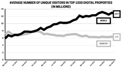
The mobile audience is now twice as big as desktop. Does your organization’s design process reflect that mobile is now your primary platform?
The top 1000 digital properties welcome twice as many mobile visitors as desktop visitors, comScore reported this week. Time spent on mobile is likewise more than double desktop time (69% of digital time is spent on mobile, versus 31% on desktop). These top properties are a decent proxy for general internet use; chances are good that your site is part of the enormous mobile majority, too.

Despite the obvious importance of mobile, I visit organizations all the time that still embrace a desktop-driven design process. While much lip service is given to mobile-first strategy and process, the desktop tail continues to wag the mobile dog. Desktop web designs inevitably seem to gobble up more time and attention than their mobile counterparts.
This is an expensive mistake
This mismatch between where traffic comes from (mobile) and where design attention is spent (desktop) is not only backwards, it’s costly. For e-commerce, comScore reports that only 20% of dollars spent came from mobile, although mobile accounts for 67% of time spent shopping. This gap is a breathtaking missed opportunity.
Executives often tell me that they interpret these numbers to mean that people don’t want to buy on mobile, that touch is too clumsy, the security too untrusted, the task too slow for phones. The problem, they suggest, is mobile itself.
I tell them I have a different interpretation: their mobile experience isn’t measuring up to the opportunity. It’s not a platform problem; it’s a design problem. I’ve seen first-hand how quickly the traffic-revenue gap closes up when organizations start treating mobile as the main event.

Faster, easier, kinder
Nearly all of the techniques and flows I suggest in my book Designing for Touch are tuned for making interactions faster and easier, for reducing the unnecessary and wasteful friction still found in so many mobile interfaces. This is more important than ever. Designers have to be relentless in uncovering the key tasks people want to accomplish—and then helping them get there quick.
Too many interfaces instead get in the way. In commerce sites, the average checkout flow has 15 form fields, about twice as many as needed.
Media companies meanwhile assault mobile visitors with takeover ads or with banners that effectively trick you into tapping them. This improves click rate, alas, but ironically also turns out to harm overall revenue. When we designed several verticals for About.com, we found that revenue, page views, and session length all went up when we reduced the number of ads. Yep: revenue went up when the number of ads went down. We also made their interactions more respectful of the content, more in tune with the platform. By focusing on user wants and needs—a good reading experience in this case—we increased revenue, with fewer ads.
Across all categories, mobile experiences need to be faster, easier, and kinder.
What keeps us from making mobile the primary focus?
Too many organizations don’t treat mobile as the primary platform, even when traffic definitively says it is.
It’s a chicken and egg problem: when desktop revenue is higher than mobile, intuition says keep favoring desktop. Yet you’ll never close mobile’s yawning traffic-revenue gap until you lean hard into making that mobile experience truly great. Meanwhile, desktop’s share is shrinking; it’s time to switch horses.
This takes more than just a change of mind, of course. Designing truly mobile-first is a different workflow than designing with desktop top of mind. It requires fundamental process change in the way you research, prioritize information, wireframe, and iterate between design and code. That’s a deep transition we help our client companies make.
But there’s also a fundamental shift in mindset (and even office infrastructure) that’s required. The place and manner in which we work is often hostile to mobile design. It’s helpful to recognize and compensate for these off-putting influences:
- Our design infrastructure isn’t friendly to mobile. Designers work and think at desktop machines; reviews are held in conference rooms with giant shared displays. Instead, all of us need to review our work constantly where it will be experienced most: on mobile. Pull out your phones for those design reviews.
- Bigger screens have distracting impact. With a bigger canvas, desktop experiences have the potential for correspondingly bold expression. Don’t let the desktop’s Big Brand Experience divert you, however, from the small-screen platform where your service is actually delivered. This takes discipline.
- Bigger screens have more design complexity. This one is tough. Fine-tuning a wide, multi-column visual design is a more complicated project than designing a single-column mobile layout. It’s a big reason teams find themselves spending a disproportionate amount of time on widescreen designs. At a certain point, it’s important to call the thing good enough, and return focus to the mobile main event.
Changing habits, perspectives, and process is easier said than done, but we’re past due. When two-thirds of the audience has gone mobile, it’s time to recognize that mobile experience is actually the experience, not a poor cousin to what happens on desktop. Mobile is the show now, and the design process has to adapt.
Does your company need help adopting (and sticking to) mobile-first design? Big Medium offers workshops, executive sessions, and full-blown design engagements to help you make the transition for real. Get in touch.


