I just stepped 80 years into the past for a lesson on the links between technology, design and culture.
The Maison Européenne de Photographie here in Paris is just wrapping up an exhibition about Vu, the French photo magazine of the 1920s and ’30s. I expected a nostalgic survey of period feature photography, but instead got a ton of insight into something more contemporary: how technology works to spark design inspiration.
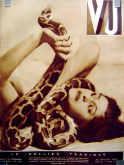
Vu preceded its American counterpart Life by nearly a decade, trailblazing the magazine format of photojournalism. It attracted phenomenal talent; the magazine’s photo credits read like a who’s who of French photography: Cartier-Bresson, Man Ray, Brassaï, Kertesz, Gaston Paris.
The photos are remarkable, and so is the breadth of the magazine’s coverage. The sprawling MEP exhibit does a terrific job at presenting Vu’s editorial range: a hanging in Kentucky, a pre-war visit with Mussolini at his summer villa, an investigation of mental hospitals, celebrity gossip, the lives of Paris street children.
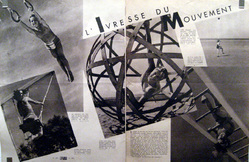
This was all good fun, but the thing that really struck me was the layout of the pages. The design is full of sharp angles and wild proportions—vigorous, effusive, dizzying, almost violent. It commands attention.
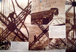
This is particularly true of Vu’s double-page photo essays, where you can feel the designers testing the boundaries. The titles of two such spreads seem to refer more to the page design than to the photos themselves: “The Drunkenness of Movement” and “The Vertiginous Maintenance of the [Eiffel] Tower.”
Some 80 years later, most of these adventurous layouts hold up well, although some have the adolescent sensibility of a high school yearbook staff trying things out. The newsmagazine was a new format, after all; the rules were still being written, and experimentation was the order of the day. We’ve retreated since then to a more conservative sensibility in graphic design, I think.
The innovation and enthusiasm of the magazine’s design is a perfect example of tech advances triggering creative energy and inspiration.
Vu debuted in 1928 amid rapid improvements in photo technology. The arrival of cameras like the Leica and Rolleiflex, in 1925 and 1928 respectively, had just made high-quality photography truly portable for the first time (flashbulbs helped, too; they also appeared in the late ’20s). Wire transmission of photos had become possible in 1921. And the real enabler: New printing processes were making it cheaper and easier than ever to lay out and print high-quality photos in bulk.
Photography had been around for a century, but this was a breakthrough moment, a revolution in modern media. Thanks to a handful of simultaneous tech innovations, an entirely new medium was suddenly created: the photo newsmagazine.
Here’s the cool part. This meant that an entirely new design vocabulary had to be created. This was the first time that designers had the opportunity to mix text and image so freely and flexibly in mass production. With this opportunity came a set of creative challenges so new that an entirely new creative specialization emerged.
The curators of the exhibition described the change this way:
To the ordinary tools of graphic design (variations of image proportion, geometrical forms, symmetries) were added new criteria specific to photography: orientation of bodies in space, direction of gaze, the temporal transitions the images suggest. And so a new specialty was created: the layout designer, whose art consists of arranging images to create a structural logic that channels and directs the attention of the reader.[1]
Wow. It feels familiar, right? In our very own historical moment, you could say something similar about web designers and information architects. We live in a time, as did Vu’s graphic designers, when sudden technological advances have enabled new ways to express the creative spirit.
Now as then, this is more than a matter of having new tools at our disposal. We’re actually carving out new forms of communication as scientific change yields creative and artistic inspiration.
Nearly 15 years after the arrival of the graphical web, we’re still figuring out what it all means. You can see in our own experimentation the same enthusiasm and adolescent gusto occasionally seen in Vu’s layouts.
It’s interesting, too, that when technology influences creative pursuits, the result flavors the culture, too. Technology becomes a preoccupation. We certainly see it now with our own enthusiasm for gadgets and personal technologies, along with protectionist fears of what tech-enabled globalization might bring.
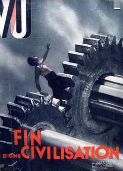
Perhaps not coincidentally, the Vu editors of the ’20s and ’30s seem equally tantalized by technology and its influence (good and bad) on culture. This was expressed most ominously in the magazine’s photomontages, another medium made commercially feasible by the technology of the era. A 1933 cover, for example, announces “the end of a civilization” as a man is trapped in enormous gears.
Sharing the same pages with this doom-and-gloom outlook, though, was a decidedly more awed outlook on the possibilities offered by new technology. The very first edition of Vu in 1928 included a snapshot of a Westinghouse engineer with his quaintly charming robot invention. The breathless caption captures the oh-so-timeless human fascination with scientific wonders:
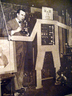
American engineer H. J. Wensley of Westinghouse laboratories just created a robot which he named “Televox” because it follows directions remotely from voice commands or sounds of a musical instrument. The vibrations trigger an electric motor in the robot which makes it act according to the commands received.… This bewildering being is the most striking design of our mechanical time, whose creations, having neither sense nor brain, achieve a perfection that truly appears to approach the supernatural.[2]
We’ve come a long way since Mr. Wensley’s robot, but perhaps less than we might think. It’s tempting to believe that we live in a uniquely tech-focused era, a time when culture, technology and creative life mix to a degree that’s unprecedented. The pages of Vu suggest otherwise.
1. The original French: “Aux outils ordinaires du graphisme (les variations de proportions des images, les forms géométriques, les symétries) s’ajoutent des critères liés a la lecture des photographies: l’orientation des corps dans l’espace, la direction des regards, les successions temporelles que suggèrent les images. Ainsi se crée un nouveau métier: celui de maquettiste, dont l’art consiste à faire apparaître dans l’agencement des images une logique structurante qui canalise et oriente l’attention du lecteur.” Go back
2. The original French: “Un ingénieur américain H. J. WENSLEY, des laboratoires Westinghouse, vient de créer un automate qu’il a dénommé “Télévox” parce qu’il se conforme à distance aux excitations de la voix ou des sons titrés d’un instrument musical. Les vibrations déclenchent dans l’automate un moteur électrique qui le fait agir selon les indications reçues. ... Cet être effareant est la conception la plus saisissante de notre époque mécanique, dont les créations, ne possédant ni sens ni cerveau, réalisent une perfection qui vraiment parait frôler le surnaturel.” Go back


