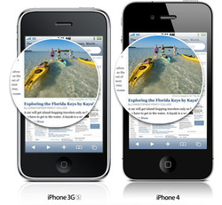
So, um, maybe you heard: there’s a new iPhone out. For my money (and I shelled out plenty for it), the phone’s best feature is the new “Retina display,” the eye-popping high-resolution screen. Everything they say about it is true: at 320 ppi, the pixels are just plain invisible. The crisp bright screen really looks as good as print, absolutely gorgeous.
But what soothes the eye also adds headaches for designers. For three years, the iPhone came in just one flavor of screen resolution: the 3.5-inch screen was always 320x480 pixels. The new phone doubles the resolution to 640x960 pixels. Suddenly, we’re all designing for two different screens. Fold in the iPad, and you’ve got three iOS screens to juggle. (Hey, it’s better than designing for Android phones, which will have around 60 different devices and form factors by year end, but still… device fragmentation has arrived in its own small way in iOS land.)
Apple’s done some nice work under the hood in iOS 4 to make this transition as easy as possible, but designers still have to take on some extra legwork. Here’s the gist.
I’ll Give You Two Pixels for That Point
Starting in iOS 4, dimensions are measured in “points” instead of pixels. Conveniently enough, the iPhone screen is 320x480 points on both iPhone 4 and older models. Since that matches the pixel dimensions on older phones, existing apps look and work the same on those phones in iOS 4 as they did in earlier operating systems. There, one pixel is one point, a one-to-one match.
In other words, dimensions for all the various elements of iOS 4 remain the same, but their units have changed: you just substitute points where you used to say pixels. (Ah, the travails of the hard-working tech writer; the new phone was unveiled just two weeks after my new book Tapworthy went to press. Though the 640x960 screen was already a foregone conclusion, it wasn’t yet clear how iOS would handle the new resolution, so I had to treat the matter with benign neglect. Alas, Tapworthy refers to all of its dimensions in pixels. If you have the book, just squint a little and pretend it says “points” instead.)
On iPhone 4, a point is two pixels; draw a one-point line, and it shows up two pixels wide. So: just specify your measurements in points for all devices, and iOS automatically draws everything to the right proportion on the screen. Text and images remain the same physical size on both old and new phones. That goes for bitmap images in legacy apps, too; iOS 4 blows ‘em up, automatically pixel-doubling them to adapt to the new phone’s resolution.
Of course, pixel-doubled images don’t take advantage of the gloriously crisp display on the new phone. That’s where your extra legwork comes in: to add high-resolution images to your app, you have to include a second set of all your graphic files. For every image in your app, add a second version that’s twice the size, adding @2x to the name. For a low-resolution image named image.png, for example, you would add a second file named image@2x.png. The new image will be picked up automatically by iPhone 4. Everywhere your code requests image.png (or even just plain old image), image@2x.png will be used instead.
Really? Yep, Really
I know what you’re thinking: “Do I really have to make two versions of my images? If I make a single high-resolution set, won’t iOS 4 scale them down on older devices?” Sorry, no, not automatically. While iOS 4 goes seamlessly in the other direction (scaling up low-res images for iPhone 4), it doesn’t work the other way. By default, it scales all images so that one pixel equals one point. That’s a great solution for making sure that old apps work correctly on the new phone, but it doesn’t help you go the other way ‘round.
While you could add additional code to downsize each and every high-res image for older devices, that would a) be a hassle, b) reduce performance, and c) create resized images that don’t look as good as the original. It might be extra work to create two sets of images for both old and new devices, but that’s the right way to go.
In practice, that means Photoshop fans should learn to get comfortable with Illustrator or [insert preferred vector application]. By building your app graphics in vector format, you can export them in whatever size you like with limited muss or fuss. This almost certainly won’t be the last time we see a new iPhone screen resolution emerge, and you can be ready for the next time by prepping all your graphics in vector formats. (Some folks, including Sebastiaan de With and Rusty Mitchell saw this coming a long time ago.)
There’s one exception to that: the app icon. Because of the wide variety of sizes and contexts in which your app icon appears, a pixel-perfect bitmap approach makes good sense. That’s particularly true for the tiniest versions, where the fabulous vector detail of your large icon will just scale down to mush. More on icon Photoshoppery in a sec. First, let’s get acquainted with the growing family of app icons that iOS requires for the various devices.
Boy Howdy, That’s a Lot of Icons
It used to be simple. You used to need just three icon sizes: a big 512px icon for the App Store, a 57px icon for the home screen, and a 29px icon for search results. Now, if you’re building a universal app for iPhone, iPhone 4, and iPad, you’ve gotta create 11 — eleven! — separate icons. And can you believe it: the mix even includes both 57x57 and 58x58 versions. Oh, the humanity. Here’s the rundown:
App Store Icon
- 512x512 (scaled down to 175x175 for display in the store)
Application Icon
- 114x114 (iPhone 4)
- 57x57 (older iPhones)
- 72x72 (iPad)
Spotlight Search Results and Settings Icon
- 58x58 (iPhone 4)
- 50x50 (Spotlight results for iPad)
- 29x29 (settings for iPad and older iPhones)
Document Icon
This is a new icon type in iOS 4. It’s used if your app creates a custom document type. The iPad uses the document icon in two different sizes.
- 320x320 (iPad)
- 64x64 (iPad)
- 44x58 (iPhone 4)
- 22x29 (older iPhones)
Neven Mrgan to the Rescue
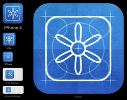
And finally, the promised icon Photoshoppery. The inimitable Neven Mrgan put together a handy Photoshop template to help make quick work of this app-icon assembly line. Highly recommended.
Meanwhile, Back on the Web
If you’re designing mobile websites or web apps, you likewise need to do a tiny bit more work to show off your high-resolution prowess on iPhone 4. WaltPad has all the details on how to use CSS3 media queries to give iPhone 4 (and other high-res devices) their own special style sheets. Good stuff.
