A huge and varied amount of work goes into making any digital experience. As software makers, we do research, we sketch screens, we map flows, we do animation studies, we stub out code, and we make hundreds or thousands of Git commits before we finally ship.
All of this preparation is incredibly important. But the documents it generates are not.
Too many designers get precious about those documents—I know I’ve been guilty of it. Somewhere along the way, detailed wireframes, high-fidelity comps, and motion prototypes all got enshrined as critical deliverables. Those design artifacts are unimportant. Only one deliverable matters: the product itself. Everything else gets thrown away when you ship.
At Big Medium, we are clear-eyed that those artifacts are merely drawings of websites—aspirational watercolors of imagined interfaces. We aim to help clients ship software, not pictures of software. Or, to put it in the words of the Agile Manifesto: we value “working software over comprehensive documentation.”
While we still do lots of planning and thinking, we save the high polish for the product itself. That means we spend as little time as possible on wireframes, comps, and motion graphics. We’ll even skip them entirely if more informal communication gets the job done.
It works. Ours is a nimble process that gets projects finished faster, improves collaboration, and ensures better alignment between design and business goals. And with every engagement, we coach our client teams to help them adopt that process, too.
Tools for thinking and conversation
Don’t get me wrong. Up-front thinking and planning is critically important. It’s as important to design the right thing (strategy) as it is to design the thing right (tactics). That takes lots of thinking, talking, and experimentation. The original spirit of wireframes, journey maps, comps, and the like was for exploration and to communicate ideas efficiently. They began as devices for conversation and experimentation, and in that loose context they remain as useful as ever.
It’s as important to design the right thing (strategy) as it is to design the thing right (tactics).
Over time, process calcified. Artifacts became shrines. These sketches became “milestones” and “deliverables.”
It became the norm to design a website over and over again in high fidelity across several different formats. First the UX designer sweats over a detailed wireframe. Then the UI designer replaces the wireframe with a detailed comp (and then another and another and another). Then the interaction designer replaces those comps with a full-blown motion prototype. Our industry builds generations of carefully crafted, disposable facsimiles before even writing a line of code. It’s a waste of time, effort, and resources.
“As it stands now, every step in the design process and every artifact produced is a dead end,” says Benjamin Wilkins, design technology lead at Airbnb. “Work stops whenever one discipline finishes a portion of the project and passes responsibility to another discipline.”
In fact, all those high-fidelity pictures of websites and earnest drawings of apps soak up much needed time from the work that matters: building the actual product itself.
“There’s only one role that’s strictly necessary to get a software product made: the developer,” says designer Dan Mall, SuperFriendly founder and frequent Big Medium collaborator. Yet developers are often left with bare scraps of time after designers burn weeks on wireframes and comps that will ultimately get thrown away.
Designers, I love you. I’m a designer myself. But there’s a better way for us to work. At Big Medium, we treat those artifacts as rough sketches, not deliverables, and we instead shift our design effort into working software.
Here’s how we do our thinking and planning:
- Words, not wireframes
- Skip the wireframe, sketch mobile UI
- Push the point of production downstream
- Code commits instead of redlines
- Cultivate trust outside of documentation
- The product is the common workspace, and vice versa
Words, not wireframes
I stopped making wireframes years ago, with the inspiration of the brilliant Jennifer Brook. Jennifer was the researcher and interaction designer on our projects designing the TechCrunch and O’Reilly Media websites back in 2013 and 2014. Jennifer showed us that you could do the work of a wireframe with a simple spreadsheet.
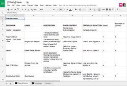
Gorgeous, isn’t it? No, really. It at once has lots of content detail but very little layout detail. It doesn’t prescribe visual layout at all; there are no boxes or arrows here. And that’s okay—great, even—because the UI designer will almost certainly have stronger ideas for layout. Let’s not waste time on that now (or tie the UI designer’s hands).
Instead, the spreadsheet details the content that this page should display, with brief notes on functionality. This is work that’s informed by customer and stakeholder research. And it puts an implicit focus on the jobs that this page has to do, as well as each of its elements (or “organisms,” in Atomic Design lingo).
I’ve since become more explicit about that focus on jobs, goals and outcomes, so I also accompany every page’s spreadsheet with a list of:
- mindsets that users bring to these pages
- tasks that the page can complete for users
- goals that the page must fulfill for the organization
These always reference and build upon the findings from our research interviews. These contexts describe the page’s reason for being. Any element that doesn’t address those mindsets, tasks, and goals does not belong. To help check that, I also add a column to label the primary job for each element.
Now we have a discussion document that sets out the content of the page, along with the priority, function, and existential job for each element—all in plain text. This simple, prioritized list of content turns out to be a valuable discussion piece. Does the page have all the content we need? Do the content and functionality focus tightly on the jobs we agree this page should do? Is the content in the proper priority?
The focus is not only on what to make, but why… and to what end. The entire team can use this document to have a conversation about the UI solutions that will best deliver on those tasks and goals.
“The core value of a wireframe is in the conversation, not in the boxes,” says accessibility expert Derek Featherstone. If we can get to that conversation without the wireframe, perhaps we don’t need that wireframe in the first place.
Skip the wireframe, sketch mobile UI
It turns out, though, that the spreadsheet quietly delivers a kind of stealth wireframe on its own. Squint your eyes and just look at that first column. It looks an awful lot like a mobile wireframe, doesn’t it? It’s a single column of content elements, a box for each. This gives us enough to sketch out a design.
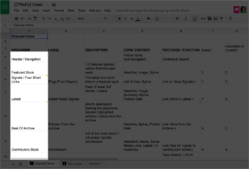
Traditional wireframe layouts are distracting because they say both too little and too much. They say too little in the sense that civilians often have a hard time imagining how those squiggles will actually look as a website: “Sure, I guess that’s fine, but I’ll need to see the whole thing to know for sure.” (In other words: “you’ll need to design the website before I can approve this wireframe.”)

Wireframes also say too much. Despite their abstraction, wireframes create expectations for what the layout should be before the layout expert—the UI designer—even starts work. The whole intention of wireframes is to put the focus on content hierarchy instead of visual design, yet the very fact that they embed layout undercuts that mission.
Turns out our humble spreadsheet gives us enough to validate content hierarchy. So instead, we go straight from the spreadsheet to a proper visual sketch. Now we can let people evaluate a design that actually looks like a website.
Working with mobile comps at this stage lets us visualize our spreadsheet content in the context of first-take brand styles and interaction models. And because mobile layouts are far less complex than widescreen versions, we don’t yet dive down the rabbit hole of figuring out the whole layout puzzle. The emphasis remains on content hierarchy.
Along the way, we still draw the boxes to share layout ideas with each other, but we do it in informal sketches on paper and whiteboards. But these are not the carefully annotated, high-effort specifications that is typical of wireframes. These sketches are instead the minimum we need to convey an idea and get to the next stage of production.
Push the point of production downstream
By skipping wireframes and jumping into mobile comps, the UI designer is effectively replacing production work that’s traditionally reserved earlier in the process for UX and interaction designers. The core tenet of our process is to push as much production effort downstream toward working software.
In fact, front-end developers are already up and running at this stage, too. Even as the mobile comp is getting sorted out, developers have enough to go on to start blocking out page layout. Pseudo-code markup yields “pseudo-design” visuals, scaffolding for the interface to come.
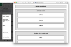
In short order, that pseudo-design gets replaced by the real thing, or at least as much as we’ve figured out so far. Once we feel like the comp design is about 70 percent there—on the right track but not yet complete—we shift design into markup. We linger as little as possible in static comps. We treat these only as sketches, initial explorations. The front-end developer takes over production of the interface from here on out, as we continue to fine-tune the design and sort out responsive behavior.
That doesn’t mean that the developer is exclusively responsible for the rest of the design. UI and UX designers are right in there collaborating, offering feedback, suggesting direction. Informal sketches and spot comps of individual components fly back and forth. Conversations are frequent.
To bring the design home, designers continue to work in their preferred tools—everyone should work where they do their best thinking—but instead of cranking out elaborate full-page comps, they comp the small bits that need attention. It’s a just-in-time design process that supports developers with what they need in order to do the very next thing.
This process evolved over several years in collaboration with Dan Mall and Brad Frost. They put together a two-hour (!!) video that illustrates how this back-and-forth works:
In this process, design becomes a collaborative effort, with the developer as the main point of production. What you see in the browser—the product itself—becomes the reference design, not a static wireframe or comp.
This means design and development happen in parallel, interleaving efforts. If they like, developers can contribute to solving design problems instead of implementing received solutions. The happy result is that they also get more time to work on the project. This design process extends the development deadline instead of shrinking it. It also hedges against unexpected trouble; problems not immediately evident in static comps can surface sooner to be solved earlier.
Done badly, though, this arrangement could leave developers whipsawed by the changing whims of designers—or flummoxed by a flood of redlines and spec changes. The fix is to get designers involved in the dev work, too.
Code commits instead of redlines
Just as we get developers involved earlier in the design process, we also get designers contributing to development. In traditional process, designers deliver corrections and updates to developers in the form of redlines. These are marked-up comps showing where spacing, font size, border radius—you name it—needs to be adjusted. Instead of using redlines, we enable designers to handle those changes themselves.
Depending on the project, we use either a design token platform or a simple SASS variables file to create a single place where all design values are held. It’s where all the hex colors, typefaces, paddings, margins, and the like are defined. With little to no coding know-how, designers can get in there and edit the variables, which go straight into the build process to update the design—no redlines needed.
The result is that specs live in the code itself and are available to designers and developers alike. This is also a boon for future maintenance. Static spec documents tend to fall out of sight, out of mind. By recognizing the production code as the source of truth and by opening a corner of it to designers, everything is always in one place and visible to all. No redlines required.
The product is the common workspace and vice versa
By pushing into code as early as we can and by finishing the design inside working software, the team’s working environment converges. The wonderful effect of this is that designers and developers both locate design truth in the product itself, and the design system emerges in production code.
That’s a far better arrangement than trying to document a design system inside a Sketch library, for example. As I recently wrote, such a library will inevitably fall out of sync with what’s in production:
This causes a disconnect between designers and developers because design comps drift from the realities of the established patterns in the code base. A Sketch library—or any collected drawings of software—can be a canonical UI reference only when the design is first conceived. Once the design gets into code, the product itself should be the reference, and fresh design should work on top of that foundation. It’s more important that our design libraries reflect what’s in the code than the reverse. Production code—and the UI it generates—has to be the single source of truth, or madness ensues.
This does not mean that designers have to be come developers. We can still use our favorite visual design tools. But now we’re riffing on and improving the designs pumped out by the developers’ pattern library.
In fact, once there’s a sturdy pattern library in place, comps aren’t always needed. That original spreadsheet, or a quick whiteboard sketch can get the job done. Just name the patterns to use, and the developer can get a first prototype up and running in the browser. From there, designers and developers can bounce back and forth to refine the final design.
Cultivate trust outside of documentation
Documentation signals lack of trust—either in ourselves or in others. Sometimes it’s distrust of the people who will implement the design. Other times it’s a lack of faith in our own memory (or our organization’s) to remember our decisions months or years down the line. Sometimes we just do it to cover our butts.
Trust is a human concern, however, not a technical one—and it requires human solutions. Meticulous documentation can often be replaced with (or at least reduced by) real-time communication and collaboration—just enough to communicate intent. Good communication and fast progress will boost trust, understanding, and quality better than any detailed spec.
Meanwhile, embedding specs into the fabric of the production code makes the product self-documenting. It’s an approach that aids individual and institutional memory much better than off-to-the-side documents that often go ignored or, worse, go missing. Comps, wireframes, and motion studies are terrific thinking and sketching devices, but we over-invest in them. In doing so, we make them a replacement for more meaningful and successful collaboration on the end product itself.
We’re all here to make amazing, meaningful, lasting products. The explorations we make along the way are ephemeral, and it’s okay to treat them that way. Eyes on the prize, friends.
Is your organization wrestling with slow process, inconsistent interfaces and duplicative design work? Big Medium helps companies scale great design and improve collaboration through design systems and other best-practice process. Get in touch for a workshop, executive session, or design engagement.
