Connor Sears of ZURB offers a useful lesson in designing good (and bad) interface metaphors for touch devices. He makes a run at iPhone’s built-in Voice Memo app, noting that the big shiny microphone does nothing except to distract users from the actual location of the phone’s mic (at device bottom):
Real world visual metaphors can be useful in helping users understand an interface. Buttons are a perfect example of this. The problem is when designers over use visual metaphors that don’t relate to any functionality. When that happens, the metaphor confuses users.
Connor offers up an elegant alternative, a design that features nothing except a big can’t-miss Record button and an indicator to show where to talk into the mic. Fine work.
Using real-world gizmos as interface metaphors is a familiar strategy for desktop designers—and graphic designers, too, for that matter. But touchscreen devices create new expectations: if it looks like it can be touched and operated, that’s what we’ll try to do. Used appropriately, these I-can’t-believe-it’s-not-butter facsimiles offer useful hints about what can be touched and what can’t. But when they’re just eye candy, those hints are only misdirection.
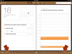
iPad users know this one: the attractive Calendar app looks like a book, creating the expectation that you can swipe to turn the page. No dice. You have to tap those tiny arrows at the bottom of the screen to flip the page.

The iPad’s Contacts app is even worse. Try to flip the page by swiping at the interface, and you actually delete content:

Used appropriately, however, familiar real-world objects give users implicit, no-brainer explanations of how to work the app. If the Calendar and Contacts app actually flipped their pages with a swipe, then the book metaphor would serve its purpose. So how to stay out of trouble? Fred Beecher offers up a useful starting point with his UI Guidelines for Skeuomorphic Design, a great read that starts with this cardinal rule:
If it is functional in the physical version, it should be functional in the multi-touch digital version.
Seriously. Tattoo that line on your mouse hand, and have it laser-etched on the back of your phone. When you introduce touch, virtual devices must respond just like their physical counterparts, or you’ve picked the wrong metaphor.


