Sometimes the best way to solve a new design problem is to find out how others solved an old one. That’s the whole idea of design patterns, which stake out familiar solutions to common problems. In recent days, several mobile design-pattern resources have passed through the series of tubes which criss-cross my desk. All are useful sites for reference or inspiration for mobile app designers:
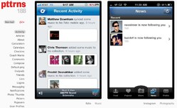
Pttrns
Pttrns is a project of Robin Raszka and neatly categorizes screenshots of iOS apps according to functions like logins, searches, custom tab bars, and so on. Nice work, lots of great examples.
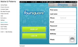
Mobile UI Patterns
This site from Mari Sheibley similarly clusters iOS screenshots by functional category. While a bit less comprehensive, it’s a great companion to Pttrns.
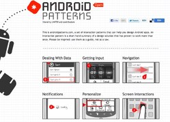
Android Patterns
Unlike the other sites, this one doesn’t show screenshots but instead uses wireframe sketches to show common solutions to frequent design problems. In the Dealing with Data category, for example, patterns are organized by the specific challenge: “How can I change view on a set of data?” “How can I let users know my app is loading data?” “How can I let users sort data?” etc. This wiki site is a project of UNITiD.
TappGala

This one’s not really a design pattern collection, but it is a consistently good and useful gallery of pretty designs. A fine resource of inspiration and clever experiments. TappGala is a project of John Phillips and David Mulder.
