Emmet Connolly shared some wonderful thoughts about pattern libraries—and how they’re only one part of a full design system:
But there are a few problems with pattern libraries. Yes, they allow you to keep all of the smallest elements consistent. But they don’t have an opinion about how they should be put together. They don’t know anything about your product or the concepts behind it.
To return to our Lego analogy, simply having a limited pattern library of bricks to choose from doesn’t preclude me from building some really crazy shit.
Now think about those branded Lego kits you can buy. Each piece is much more opinionated. It knows what it’s going to get used for. There are still generic pieces involved, but when you put them together in a certain way they form something specific, like the leg of an AT-AT Walker. This is a design system.
I love it. Design systems are more than a kit of parts. The best design systems have a strong point of view—a gravitational force that coerces disparate components into patterns and ultimately into a coherent whole. The design system brings order to the pattern library and what would otherwise appear to be a chaotic jumble of components.
Another metaphor: if components are words, then patterns are sentences, and the design system is the full story.
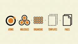
If this nested arrangement echoes Brad Frost’s Atomic Design methodology, that’s by design. Atomic Design champions design elements built from a common set of lesser design elements. In Atomic Design, UI “atoms” assemble “molecules” which assemble “organisms” which assemble templates which assemble pages.

But there’s a common misunderstanding about Atomic Design which Connolly in turn suggests is a limitation:
Atomic Design will tell you to take some of your basic elements (label, input, button), stick them together, and call it a molecule. Then you can reuse that molecule again and again. Further, you can stick some molecules together to form a reusable organism.
The problem with every real-world example of a system like this that I’ve encountered is that they remain willfully unaware of the product being built.
Atomic Design does indeed promote reuse, assembling larger parts from smaller ones. However, many mistake this philosophy for linear process, that somehow Atomic Design demands that all design must first start by building its smallest pieces (e.g. “start with buttons and labels”) before proceeding to page- and site-level design. It’s an approach that would indeed be blind to the end-result project, placing design tactics ahead of design strategy. But that’s exactly opposite to how Brad himself approaches projects.
It’s never a linear path from small to large; it’s a constant roundtrip between the two scales.
Right from the start, when Brad was first developing his tools and methodologies in our designs of TechCrunch and Entertainment Weekly, our process constantly zoomed back and forth between page level and atomic level. It’s never a linear path from small to large; it’s a constant roundtrip between the two scales.
As Connolly writes, “Complex systems can be designed, but to do so you must first sketch the outline. Only then can you start filling in the detail.”
Well said, and I totally agree. Indeed, our Atomic Design projects always begin with the big-picture questions. What are the business goals for the project? What are the user needs? What’s the brand promise? When we get to individual pages, it’s about the user mindset when they arrive, and the jobs the page has to do for both user and company.
From there, we do sketching of the whole page, identifying the broad design patterns that the page needs to do its job. We start to imagine the components necessary to bring those patterns to life.
Only then do we start to work at the atomic level, building out those component atoms and molecules to construct the pattern organisms, and ultimately the page itself. As more high-level pages and components are designed, we zoom back down to revisit the atoms and molecules, making adjustments to make them more flexible and support a wider range of organisms and pages. The atoms and molecules might compose the design, but it’s the high-level design that creates the order, the overall system.
In the end, a pattern library emerges. Here’s the important bit: the design system is implicit in the process that led to the library’s construction, and it’s implicit in the design’s use of components. For a small team on a contained project, that implicit knowledge may well be enough, commonly shared in the heads of the designers who built it.
But implicit knowledge won’t do when you’re working at scale across many projects and many teams. The design system has to be documented. That’s where all the other artifacts of a fully articulated design system come in: design principles, style guide, voice and tone, UX guidelines, code repository, and so on.
I agree very much with Connolly that those pieces are required for the “full-stack design system.” My only caveat is to add that an Atomic Design process can get you there, too.
Atomic Design surfaces all of those aspects during the course of the design process. Responsible designers document them.
For more, see The Most Exciting Design Systems Are Boring.
Is your organization wrestling with inconsistent interfaces and duplicative design work? Big Medium helps big companies scale great design through design systems. Get in touch for a workshop, executive session, or design engagement.


