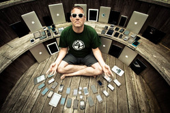
Mobile arrived as both opportunity and crisis, forcing designers to find new ways to present information across a challenging range of screen sizes. Through responsive web design and app development, we’ve done heroic work to design for each of those devices individually. But for all of our advances in technique, a new design crisis has developed. This one’s less about the variety of devices that we use and more about the sheer number. As we juggle more and more gadgets in our daily lives, we often get stuck between them. As devices multiply, the new opportunity is less about designing individual screens, and more about designing interactions between the devices—often without using a screen at all. There’s untapped magic in the gaps between gadgets.
One Task, Many Devices
We’re all constantly switching between devices, from phones to laptops to desktops and tablets. A 2014 study in the UK found that in the course of a typical weekday evening, the average Brit switches devices about 21 times an hour—and 95% of the time, the TV is on in the background, too. Much of the time, this gadget-switching takes place while we’re completing a single task. An August 2012 study by Google found that 90% of people who own more than one device complete tasks across their multiple devices. For example, 2/3 of us shop across devices: we start shopping on one device, typically a phone, and finish the transaction on a laptop or tablet.
The way we shift tasks across devices isn’t pretty. We lurch and heave our data from one to another, often through clumsy hacks. You know the drill: we’re constantly emailing ourselves URLs just to shift an activity from our phone to our laptop or vice versa. We text a phone number or photo to the person sitting right next to us. Or, most often of all, we just start from scratch on the second device, firing up a new search to find our place and start all over again.
The consumer desire to shift tasks across devices is obvious, but the design solutions aren’t in place yet. As customers, we’ve come up with primitive hacks to make it work. But as designers, we’ve simply ignored the problem.
What Should Interactions Look Like?

Operating systems are just beginning to address these transitions between devices. Apple’s 2014 OS update, Yosemite, does so with Continuity and Handoff. With Handoff, if it’s taking me too long to write that email on my phone, I can go over to my laptop, and there’s a little icon waiting for me. When I click it, the very same email from my phone materializes on my computer and I can continue typing right where I left off. Similarly, if I’m looking at a map on my laptop, I tap an icon on my phone, and I can see the map there. Android is rumored to be working on a similar service called Copresence, and Samsung has announced its version, called Flow.
This is all heartening to see, but at the moment, they’re only plumbing, basic infrastructure to connect devices. That’s badly needed, but it’s only half the story. Designers have the fun challenge of creating effortless interactions to improve these services. Right now, features like Handoff are entirely screen-based, a virtual interaction that ignores the fact that they’re bridging a physical gap—the space between phone, tablet, desktop, laptop, or television. Digital experiences have become physical in recent years as we’ve etched our interfaces onto the slabs of glass that we carry out into the world with us. When we stop considering these things as screens but as physical objects that can interact, the possibilities become at once simpler, more playful, and more human.
The Role of Sensors in Interactions
Our phones, tablets, and computers are loaded with sensors. With sensor-based interactions, we can now move interactions off the screen. One fun example is Drumpants, a sensor kit that you, um, slip into your pants to turn it into a musical instrument. Tap out a rhythm on your knee, slap your thighs, and tap your foot to become a 21st-century one-man band. It’s far more immediate, natural, and familiar than using a new-fangled touchscreen music app. It bends technology to our natural behavior, rather than the reverse.
We absolutely have more important problems to solve than giving the world Drumpants, but toys like this are important. It’s novel, playful thinking like this that can help us begin to imagine and develop off-screen interactions. What does it mean to start thinking of our devices as physical objects with real, local presence, instead of disembodied screens on the network?
Happy Together is a prototype I created with my studiomate Larry Legend to show how this might work. The video above shows the result: Larry’s listening to music in the studio, and he has his headphones plugged into his phone. He gets to his computer and wants to start listening to music there. So, he taps the phone twice on the computer, like he’s shaking the music out of his phone onto his desktop. The music picks up on his computer seamlessly, playing from the exact same moment. It’s something you can do now by tapping buttons on your screens, but it could (and should) be better. That’s the kind of natural, physical interaction we should be aiming for. We also have this working with maps, URLs, text, and photos—just shake the content from your phone into your computer. It makes your gadgets, and you, happier together.
Designing Obvious Interactions
We’re starting to see other early experiments that recognize the physical relationships between our devices. For example, the Misfit Shine fitness tracker lets you sync the device with your phone by laying it right on the touchscreen. Waves slowly begin to radiate out from the Shine, and you can watch the data soaking right through the screen, like magic. Or so it seems. Like all magic, there’s some misdirection at work here. It has nothing to do with the screen—it’s actually a familiar wireless sync via Bluetooth. This charming interaction was the result of a design flaw. When the Shine got its lovely metal casing, it blocked the radio signal so much that the designers realized it worked only when you brought the Shine right next to the phone. As a wireless sync, it seemed like a bust. How could you get people to put these things so ridiculously close to each other? Then they thought, Maybe we can get them to put it on the screen. The result is the illusion of a direct physical link. Just put the two devices together, and they talk to each other. It’s almost like they’re kissing, exchanging their data in a lovely, social, physical interaction. Sometimes, hitting what seems like a roadblock or constraint ends up working in your favor.
Simpler Than You Might Think
Here’s the thing: this kind of magic doesn’t require new science or new technology. There’s tons of tech and code ready and waiting for us to use—often laying fallow in our pockets, handbags and living rooms.
For example, Aral Balkan built Grab Magic, a nifty interaction that turns you into a wizard, in an overnight hack. You play a video on a projector, grab an image from the video from thin air, and throw it right onto your phone. It’s startling to see in action, breathtaking in its novelty. But the underlying technology is disarmingly simple. To make the stunt work, Balkan taught an Xbox Kinect to take a screenshot and send it to his phone when it saw his “grab” motion, then taught the phone to reveal the image with a touch of the screen. These are such simple, fundamental interactions to the Kinect and smartphone that you wouldn’t give them a thought in isolation. But the combination is exciting, and that’s where the magic lies.
We tend to think of our interfaces in isolating ways: “Oh, this a mouse and keyboard interface. And here is a touchscreen interface. This one is for voice. This one is for Kinect air gestures. This one is for camera vision.” But the reality is that more and more of the computers we carry every day have all of these features onboard. They can and should do these things in combination—for both ease and wonder.
Making Interaction Human Again
Creating natural interactions for these freshly physical interfaces has the important potential to diminish the importance of the screen. As the internet of things expands, becoming embedded into everyday places, objects, and even people around us, we should move interactions off the screen and into the environment around us.
Screens isolate us from one another. The more connected we are, the more disconnected we seem to be from the people and places we care about. At the dinner table, in bed, at the office, on the street, we’re heads down in our devices instead of heads up in our lives. We can do better.
By embracing (and combining) sensors, we have a fresh chance to create interactions that bend to the way we interact with the world, rather than the reverse.


