Turns out snake oil is actually good for you. The stuff is high in antioxidants, and it’s a potent anti-inflammatory. These modest health benefits do not mean that snake oil will cure cancer, regenerate lost limbs, or reverse aging. As always, be distrustful of folks hyping any solution as a cure-all—but don’t assume it’s useless, either. We might just need to come at it from a different angle.
AI has a snake oil problem. Generative AI has delivered an extraordinary leap in capability that is often jaw-dropping. But it’s sold and applied (by giant companies with vested interests) as something that can answer any question, do any job, or fill any role. When AI fails to live up to these outlandish promises, there’s a justified backlash—loss of trust, accusations of hucksterism, and wholesale dismissal of the technology.
Pushers of the AI miracle cure are “promising God and delivering email prompts,” Signal president Meredith Whittaker said last week. The high expectations of the soapbox spiels are a mismatch for the relatively humble capabilities that have been delivered so far. That’s too bad, because we’re missing the genuine utility of this latest crop of machine-learning tools by burying it in hype and poorly considered applications. What AI is reliably capable of is genuinely remarkable; yet our expectations are routinely jacked up beyond reason.
“Imagine having products THIS GOOD and still over-selling them,” writes Drew Breunig in a plea for “sober AI.” “The end result is we train users to dangerously trust whatever AI slop they’re presented or we train them to dismiss the whole field.”
This is not (only) a matter of marketing or hubris—it’s a design problem. The job of UX is to identify problems worth solving, pick the right technology (if any) to solve that problem, and then set expectations and channel behavior in ways that match the system’s capabilities. It requires a clear-eyed understanding of what the technology is good at, what it is not, and where it fits.
That’s always the job of design. But setting expectations and channeling behavior is more important than ever in cases like AI-mediated experiences where designers are not always directly in the loop. Let’s look at a couple of examples.
AI overviews are a good idea, poorly presented
When Google launched AI overviews last month, the feature got tripped up by embarrassing recommendations to add glue to your pizza or to eat rocks to improve your health. In addition to a few giggles, the gaffes contributed to a growing consensus that AI just isn’t good enough—and that Google miscalculated by shipping the feature.
Google is dead beyond comparison pic.twitter.com/EQIJhvPUoI
— PixelButts (@PixelButts) May 22, 2024
Here’s an unpopular take: AI overviews are a good idea and a worthwhile application for large language models (LLMs). But! Their current iteration also has a design problem: the presentation suggests confidence that the system is not designed for and that the underlying data does not support.
Here’s the good-idea part. There’s an LLM under the hood, but it’s not what’s providing the answer; LLMs are unreliable answer machines, so this is a good call. The LLM instead interprets the request, does the search, and then reads/synthesizes the top results. The good ol’ Google search engine still delivers the raw-material results, and the LLM merely rounds up what’s in those links. Like it says on the tin, it’s an “overview”—a layer on top of Google’s traditional ten blue links. The idea makes sense, and it’s well suited to what LLMs are good at—interpretation, synthesis, reformatting. The goal is to save you the effort of clicking through the ten blue links to tell you what’s inside. (The fact that this will throttle traffic to the sites that source the traffic is an important and separate problem.)
Alas, the way the AI overview is presented makes it seem like “the answer,” and that’s not what this search-results summary is. The promise does not agree with what’s delivered, and the mismatch delivers a broken experience. The just-the-facts result appears to prescribe glue for your pizza, when in fact, it’s giving you a book report of the ten blue links—one of which is the jokey Reddit thread that suggested preventing cheese slippage by adding glue to your pizza or by hammering nails into the crust. If there’s a data problem here, it’s with Google’s ten blue links. The AI overview is technically correct based on the job it was given: It delivers nothing substantively different from the ten links, and yet its presentation changes everything.
I wrote about this years ago in my essay Systems smart enough to know they’re not smart enough. Too often, we present machine-generated results with more confidence than the underlying system reports. We rush to present the results as one true answer when the data and results don’t support it. This is a kind of design dishonesty about the quality of the information—or at least an over-optimism in what we can confidently share with users.
The design challenge here is: what language or presentation could we use to suggest that the AI overview is only peeking into the top results for you? How can we be more transparent about sources? How and when should design or UX copy engage the user’s skepticism or critical thinking? How can AI systems handle humor, satire, and sarcasm in search results?
The takeaway: machine learning and AI are great at providing signals and suggestions, but unreliable (and sometimes flat-out awful) at providing facts and answers. Adjust your presentation accordingly. Acknowledging ambiguity and uncertainty is essential to designing the display of trusted systems. There’s real value to be provided here, but there’s hard design work yet to do.
A mind-bending demo dismissed
If incomplete or inexact results can still be useful with proper presentation, the same goes for incomplete process or artifacts. Rather than overpromising what partial solutions provide, let’s think smaller. Let’s see how machine-generated results can improve our work instead of replace it.
Last week, Eric Vyacheslav shared this demo on LinkedIn, writing “GPT–4o is going to completely change the way we design. This is GPT–4o generating Figma designs based on PRD (product requirements document).”
The comments are full of folks dismissing this demo out of hand: This isn’t real design. There’s no brainstorming. There’s no iteration. There’s no discussion. The result is generic and allows for no innovation.
Friends! Hang on a second. Let us start by acknowledging: this demo is freaking amazing. No details were provided about the quality of the PRD, or what tool was used to generate the results, and those things matter, of course. But going from requirements document to first-draft Figma file in 30 seconds is astonishing and, with the current crop of tools, entirely plausible. A year ago, our brains would have melted seeing this.
This is clearly not a replacement for the entire design process, but it’s not hard to imagine that this new capability—instant draft from a requirements doc—could somehow improve some stage of our process, or empower new audiences to share design ideas. Instead of dismissing the demo with “no but” why not respond with “yes and”? How might a tool like this help our process or include a new audience?
The snake oil problem here is the assumption that this technology would replace the whole design process—click a button and done! Instead, it’s much more powerful to think smaller. What part of the design process could this it ease, even with a clumsy draft? What new conversations could it enable? How could it make design more inclusive?
The wonderful Scott Jenson swooped in to poke at the demo.
Sorry, I feel like such a wet blanket these days. This demo shows promise to be sure but it’s all the ‘little stuff’ that it conveniently doesn’t show:
- PRDs are always inconsistent, incomplete, even flat out wrong
- What is the quality of the Figma output? Does it layer things well, create semantically meaningful groups, use auto layout, create components?
- If I make changes to the Figma file and the PRD changes, what happens?
None of these are ‘gotchas’ that kill the concept. They are just likely pain points that aren’t addressed by this demo, so I need to know more. By producing such impoverished output, this could actually place MORE burden on the designer as they have to clean up that mess to productize it. …
Just like people freaked out when ChatGPT spoke like a pirate, they are equally freaking out when they see ANY output into Figma. It’s impressive, it’s a great start, it may eventually even work. But this is a complex problem and a demo like this isn’t nearly enough. I want us to be more nuanced in talking about problems like this.
Scott framed his response as being “a wet blanket,” but I see his comment as genuinely productive “yes and” thinking. He acknowledges that this demo is a promising first step—but it’s the beginning, not the end. It’s an opportunity to ask what’s next and what is this for. What are the barriers to using this? What needs to change to make it useful? Where does it sit in our process? What change do we hope to accomplish with it? What could go wrong? These are all excellent design and UX questions as we learn to use this new design material.
Reading between the lines of Scott’s response, it’s easy to see his fatigue about AI boosterism and the rush to say, “see, AI solved it!” He’s sick of the breathless enthusiasm and the snake oil pitch—but he also sees the undersold actual value of the medicine. Let’s slow down and see what this medicine can actually do and what it’s good for.
Putting snake oil to healthy use
There are options between swallowing snake oil promises and rejecting the medicine outright. As we adjust our expectations to what’s viable and reliable, here are some questions to ask:
What’s the problem to solve? Before rushing to apply AI to every little thing, let’s make sure we’re clear on the outcomes we’re trying to achieve.
Is it the right medicine for the problem? Is generative AI the best solution for what we’re trying to do? Would other, simpler machine-learning tools work better—or maybe no machine learning at all?
What do you take with the medicine? If AI won’t solve the whole problem, what other steps, process, communication, or technologies should be paired with it?
Would the medicine be more helpful for a different population? If an AI-powered solution doesn’t add much value for a certain group, would it be helpful for another one? Does it empower people with less domain experience? Does the Figma-building demo hint at an opportunity for product managers or other stakeholders to participate in design conversations in a new way? Instead of delivering design, what if we think of it as a way to validate our requirements?
Do you trust the doctor? Who’s pitching the medicine, and what do they have to gain from it?
Is the cure worse than the disease? What’s the cost or risk of using AI here? LLMs are expensive in a lot of ways (economically, socially, environmentally, organizationally); does the benefit outweigh the cost, and for whom?
Is there a warning label? If there are risks, what’s the best way to convey them? How and when do we engage the user’s productive skepticism and critical thinking?
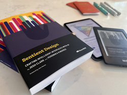
Sentient Design is intentional design
Sentient Design is the already-here future of intelligent interfaces—experiences that seem almost self-aware in their response to user need in the moment. Veronika Kindred and I are writing a book about it. While Sentient Design describes the form of this new experience and what AI unlocks, it also describes a framework and philosophy for using it. As we make mindful interfaces, designers have to be mindful, too.
Sentient Design is about AI, but also not really. It’s about identifying worthwhile problems and seeing where this new crop of AI tools can enable meaningful solutions. There’s so much opportunity and good work to be done. Let’s prove what it can do before we rush to call it a revolution. Let’s not get high on our own supply.
Me, I feel the full mix of excitement, curiosity, creativity, skepticism, and anxiety about all of this. I’m letting myself feel all of those things as I explore these new tools, make new stuff, and see what they’re good and bad at.
There are two things I feel confident about. First, AI will continue to introduce us to new ways to screw things up, like any technology. And powerful interests will use AI to screw things up in ways they expect will increase their power or profit, like any technology. And we’re seeing those things happen. We can’t be pollyanna about the ways that these things can go sideways or be used for ill. People will use these things naively, cynically, carelessly, and often all three at once.
Second, I’m also confident that the anti-patterns we’re seeing aren’t the only way to use this stuff. There are a lot of good and meaningful things to create here. We’re still learning the grain of this design material and how it wants to be used. What new opportunities does it unlock, and what benefits can deliver—and at what cost? And is that a cost that is worth bearing?
Even as I hold my nose about some of its applications, I’m learning from what those things can teach us. The best response to failed experiments is not, “What a dumb idea, there’s nothing here.” For what it’s worth, I prefer: “What can we learn from this? What’s next?”
I’m mighty excited about Sentient Design and AI-mediated experiences, even as (and maybe especially as) we learn from our mistakes. Let’s just, you know, make sure we actually do learn from them. That means distinguishing the snake oil from its pitch.
Is your organization trying to understand the role of AI in your mission and practice? We can help! Big Medium does design, development, and product strategy for AI-mediated experiences; we facilitate Sentient Design sprints; we teach AI workshops; and we offer executive briefings. Get in touch to learn more.