Le Monde’s weekend magazine offers a profile this week of Seniosphère, a French consulting firm that helps client companies to market more effectively to seniors and baby boomers.
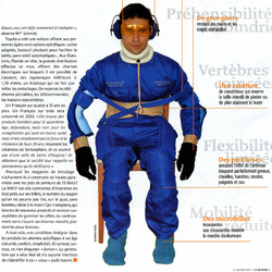
Of particular interest is the company’s use of the third-age suit, an “empathy suit” that’s designed to simulate the reduced mobility, hearing and sight associated with aging. Originally designed by the Ford Motor Company in partnership with the University of Loughborough in the UK, the suit is designed to help designers discover how well their creations work for aging customers.
Goggles reduce vision, and a headset reduces hearing. Heavy gloves simulate the reduced mobility of arthritis. Back, knee and neck braces reduce flexibility, while special shoes make walking painful. Shoulder straps prevent arms from being raised.
The result is a full-body prosthetic that ages its wearer 40 years. Le Monde’s reporter Pascale Krémer describes the experience:
How can I take notes with my arthritis? The notebook is too small… Too bad. My memory will have to be more valiant than my body, heavy and stiff with age. Remember to describe all these unpleasant sensations. The humiliating effort to extricate myself from the couch. Knees that refuse to bend to pick up a handbag on the floor.
Arrived at the supermarket, it’s not arranged well. Why the devil do they always put the packs of milk so high? Maybe they think that it’s easy to lift six big bottles at once, arms stretched out, then put them in the shopping cart without breaking my back…
Where have they hidden the decaf? All the packages look the same in this light. Apparently, it’s written too small on the label. Ah, it’s up there! But how am I going to get it with this bad shoulder? Damn! I forgot the sparkling water. Naturally, it’s at the other end of the store. I’ll skip it. My feet hurt too much to go all the way back.(*)
Seniosphère has already plunged several mall and supermarket managers into the third-age suit (also called the mobilistrictor, or “mobi” for short). The experience has turned up a range of accessibility issues: Long walking distances, shelves that are too high, shopping carts that are too heavy, too few benches and restrooms.
Empathy is, of course, a cornerstone of good design. Understanding how, and by whom, your creation will be used is crucial to understanding whether it will actually work. The old saw tells us that empathy comes after walking a mile in someone’s shoes. The third-age suit takes it a step further, making you walk a mile in their arthritic knees, hips and back.
Accommodating the physical needs of seniors isn’t just a nice-to-have. One in five Americans is over 55. In France, where few public facilities accommodate disabilities, it’s even higher at one in four. Japan has one in three.
And it’s not just architects and supermarket managers who need to take note. Software and web designers have their own accessibility issues to manage, particularly to accommodate users with reduced vision and motor skills. Robust visual interfaces should include:
- Strong color contrasts
- Flexible font sizes
- Large “click” targets (see Fitts’ Law)
- Markup that’s accessible to screen readers
An online proxy for the third-age suit is to try using your site with a screen reader, a device that reads sites aloud for the vision impaired. I have to confess that I’ve never done that (I’ve never even laid eyes on a real live screen reader), but I’d love to have that experience.
Til then, I need to rely on the various best practices that have been established by accessibility and usability advocates. Some resources to help:
- Dive Into Accessibility: 30 days to a more accessible web site. Check out the list of tips by disability.
- Watchfire WebXACT (check web pages against accessibilty guidelines)
- Color Vision (for color blindness)
- Accessibility color wheel (for color blindness)
And some more background on the third-age suit:
- Mobilistrictor: The official site of the third-age suit
- The suit that makes you feel old (BBC News)
- “New Wheels for Grandma” (Mechanical Engineering)
* Comment prendre des notes, avec mon arthrose aux digits? Le carnet est trop petit... Tant pis. Il faudra que la mémoire soit plus vaillante que le corps, devenu lourd et raide avec l’âge. Penser à bien décrire toutes ces sensations déplaisantes. Le gymkhana plutôt humiliant pour s’extirper du canapé. Les genoux qui refusent de se plier pour récuperer un sac à main posé à terre.
Arrivée au supermarché, ça ne s’est pas arrangé. Pourquoi diable placent-ils toujours les packs de lait si haut? Ils imaginent peut-être que c’est facile de soulever d’un coup six grosses bouteilles, bras tendus, puis de les déposer dans le chariot sans se casser de dos...
Où ont-ils caché le décaféine? Toutes les boîtes se ressemblent, sous cet éclairage. Evidemment, c’est écrit tout petit sur les étiquettes. Ah, c’est là-haut! Mais comment est-ce que je vais l’attrapper avec cette épaule qui me fait mal? Zut! J’ai oublié l’eau pétillante. Naturellement, c’est à l’autre bout du magasin. Je m’en passerai. Trop mal aux pieds pour refaire tout le chemin à l’envers... Back to English translation


