Ellen and I returned home this week from a stateside trip to visit friends and family for the holidays. We made our way through a number of museums and, as usual, New York’s Museum of Modern Art was a highlight.
This time ’round, my MoMA visit turned up a pair of useful lessons about usability and interface design. I’ll describe one of those discoveries here, and tackle the second in a separate post.
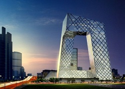
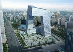
MoMA’s architecture and design galleries currently feature an exhibit about the new China Central Television Headquarters building under construction in Beijing and designed by Rem Koolhaas and Ole Scheeren. The exhibit is small and, frankly, rather inscrutable, but one section provides a terrific model for how to use stories to approach and explain design decisions, not only for building architecture but for any interface experience. It’s a wall with a series of illustrations demonstrating how the CCTV building is designed to accommodate many different types of people and uses.
Nearly all buildings, like nearly all websites and software, need to accommodate many types of users, each with related but different goals and routines. Good design provides a framework to enable these potentially conflicting profiles to move fluidly and intuitively through the same space.
This is a particular challenge for the ambitious CCTV project, which envisions a range of audiences using the building 24 hours a day. The architects make it an explicit goal to mix and blend these audiences, encouraging them to mingle and cross paths:
The building is not simply broken down into different sections, but into a loop of different communal circulation with associated social areas, canteens and meeting rooms. The shape of the building is exploited to promote direct exchange and contact between departments.
The architects created the aforementioned illustrations to communicate and test the effectiveness of this design using a story-driven approach. Alas, no photos were allowed in the gallery, but here’s what I saw:
One hundred ninety-two illustrated cards were arrayed in 24 columns, each corresponding to the hour of the day from 1am to midnight. Each hour’s column included eight illustrations showing how some portion of the building would be used at that time of day. The illustrations were computer-generated with photos pasted in of people doing their thing. It’s a vivid way to conjure the anticipated daily life of the building.
But here’s the important bit. Appearing throughout the various illustrations are five characters, who are followed throughout the day to show how they use the building and interact with each other in the space. The cards featuring these characters included captions in Chinese and English:
Character: Control room director
Location: F1 Lobby Tower 1
Time: 2:50 am
Action: Enters the buildingCharacter: Control room director
Location: F3 Open News Studio
Time: 3:15 am
Action: Monitors late night news broadcastCharacter: Actress
Location: B2 Actors’ Lounge
Time: 10:05 am
Action: Descends to actors’ lounge and dressing roomCharacter: Administrative assistant
Location: F16 Conference Room
Time: 11:00 am
Action: Meets a client from Shanghai
…and occasionally two characters show up in the same card to point up the building’s stated goal of blending audiences:
Character: Actress
Location: B1 400m2 Studio
Time: 1:30 pm
Action: Rehearsal for Chinese operaCharacter: Tourist
Location: B1 Loop (overlooking studio)
Time: 1:30 pm Action: Watches a performance in TV studio
I found it to be a great way to explain and sample the effectiveness of the building’s design–and a reminder that the same technique is useful in planning and explaining computer interfaces, too.
This type of story-driven design will be familiar to students of information architecture, but I suspect it’s rarely practiced by most journeyman web and software designers. The idea is simple: Identify the key categories of people who use your website or software, and craft “stories” that reflect each character’s goals and how they would navigate the interface.
Sitting down and explicitly doing this exercise helps to test the usability of the interface for each audience profile and, down the road, to explain design decisions to a client. In his book, User Interface Design for Programmers (excerpts available online), software guru Joel Spolsky describes it like so:
When you’re thinking about user interfaces, it helps to keep imaginary users in mind. The more realistic the imaginary user is, the better you’ll do thinking about how they use your product.… Thinking about a “real” person gives you the empathy you need to make a feature that serves that person’s need.…
When you’re designing a program from scratch, you already have a vision of what activities your users are going to be doing. Figuring out this vision is not hard at all, it takes almost no effort at all to do some brainstorming with coworkers, write down a list of potential activities, and then decide which ones you want to focus on. But forcing yourself to list these activities on paper will help your overall design enormously.…
The other great thing about activity based planning is that it lets you make a list of what features not to do. When you create any kind of software, the reality is that you will come up with three times as many features as you have time to do. And one of the best ways to decide which features get done, and which features get left out, is to evaluate which features support the most important user activities.
And there’s no reason that you can’t have a little fun doing this, too. Our computer-generated friends in the CCTV illustrations even manage to strike up a romance.
Characters: VIP and Actress
Location: F1 VIP Lounge Tower 1 Lobby
Time: 1:55 am
Action: Last drink before leaving together for the night.
With story-driven design, it seems, everyone lives happily ever after.
