Regular readers know I’m a fan of complexity. Our job as designers isn’t to remove complexity, which after all adds texture and meaning to our lives and work. Instead, it’s to manage complexity, to make complexity uncomplicated. (Complexity and complication are very different things.) As we craft simple interfaces, the goal is not to dumb down our designs but to streamline those designs for the task at hand. Hide complexity from the audience where appropriate, and make it manageable when it must be revealed.
I somehow doubt that the designers of Russia’s Kalininskaya nuclear power plant’s control room have properly pulled off that task.
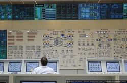
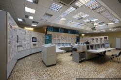
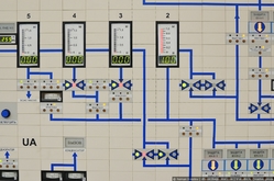
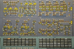
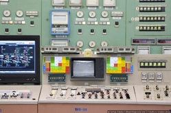
But there sure is something frankly beautiful about the absurdly complicated seventies-era control panels. It may or may not be an optimized design for a control room, but one thing I know: I’m dying to trick out my home office to look like this. You can find these photos and many awesome others at the English Russia blog.


