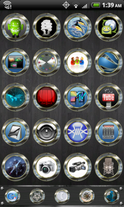
A new site shares messy and garish screenshots of Android home screens with custom themes and wallpapers. Fugly Android calls itself “an argument for closed systems,” but it’s really just a demonstration that bad taste abounds.

We all love our own bad taste. It explains the misplaced exuberance of early desktop publishing, where design newbies gleefully sprayed fifty fonts on a page, and it explains the blindingly bad personalizations of MySpace. Give people a brush, and they’ll paint something crazy just to make it their own. The number one reason people jailbreak their iPhones, according to Cydia creator Jay “Saurik” Freeman, is to pimp the home screen with custom themes. Beauty, it seems, is in the eye of the beholder. There’s something that many find irresistible about branding a visual claim of ownership on their stuff.
Platforms are cultures, and a key cultural value of Android is customization. Among geeks, at least, the appeal of Android is the ability to make the phone do and be anything you want. That’s not at all a cultural value of iOS, where consistency of presentation and style (Apple’s style) is a given. In both cases, these are values that are embraced by the audience, but are also established from the top, by the platform owners. Just compare the detail of Apple’s iOS interface guidelines to the broad and limited Android guidelines. Apple says, this is what the iPhone experience should be, while Android seems to say, hey, do what you want. (For what it’s worth, Microsoft splits the difference with Windows Phone 7, offering thoughtful interface guidelines (PDF) while also giving users a carefully controlled ability to personalize the OS’s look.)
Me, I’m an iPhone guy. That’s just the culture where I feel most at home. So yeah, I shake my head when I browse Fugly Android’s gallery of horrors. But I also know that where I shudder, lots of others see creative freedom and opportunity. That whole beauty and beholder thing.


