Khoi Vinh recently commented that cities should consider how and where they might be made more user-friendly to first-time visitors. As an example, he offers up his frustrated attempt to use a Paris pay phone:
I found myself desperately trying to figure out how to make a call from a public phone at ten o’clock Friday night on the streets of Paris. It’s a lovely city, but one of its enraging usability deficiencies is the fact that pay phones do not accept coins — or any kind of cash, for that matter.
To call anyone anywhere from these phones, you must possess a calling card, which must be bought at newsstands or other convenience vendors. But I had no way of intuiting that from any of the instructional signage presented with the pay phones, and no guidebook, and therefore no other recourse.
Ah yes, I remember the first time I ran into that one after moving here. There are certainly hundreds more — all the rituals and processes that are so natural and obvious to locals that no explanation or instructions are deemed necessary. As a traveler or ex-pat, there are so many delicious opportunities to embarrass yourself.
Among travel interfaces, though, currency may well be the most important. In that match-up, Europe wins the coin toss against the US, whose coins border on the unintelligible. If you happen to have American change in your pocket, take a look:
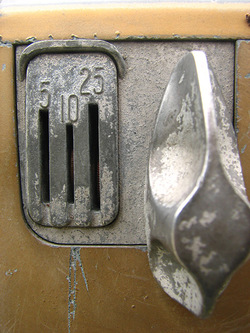
Nowhere on the quarter does it say that it’s worth 25 cents. It says, in English, “quarter dollar,” a difficult mouthful if you don’t read English. The dime is even weirder: “One dime.” The nickel is marked, “Five cents,” in small type, one of the smallest text elements on the back of the coin. (The value is even more elusive on the 2005 nickel, which is marked “Five cents” in incredibly tiny letters at the bottom-right edge of the back of the coin.)
The penny is more clear: “One cent.” Even there, though, you still have to know English-language numbers. Hopefully most visitors to the US at least know that much, but many of us have probably visited countries where we know nothing of the local language. In that case, if the local currency is as challenging as US coins, you’re out of luck.
Big numerals on the face of the coin would be so much more effective.
With all of the recent revisions to US coins and currency, it’s remarkable that these basic usability issues haven’t been addressed. The new presidential dollar coins are at least moving in the right direction, with “$1” marked on the back.
When you’ve grown up with the coins, you barely even notice their design; the size, weight and color says it all. Like Khoi’s Parisian pay phone, the meaning is so obvious to locals that it doesn’t even occur to us that the design might be hostile to first-time visitors.
